Why Instagram Failed to Become TikTok
In 2022 the Instagram team announced they were “testing a new, immersive viewing experience in the main Home feed.” As a self-proclaimed mobile app design connoisseur, this piqued my interest. Clearly this was an attempt to replicate TikTok’s UX of showing one piece of media per scroll. For Instagram this would be differentiated since the app supports both photos and videos whereas TikTok is designed for video consumption only.
The test failed, and I have a hypothesis as to why: context.
Take a close look at the press image Instagram shared when the new interface was announced.
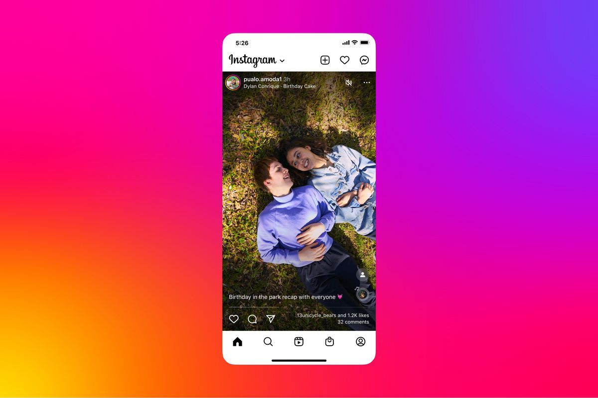
When the new interface actually launched, there was one subtle difference that fundamentally changed the app’s mental model and broke how users consume content.
Do you see it? The profile photo of the account that shared the content moved from the top to the bottom of the screen. This one change doomed the experiment by removing context from every piece of content.
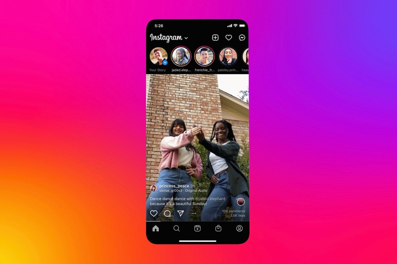
Instagram launched in 2010. The interface of course changed over time with the addition of new features, and the gradual shift in aesthetics from Apple, Google, and the design industry. However, a few things never changed. For example, the placement of the profile button in the tab bar has always been in the lower right corner, Home has always been in the lower left corner, and in the Home feed the profile photo of the account that shared a piece of content has always been in the upper left corner of the content.
Take a look at the screenshot in the first iteration of Instagram’s website.
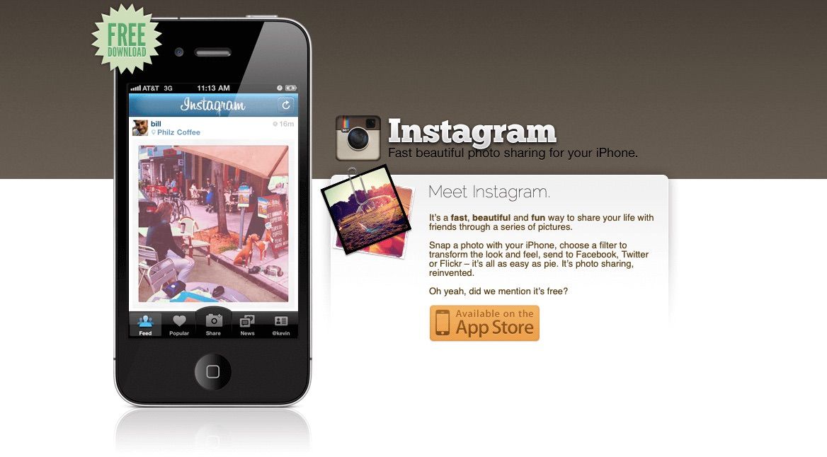
There it is. When Burbn became Instagram the profile photo appeared above the top left corner of the photo (remember when Instagram only supported sharing photos?).
Since 2010 Instagram users have been trained to instantly and subconsciously look at the top left corner of content to ascertain: (1) who shared this and (2) do I need to look at this account’s content right now or can I scroll to the next item. Sometimes I’m not in the mood to look at a certain celebrity’s third carousel of vacation photos so I scroll without hesitating. As discussed above, when Instagram’s TikTok experiment launched, the profile photo moved to the bottom of the screen. Consuming content in the Home feed became jarring because I consistently did not have context.
Allow me to demonstrate with a wireframe.
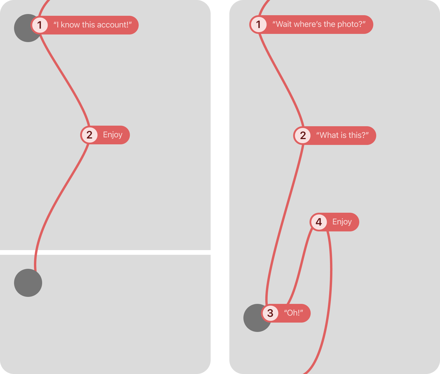
Before the experiment launched my eyes would slightly move from the top of the screen down to the profile photo, and I would make a decision about the importance of the content based on the profile photo. Then I would establish context and set expectations based on my previous experience with the account’s content before looking at the photo or video. I would briefly enjoy and then swipe horizontally if a carousel or vertically for the next item in the feed..
The experimental interface confused me by removing the account photo from the top left position. I would move my eyes downward to look at the content, become surprised or confused, and then feel required to rationalize the content. I would try to recreate the experience of the original feed by establishing context which required seeking the profile photo. My eyes would move to the bottom of the screen, analyze the profile photo, and then look back up at the content again. Scroll. Repeat. This was extremely frustrating. Instead of consuming 10 photos or videos in the feed, I had to rationalize 10 photos or videos.
Now let’s look at TikTok’s placement of the profile photo: the middle of the right side of the screen.

This works perfectly for TikTok because its users expect and are accustomed to relevant content as a result of the incredibly accurate algorithm. The account that shared the video is secondary and looking at the profile photo to establish context is unnecessary. A video’s context comes from its connection to a user’s interests instead of the source. One can use TikTok forever without ever following a single account and be entertained every day. The same is not true for Instagram where following accounts and building a community has been the primary method for gathering personally relevant content since 2010.
I believe that if the original experimental interface with the profile photo in the top left position were tested, it would have had a greater chance for success. Perhaps not successful enough to become the default interface for all Instagram users, but definitely enjoyed by more. Personally I would be delighted to try using the immersive Home interface again and remove the profile photo’s position change as a variable.
The Instagram team deserves a lot of credit and respect for trying this. It’s easy to not experiment. It’s easy to let interfaces become stagnant. Designing, building, testing, and deploying a change is hard and risky. I hope other companies take risks more often as a result.