Apple Watch Faces
For years I have felt a tension across iOS, macOS, and watchOS between simple, subtle interfaces and vibrant, complex interfaces. We have beautiful, high pixel density screens surrounding us all day every day. Should they be used to their full potential through the cramming of widgets, windows, and complications? Or should they exist on the periphery, whispering a minimal amount of data?
Since dark mode first appeared in macOS Mojave in 2018 and iOS 13 in 2019 I was hooked. I prioritized apps that supported dark mode, customized dock and app icons to be dark, and even used plugins to make some web apps dark. Emphasizing blacks and grays pushed me to become a computer minimalist, reducing the amount of toolbars and icons to let content stand out. Who needs icons and buttons when one can just memorize keyboard commands anyway. One could argue I took this a bit far (as I usually do with computing trends).
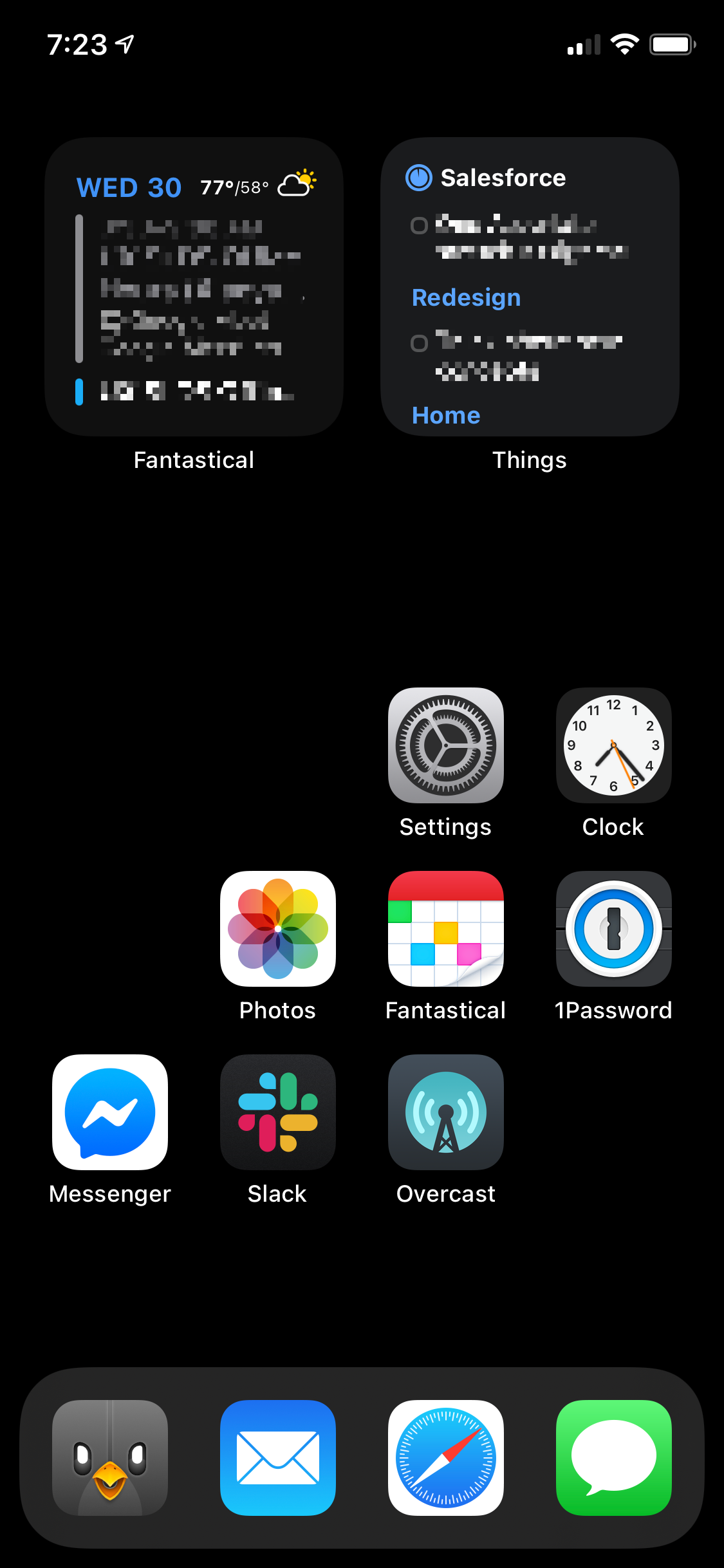
With iOS this dark mode minimalism manifested by only using 1 screen of apps, and reducing the number of app icons on the Home Screen to just 8 alongside small calendar and task widgets leaving plenty of unused space. My wallpaper and lock screen were either all black are a subtle gradient from dark gray to black depending on my mood. On macOS I meticulously chose which apps earned a place in the dock to ensure it was always as thin as possible. My wallpaper was randomly selected by Unsplash with an emphasis on dark, minimalist, architectural photos.
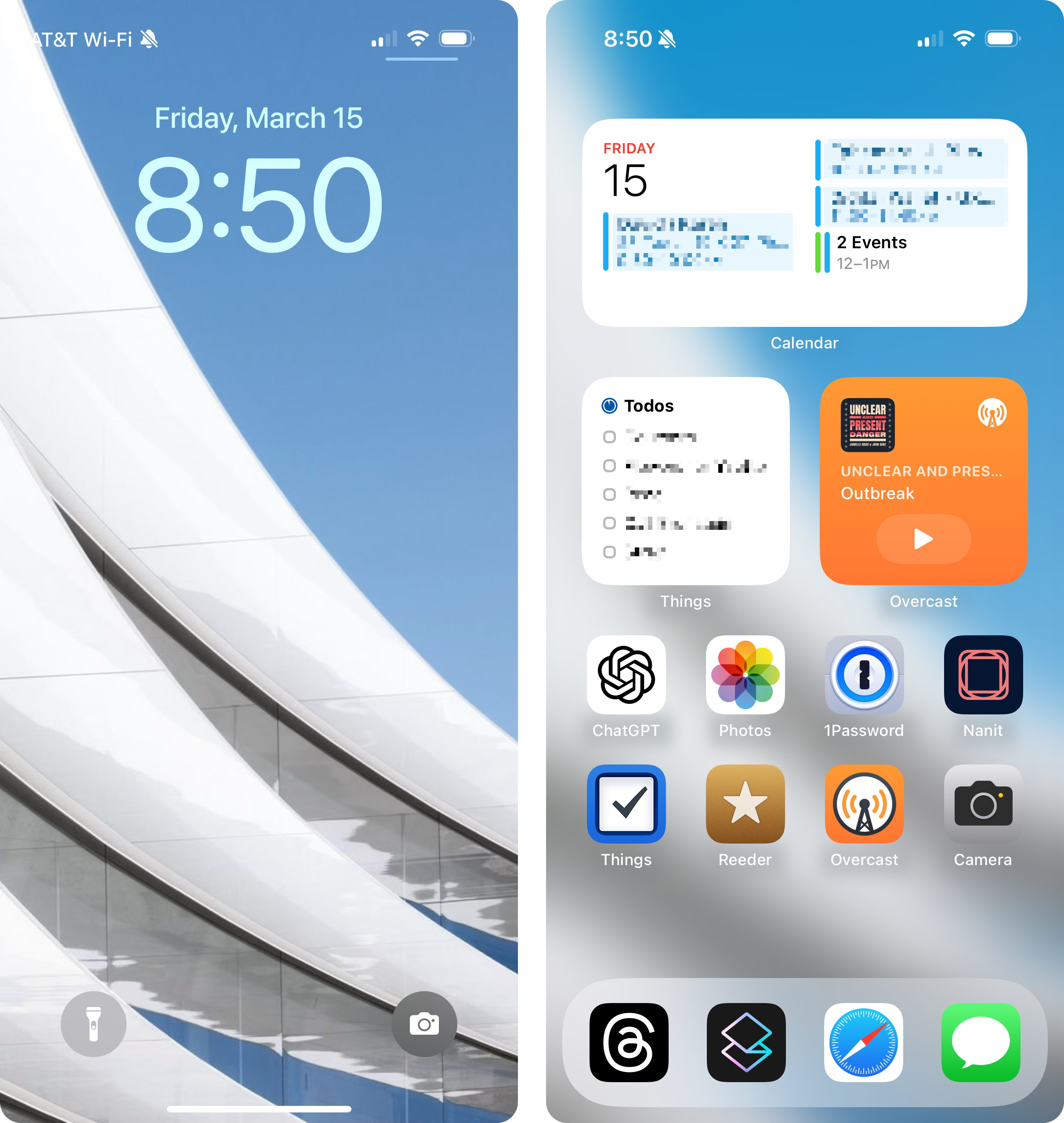
Over time I felt like beauty and joy were missing from my digital life. What if I allowed a spot of color in a few places? What if I… turned off dark mode? Years had passed since I even tried light mode. I flipped the switch on my iPhone and was instantly reminded of how computers are supposed to look. Light! I felt reconnected and rejuvenated. My devices felt fun again. iOS and macOS were reborn.
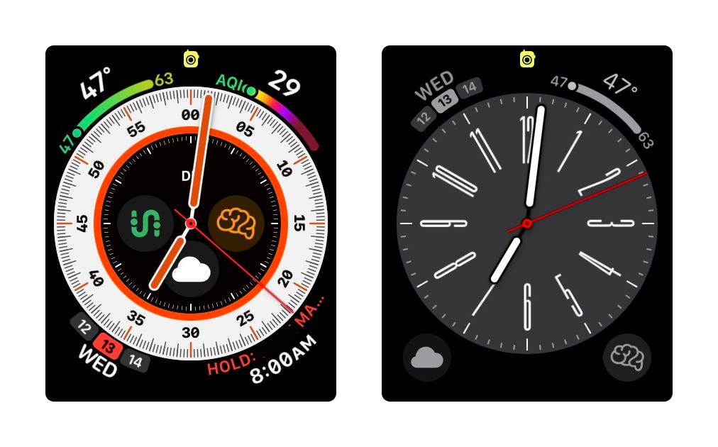
The one device where I continued to struggle was the Apple Watch. Since its screen is always on it constantly draws attention. My kids’ eyes find their way to it for no reason while talking or plying. When weighing the interface’s beauty vs. its ability to distract, I ultimately believe its vibrancy and complexity should be reduced. The watch should not shout “look at me!” It should exist on the periphery. It should be patient.
When I access the watch I should not be distracted from my primary thought process. I need to quickly and subconsciously glance, ascertain the information I am seeking, and gracefully return to be present with my task or conversation. As a result I transitioned from Modular Ultra and Wayfinder to Metropolitan. It’s elegant, and I find the elongated clock digits align with my enjoyment of crisp graphic design. It’s the face I think Massimo and Lella Vignelli would choose.