Beyond Tactility

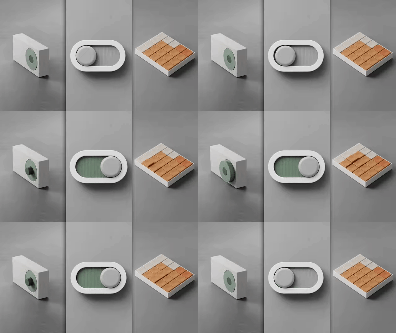
I recently read an article on Fast Company titled “These charming tools are a radical vision for how you’ll use your computer.” The article discusses a concept created by Approach Studio that asks the question: What if we updated physical interfaces for the digital ages? How might they look different? I watched the video and gifs several times and reflected on why I appreciate certain physical products: tactility.
One can appreciate, grow attached to, or even love the way certain products feel when interacting with them. For example, pressing the start engine button in a car you enjoy driving, turning a knob on a coffee grinder, or even feeling haptic feedback after tapping a button in a beautiful mobile app. Think about the power button or switch on a product that is a part of your life. For example I vividly remember the switch on the back of my Mac LC and the button on my dad’s Performa 6115. Each had a particular feel and sound that contributed to a moment of anticipation before the old Mac OS startup chime. (Of course that sound sometimes meant dread if I was waiting to use Microsoft Word for writing an English class essay.)
Approach Studio goes further than presses and sounds by bringing concepts we have learned since the dawn of mobile computers out of the digital and into the physical. These demos are easy to quickly scroll through, but I want you to take a moment to reflect on how each can be an improvement to the home.

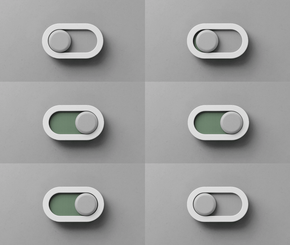
First, think of a typical switch that you flip every day. Perhaps a small and subtle light switch or an old thermostat’s mode switch for example. Now imagine a switch that provides colors to indicate its state, has a slight tension as you slide it, and ends with a reactive bounce to feel alive. This would be more enjoyable to use because of its playfulness, and it would add character to your home with its aesthetics. (Ideally one would be able to customize the color. I’m not sure my wife would approve that shade of green.) Something in your home that you observe and touch every day should both look appealing and feel good to control.

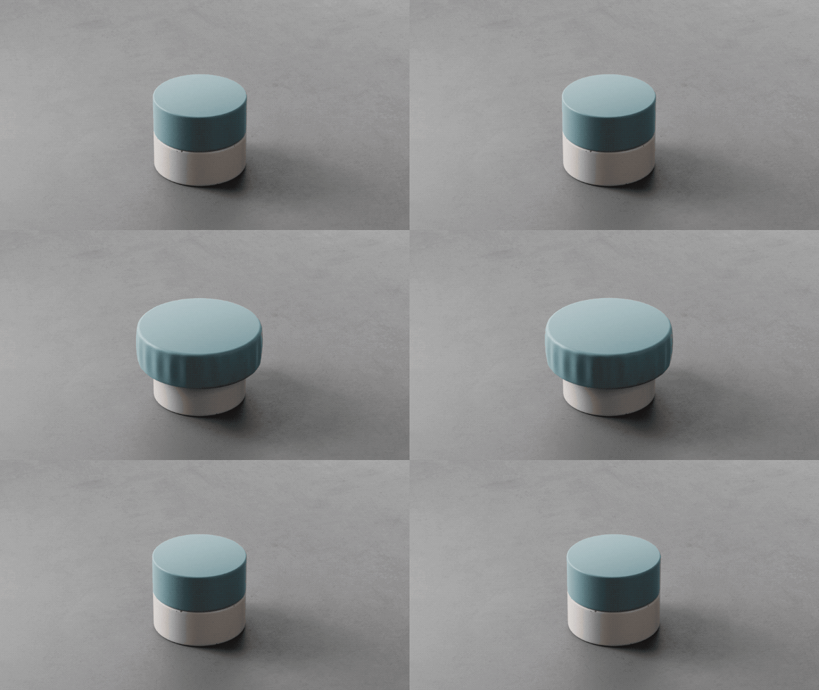
Next, think of some dials you turn. Fans, thermostats, stereos, etc. When the factory ships a product with dials they are a fixed size forever. What if instead a dial could adapt to specific tasks? This is reminiscent of Steve Jobs’ initial explanation of the iPhone’s large, multi-touch screen in 2007. Instead of fixed buttons which Blackberry, Motorola, Handspring, and Samsung phones had, the iPhone could adapt to different tasks. Approach Studio demonstrates this with a dial that grows and shrinks depending on how accurate the user needs to be in the moment. A small dial is ideal for a low number of options (adjusting a lamp’s brightness from 4 to 5), and a large dial is preferable when the user needs to be accurate (adjusting from 66 to 72 degrees on a thermostat). A dial that can grow and shrink depending on the user’s needs can allow one dial to control multiple products.

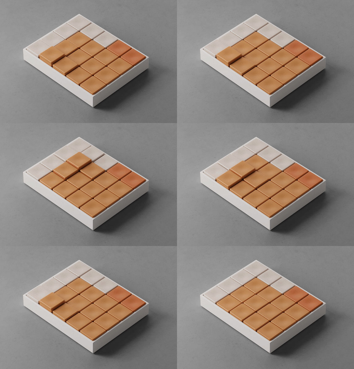
Lastly, if you are currently on a laptop and desktop computer, try hovering over a few links or buttons. Go ahead. The hover state is a subtle way computers can alert the user that there are more options behind this element, this area can be clicked on, etc. (In my opinion software designers occasionally rely too much on hover states that require the user to move the mouse to an element before discovering additional options. Designers also occasionally place crucial functionality behind a hover state that is inaccessible on touchscreens. This is solved by assuming that the user is OK with being forced into the hover state after a tap which makes touchscreen users less efficient. Tap and hold? That doesn’t work either because Safari and Chrome have built-in functionality for tap and hold. Basically, avoid using hover states.) However, when used properly, hover states can add delight and surprise to an interface.
Now imagine if physical objects had hover states similar to software. Not only would they feel alive and fun, but they would also have more accessible buttons. Your finger would travel a shorter distance allowing you to press more buttons in less time. This could start with Microsoft Excel experts who need to enter data quickly, and it could lead to other innovations in the home. Arming and disarming a security panel for example. Of course the trend is to slap screens on everything, but products that are designed for specific purposes could be improved with this innovation.
I would love to see some of these ideas incorporated into a future elgato Stream Deck.