Design and Write Separately
Designers beginning their careers or looking for their next gig often express similar frustrations when working on portfolio case studies: “Where do I begin?!” After writing a few paragraphs they become frustrated and unsure of their progress. The design must be beautiful! I’m a designer, right? My case study better be perfect! Fortunately there is a solution to this problem.
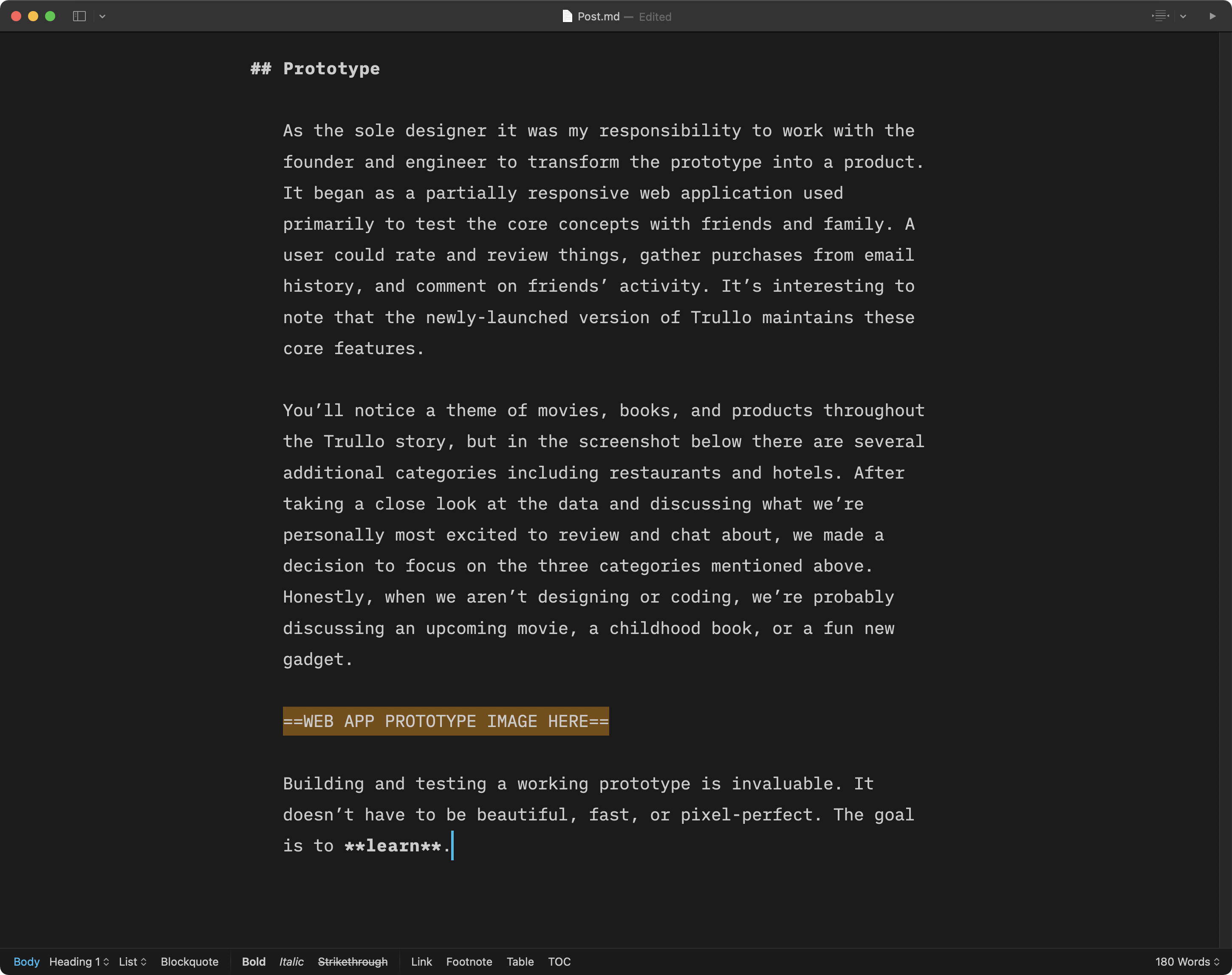
When working on your case study it is crucial that you separate the design from the content. Do not start with a blinking cursor. Do not jump right in to Wordpress or Squarespace or Tumblr (I once used Tumblr to build a portfolio). Look at the screenshot below. How can you possibly juggle how your portfolio should look while trying to write?

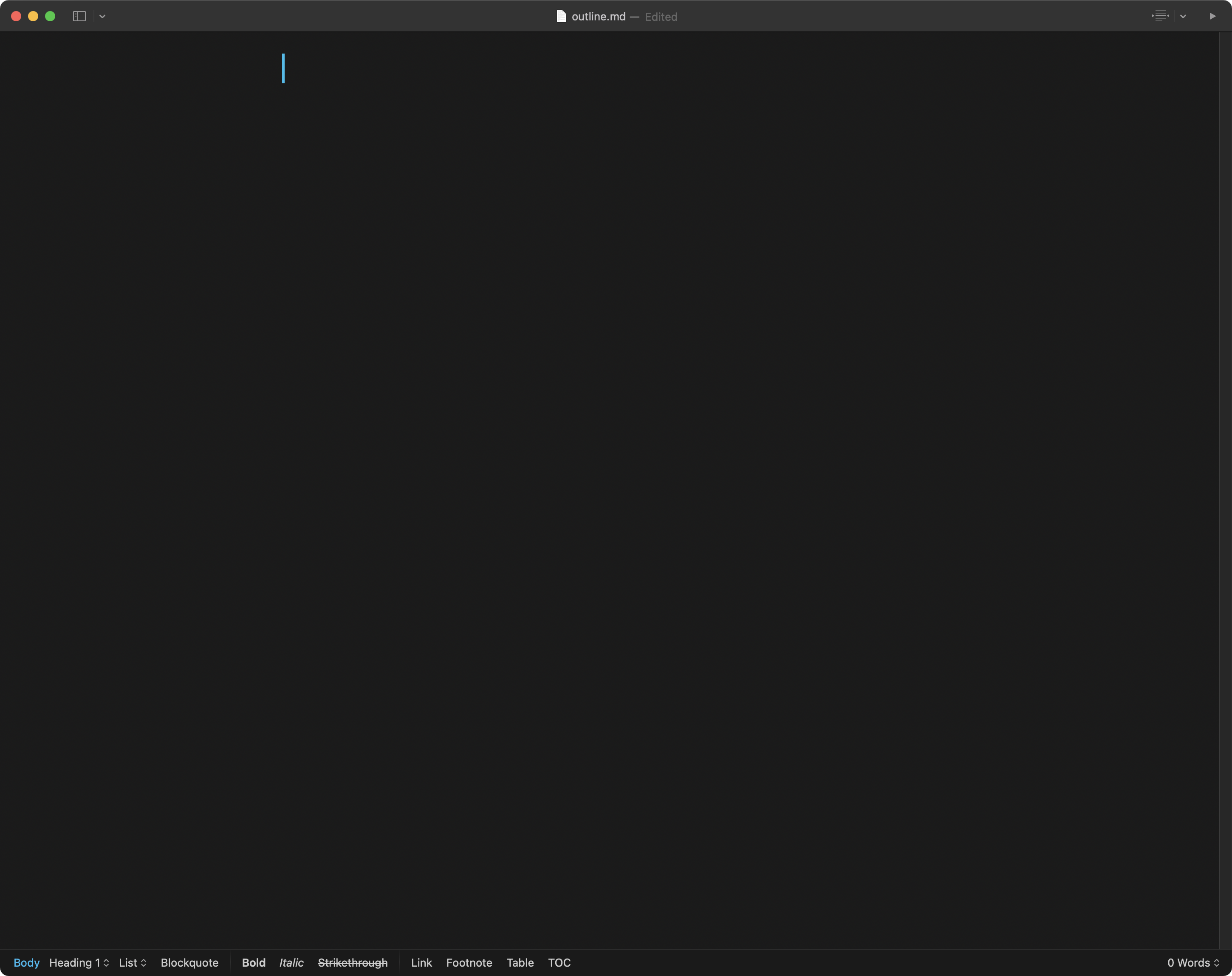
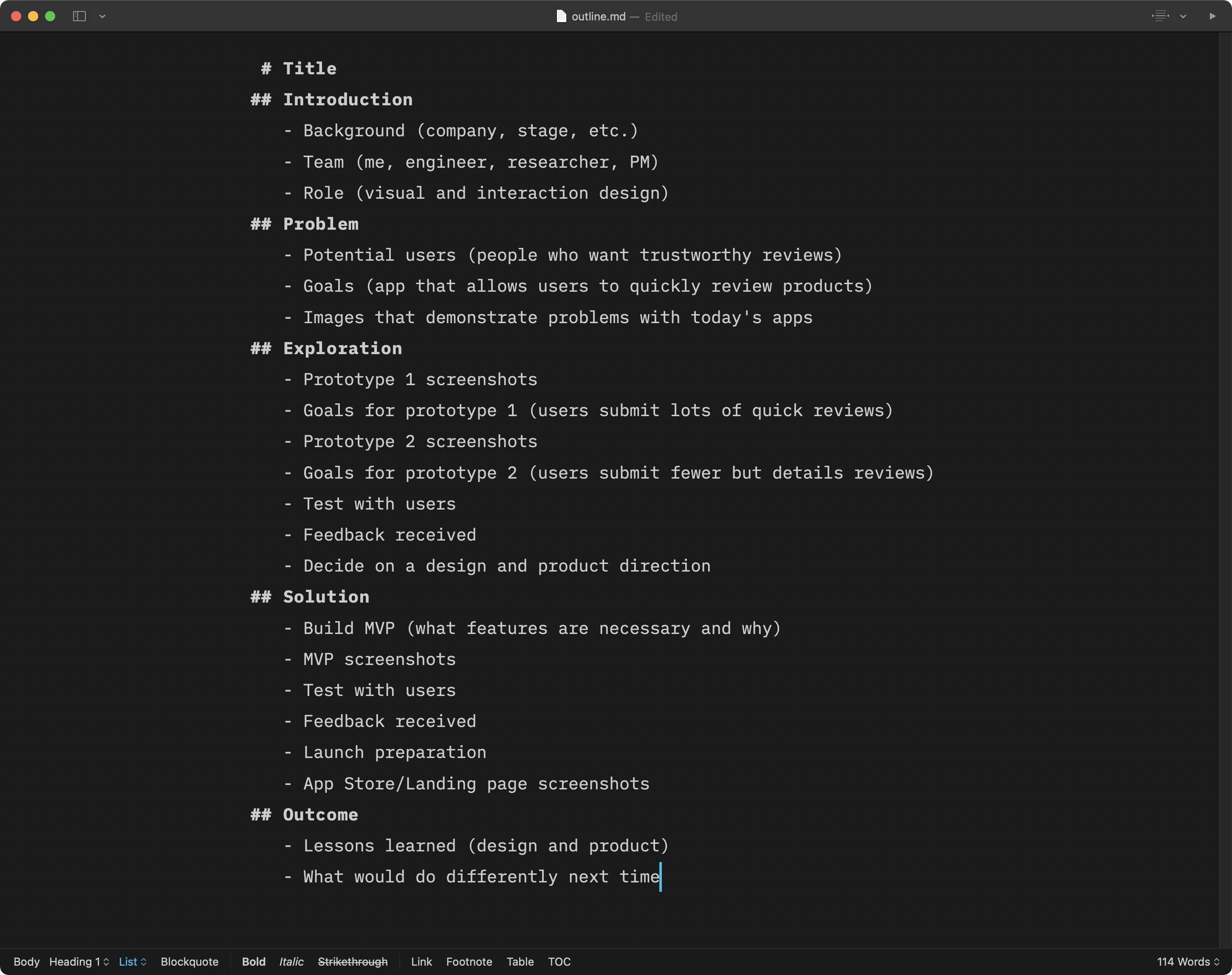
Here is how I approach writing case studies. Remember high school or college English classes? Remember essays? Start with a pencil, Google Docs, Pages (I used Pages to write all of my essays at Cornell), or a basic text editor (I use iA Writer) and focus on the content at a high level. I quickly wrote an outline for an app I worked on in 2015. (Sadly it is gone forever because competing against Facebook in the social networking space is not ideal.) Here are some questions to consider:
- What is the problem you and your team tried to solve? Perhaps it’s “There are no apps for me to look at my friends’ product reviews.”
- What is the story you want to tell? Perhaps it’s “I worked with a small team to build a beautiful app but in the end we learned that we failed to find a real problem.”
- What sections do you need? Perhaps it’s introduction, problem, exploration, solution, and outcome.
- What images do you need to include? Perhaps you need screenshots of how product reviews look on typical social networking apps, prototypes, illustrations that convey the goals of a few prototypes, marketing materials, and final mockups.
- Where will you put images? Avoid using so many images that they get in the way of telling a story.
Write a thorough outline. Getting more information out of your head at this stage will help you efficiently write the details later.

Now convert each line of text into a few sentences or paragraph. Fill in the details. Get into a writing flow. Again: you are not thinking about design. You are focusing on content. Typography and colors come later. Tell your story!

Once you are confident that the content is ready (including images captions because they are a fun way to inject personality), you can select a content management system and browse templates. I’ve used so many (even Carbonmade!) and they all have pros and cons. If you want to discuss in detail please feel free to Tweet me. In my opinion it is wholly unnecessary to design and build a template from scratch now. Even Jekyll has templates (although most are pretty scrappy looking).
OK you’ve selected a template and you’re ready to write. Wait you already wrote everything in Pages (seriously give it a try)! Just simply copy and paste your text and upload your images. When your content is already written, building your portfolio is fast and easy. After inputting everything you can focus on the design. Tweak your typography. Mess with colors. Try different templates. You are free to experiment. You finished the hard part; now comes the fun.