Home View Is Back
By 2011 the design team at iControl Networks had already devised a way to visually summarize a house’s security system, cameras, thermostats, locks, and lights into a single, simple, and quite lovely representation: the orb.

We knew we could go even further with simplifying how to visualize and, more importantly, control your home using a touchscreen. Home View was born. Users could quickly draw a rudimentary floor plan, label rooms, and then drag and drop devices onto it. We provided a variety of possible layouts that could quickly be augmented and rearranged. I was reminiscing about this project and its complexities recently when I read about a new app named Controller for HomeKit on The Verge:
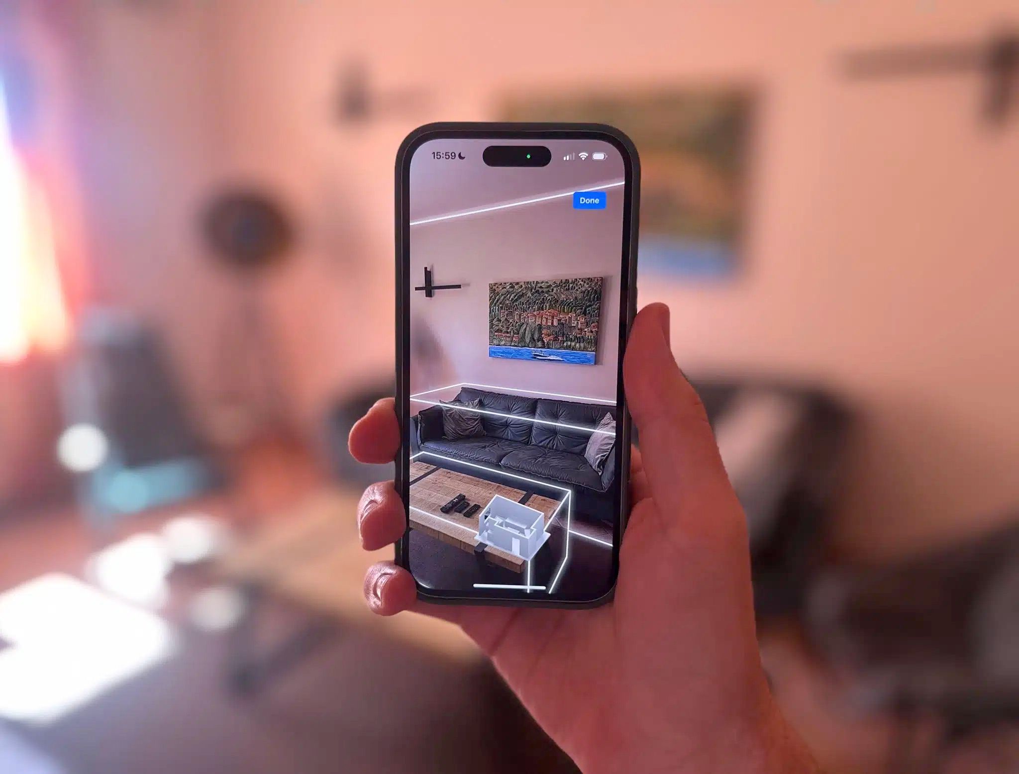
Controller for HomeKit, a third-party app for controlling your Apple Home smart home, has a new Floor Plan feature that adds a map interface for interacting with connected devices like lights, locks, shades, sensors and more. I got some time with the new feature ahead of its launch this week and it’s a compelling way to control your smart home. A 3D scan of your house becomes an interactive map filled with all your connected devices providing an intuitive way to control them: Just tap the lamp next to the sofa on the map and that light will turn on.
Capturing a 3D scan of your home by walking around your home is probably a much easier (and more magical) way to input your floor plan. Tables, chairs, and other objects are documented which is far superior to iControl’s general emptiness. However, I’m still proud to show what we launched long ago. Below are a few screenshots from the iPad app. Again, these are from 2011.
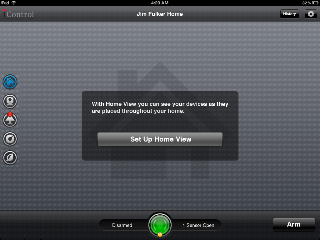
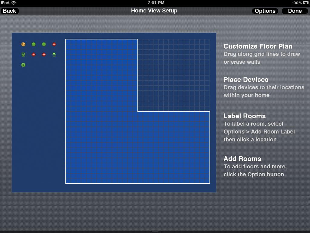
Blueprint mode allowed users to draw and erase walls with a finger. The algorithm for how the app should behave as a finger bumps into other walls or edges of the container was particularly fun to iterate on.
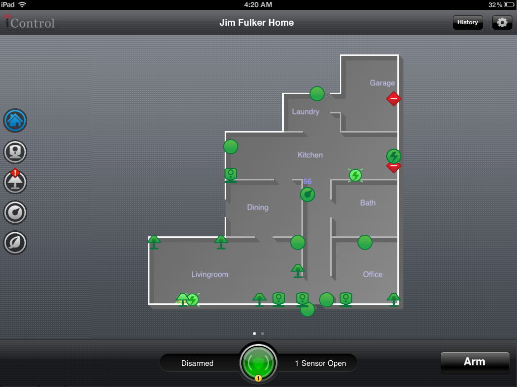
Once the floor plan was complete and devices were placed throughout the house, users could tap on a camera to see live video, a lock to lock or unlock a door, a light to turn a light on or off, a thermostat to change its mode, etc. Honestly, it was just so fun to play with.
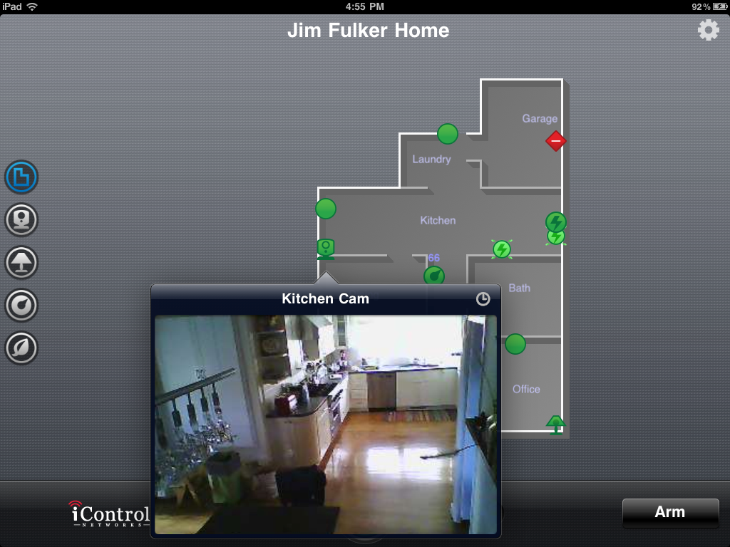
After the uesr taps on a camera, a small window opens to show live video. With one additional tap the user could view that camera’s history. Why scroll a long list when you can just take a peak at Home View?
I’m thrilled to see ongoing investment and innovation in the smart home space. Over the past few years I have slowly divested from smart home products in favor of reliability. For example, I recently sold all of my Google Nest Mini smart speakers. It seems like Google has let this product line languish with an increasing number of errors and connectivity problems. Perhaps incorporating LLMs will improve the situation in the future, or an entirely new device is needed.