Next Generation CarPlay
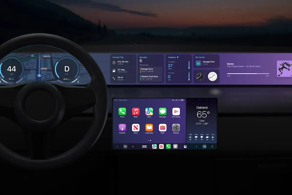
During WWDC in 2022 Apple shared a mockup of the next generation CarPlay interface that would control most of the car’s functionality instead of just launching apps and being confined to a single screen. This is meant to compete with Google’s efforts to stretch beyond Android Auto with Android Automotive. Yes, Android Auto and Android Automotive are two different products.

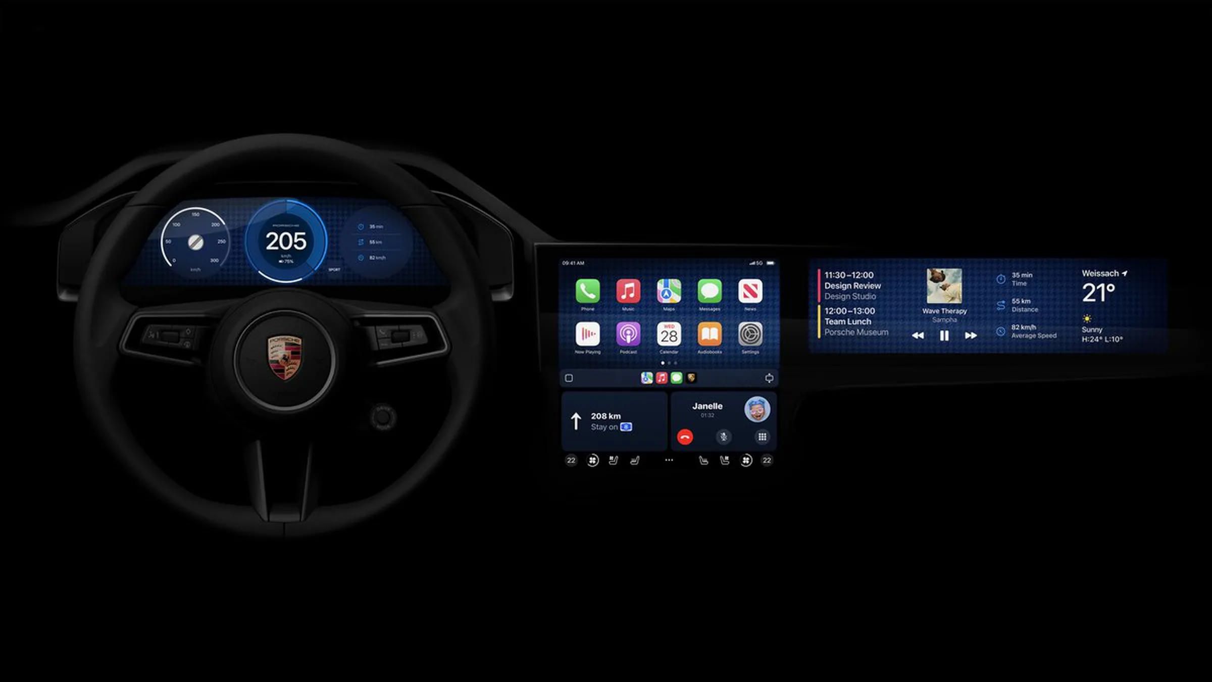
Recently Apple shared refreshed mockups specific to Porsche and Aston Martin (hopefully BMW and Subaru someday) which will have the new experience first.

A few observations on what changed over the last 1½ years:
- Gradients to patterns: Instead of one gigantic gradient we now have a wallpaper with a simple pattern. This feels less distracting while achieving a higher contrast.
- Smaller displays: Instead of a display that stretches across the entire dashboard we now have multiple smaller displays. I assume a dashboard-wide display would be prohibitively expensive. There is also so much wasted space, and cramming more content onto the display would just lead to further distractions. Smaller displays that focus on specific tasks allow the driver to quickly and accurately tilt their head, briefly focus, and shift focus to back to the road. A gigantic display could be more difficult to use when one needs to look at a specific area or for a button waiting to be pressed.
- Reach: In 2022 the area of the screen in front of the passenger seat was reserved for showing music data. I’m surprised the screen in front of the passenger seat would now include buttons. Is the driver expected to lean over, reach, and accurately press a button while driving? This could be challenging and dangerous. If one accidentally presses the wrong button, one would need to reach over, reach, and tap again, further taking attention away from the road.
The question I continue to ponder is do we need more pixels in cars? Of course it looks cool. But what if instead of more pixels Apple and Google made voice control instant and reliable with a much deeper integration into the car? Why can’t I say “hey car turn up the temperature” or “gimme directions to the Shell station on 19th?” Technically these are both possible today, but not with the simplicity and reliability I expect while driving.
In college I co-authored a paper called Context of Use Evaluation of Peripheral Displays. Two Information Science PhD students and I tried to define what makes a good peripheral display. For a driver the windshield is the primary display and everything inside of the car is secondary (or on the periphery). One of the core aspects of a successful peripheral display is to ensure it is a glanceable. What strikes me about these mockups is how incredibly not glanceable they are. There’s so much information presented which will likely interfere with driving safely.
A more interesting challenge for car designers would be to decrease information density and the overall number of pixels. There’s an infinite number of things to present if one continues to increase screen surface area. What if a car had zero pixels? Or the displays were greyscale instead of rich in color? Perhaps a driver could choose to hide the display when it’s not necessary. Maybe everything the driver actually needs could temporarily appear in a HUD and then disappear leaving the driver alone with their thoughts and the open road.