Ode to a Box
I’ve been following the team at CW&T since 2011 when they launched the Pen Type-A on Kickstarter. My design team gathered around to watch the campaign video and were immediately impressed by the delightful “pop” sound the pen makes when it is removed from its container.
The duo behind CW&T not only makes thoughtful proudcts, but they also come across as thoughtful people with genuine kindness and emphathy. You can clearly see this from their Instagram content, weekly newsletter, and podcast appearances.
Many years, product launches, and awards later, CW&T launched a product for me: the 55 66 88. It’s “a phone stand set at 3 useful angles for positioning your camera.” Clever and unique!

After having children we found ourselves regularly making FaceTime calls from the table during meals, and we used a few different average looking phone stands to free up hands and stabilize the video. When CW&T launched the 55 66 88 I immediately backed it thinking it would replace our current stands.
What surprised me beyond the cleverness of a stand that can display a phone at 3 different angles was the box’s design. It somehow manages to both demonstrate the product and perfectly encapsluate the CW&T brand. At first glance it looks like a typical box with an illustration of the product on the side.
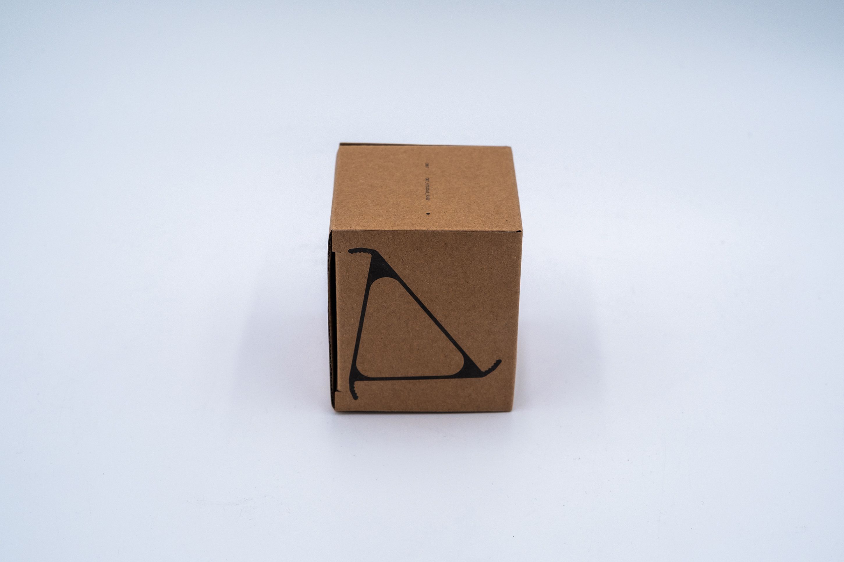
If one takes a closer look a few details quickly emerge. First, the circle.
CW&T uses the circle as either a foundational element in a product or as a colorful accent. For example, the Studio Sketchbook, the Solid State Watch (which I have come close to purchasing several times), the Orange Dot, and Salty all leverage the circle in unique ways. It’s even a core part of the website’s design as a consistent element in the upper left corner.
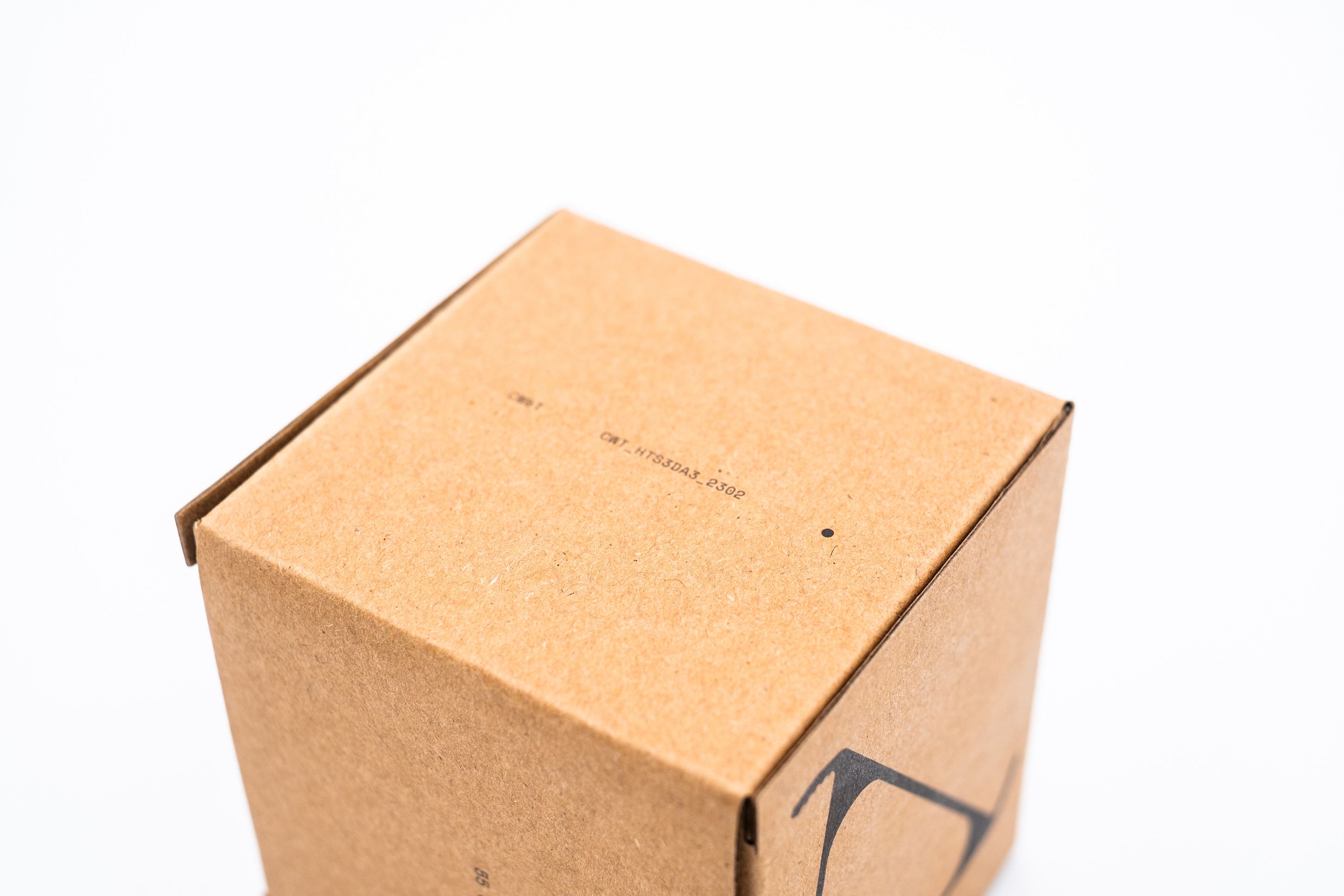
Next, the product name. It’s the same typeface, color, and font size as the rest of the box’s text. One can imagine designing this side of the box with a much larger size so the product name shouts at the customer.

Why not include a description like “a phone stand with 3 useful angles?” Simplicity. Let this side simply show the product name, and allow other sides to be busier.
Now for a few product details.
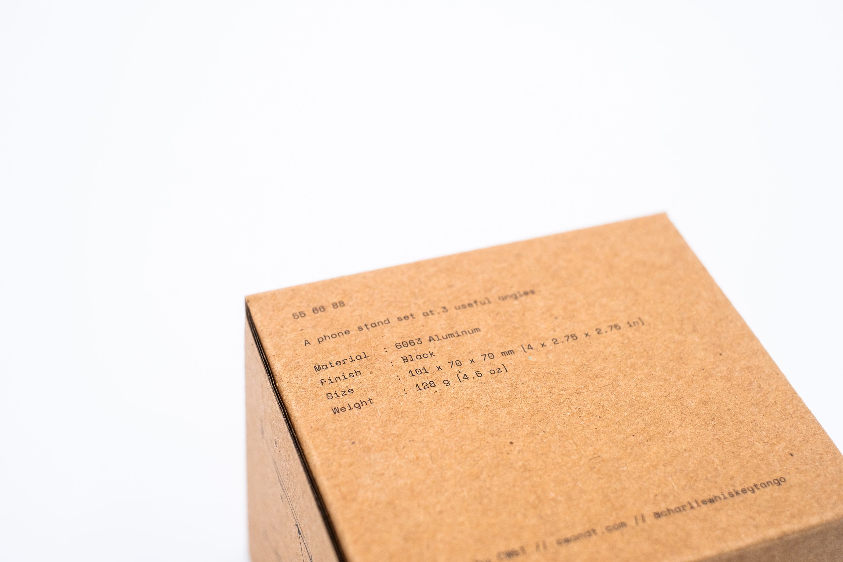
Ah hah! There’s the description: “A phone stand set at 3 useful angles.” Concise and clear. Along with the description are the material, finish, size, weight, and contact information. Instead of the obvious design of “Material: 6063 Aluminum,” CW&T inserts space after each label to ensure the semicolons and values are aligned. This leads to a much cleaner, uniform aesthetic.
Lastly, a demonstration of the product.
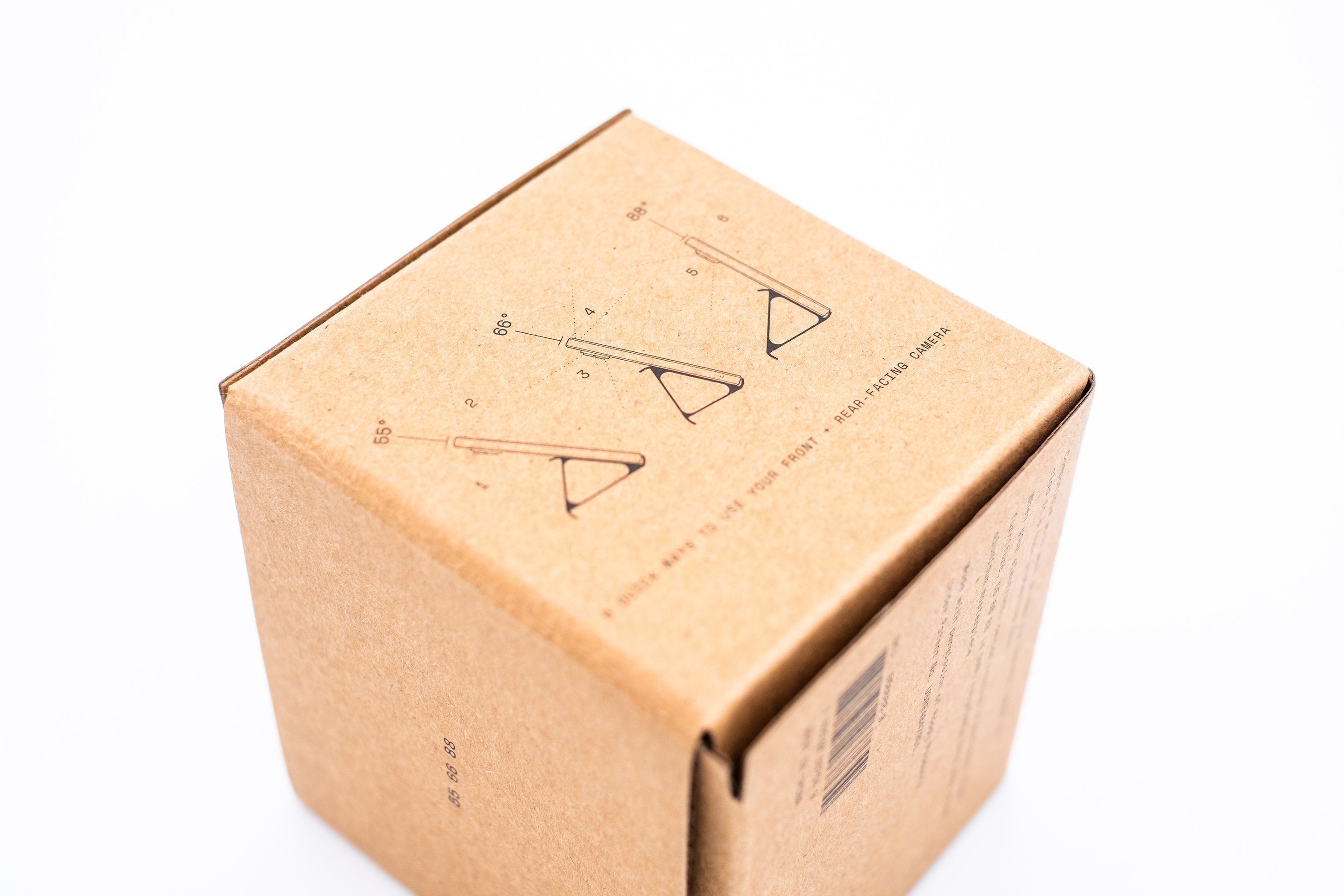
“6 quick ways to use your front + rear facing camera.” 6?! It didn’t occur to me that with 3 angles one could achieve 6 orientations by leveraging all of a phone’s cameras. In retrospect this is obvious and I was too focused on solving the FaceTime calls at the table use case. The illustrations are educational and they connect the product’s purpose to its name using the degrees symbol: 55°, 66°, and 88°. I also adore the subtle dots on the sides of each phone indicating what the cameras will be pointing at for each orientation. Again, clever details abound.
I highly recommend keeping an eye on CW&T, and I can’t wait to back the Pencil Type-C on Kickstarter.