Problem/Solution Pairs
As discussed last week in my post about portfolio presentations, designers inevitably have to share their work when applying for a job. What I witness often is the uninspiring real estate tour (or “harbor tour” if you are from the UK). Designers present a high fidelity mockup and talk about the navigation, content, buttons, personas, colors, etc. They are skipping the most important part: the problem.
Every project, flow, and mockup must be presented as part of a problem/solution pair. What is the problem you are trying to solve, and why is this solution ideal? For example, when I applied to become a product designer at Salesforce, I presented my work at iControl Networks (now Alarm.com). I did not start with an interface; I started with a very high-level problem: security systems are old. They run on POTS, are not connected to broadband, do not support new technologies like Zigbee or Z-Wave, and, most importantly, are difficult to use.
Wait! Is this the right problem? No! This immediately jumps to the technology. Why should the hiring manager care that security systems are old? How can you connect the hiring manager to a real world problem? People purchase a security system because they want to protect their family. But what happens when you leave your home?
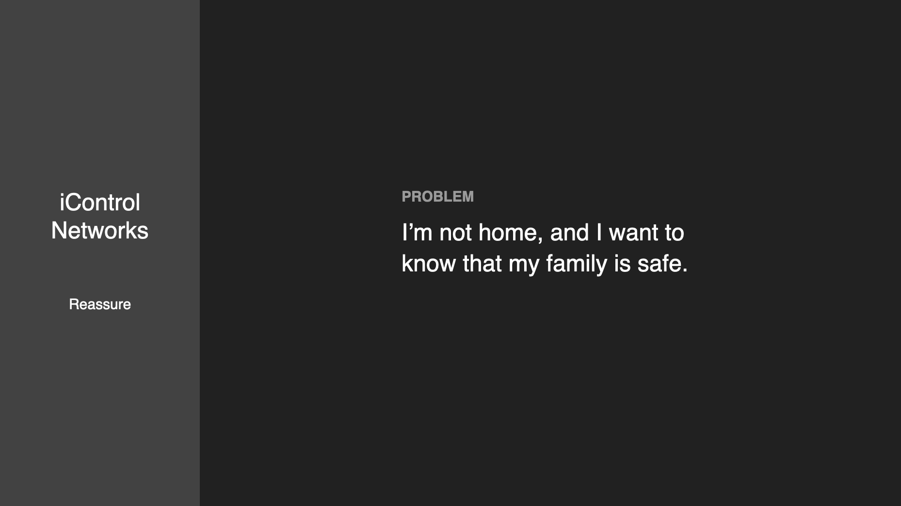
Problem: I’m not home, and I want to know that my family is safe.
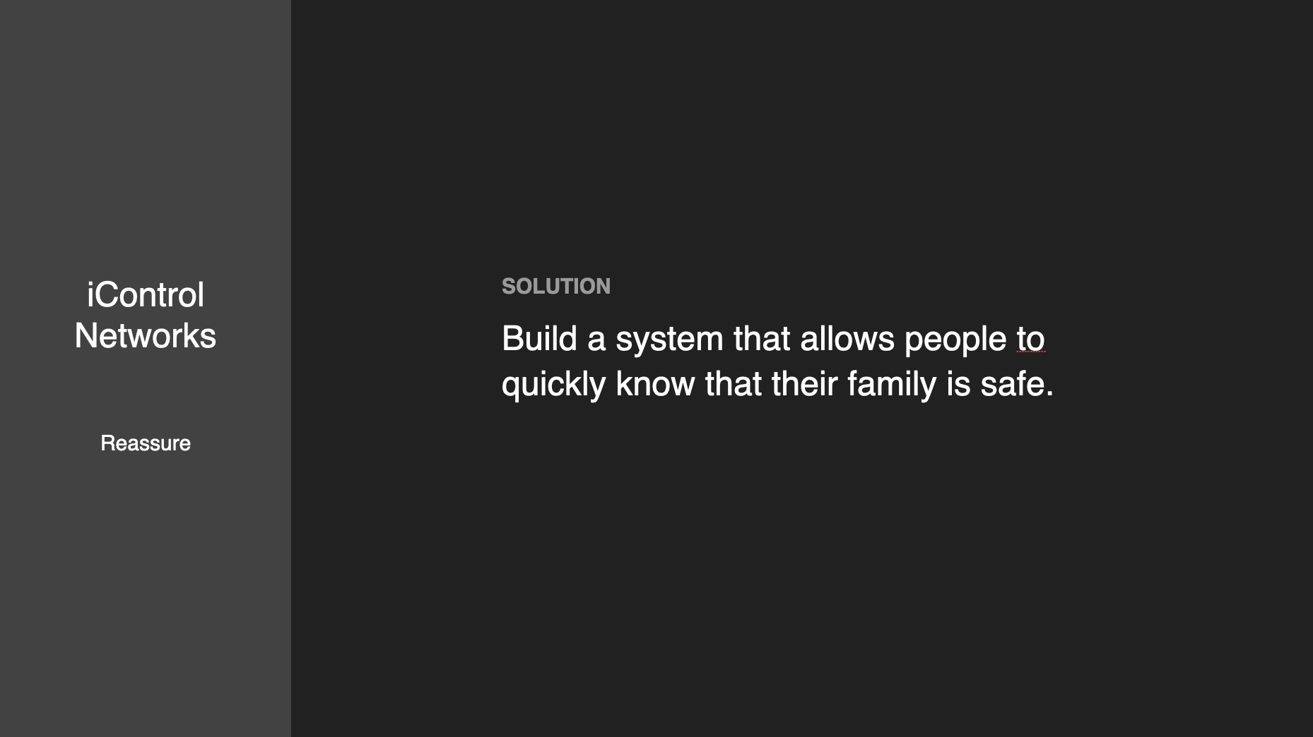
Solution: Build a system that allows people to quickly know that their family is safe.
By the way, I’m not exaggerating; this is really how I presented my portfolio. One slide to talk about the problem, and another for the solution.
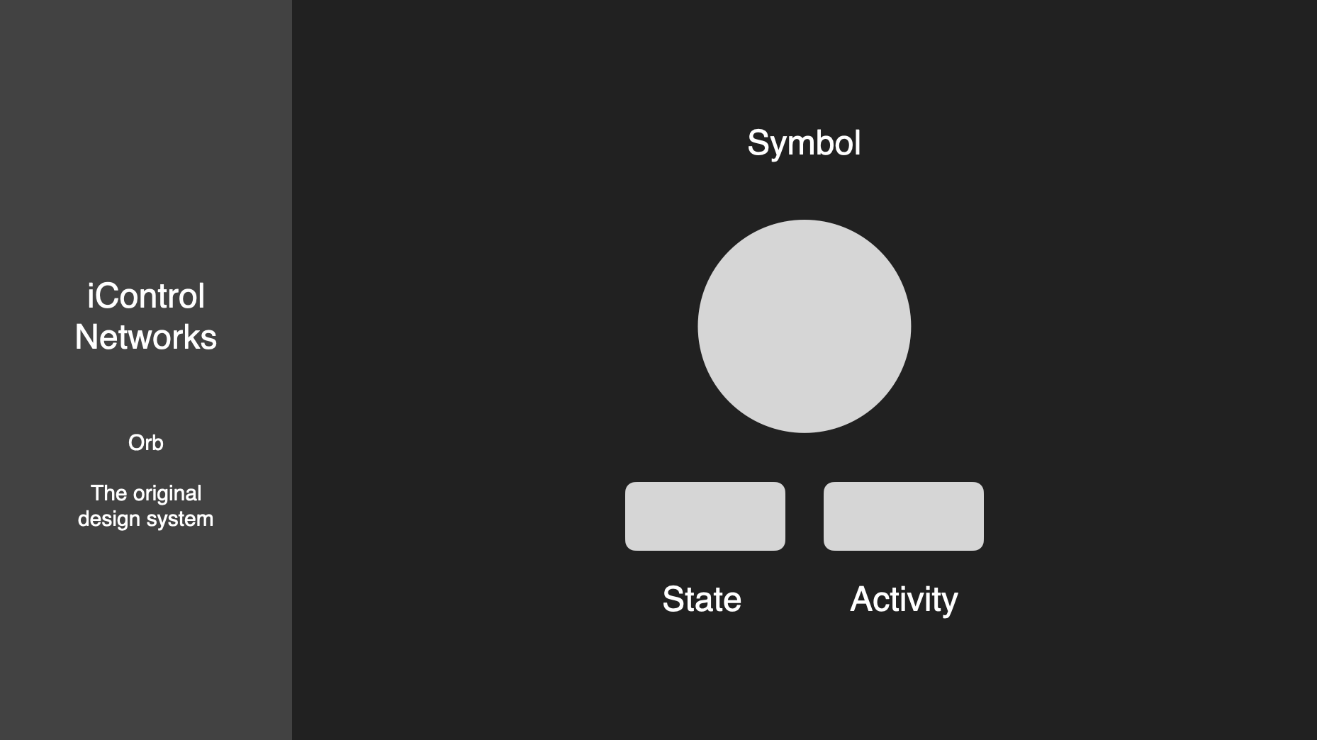
Family. Everyone can relate to that. After grounding the audience to the purpose of the company, it’s now time to discuss my team’s role. When you configure a home with a dozen sensors, a security panel, a few cameras, a couple thermostats, and a bunch of smart plugs, it becomes overwhelming trying to ascertain the state of your family and home. Instead of showing the final interface, demonstrate the design challenge.
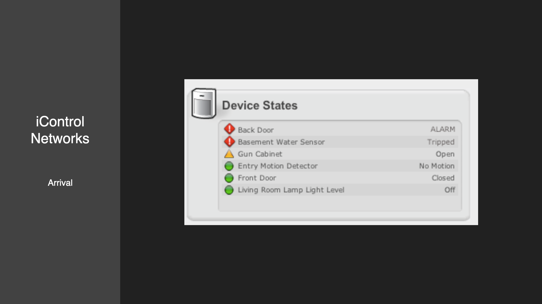
Oh that’s not ideal. Should I jump to the main event here and show the final interface? No! First explain why a lot of data is overwhelming. The hiring manager can’t appreciate the awesome final mockup without first understanding why it’s awesome. In the image above the user is forced to scan a list of devices’ icons and states, and then make an interpretation about the state of their home. That’s time-consuming and frustrating. There must be a better way. Perhaps a symbol.
One symbol to summarize all activity in the home. The problem here is there’s so much device and sensor activity that you may not be confident you fully comprehend everything after glancing at one symbol. Windows may be open, people may be tripping motion sensors while walking around, the security panel may be in a specific arm state, etc. This can be solved by including a few words to summarize the state of the home.
You can see this concept coming together after a few slides. It’s important to note that the audience has still not seen high fidelity mockups. First I dedicated time to establish context by explaining the problem, and now I’m walking you through how we solved it. By now the audience should have a clear idea of the interface’s structure and purpose. It’s time to add fidelity.
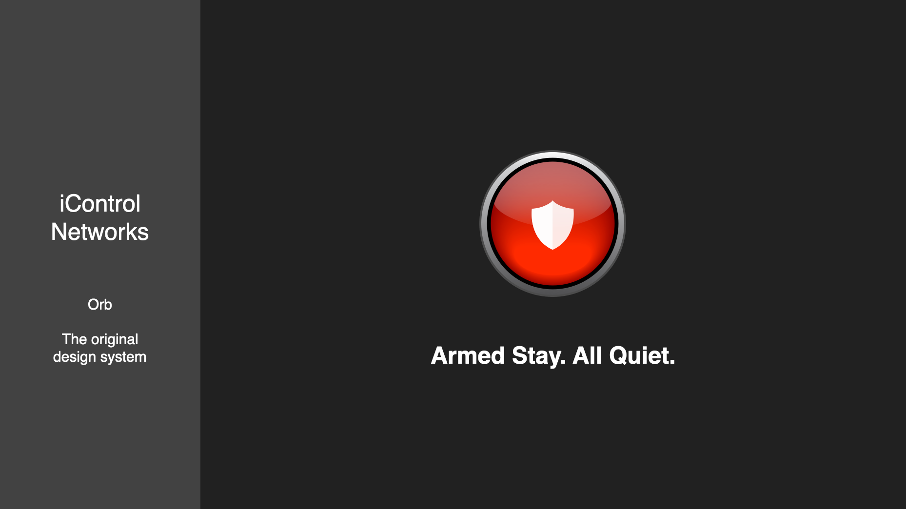
We arrived. The symbol plus a couple text snippets like “Armed Stay. All Quiet.” tells the user that the security panel is armed, no sensors are tripped, and all devices are online. Here is where you remind the audience what the problem is and explain why this solution is ideal. There’s a lot of data produced by sensors and devices. This interface allows the user to launch the app, glance at the interface, and feel confident that their family and home are safe. We started with a list of devices and their individual states, and ended with a symbol paired with a few words.
Without context mockups are just pictures. They may be beautiful or innovative, but context is what enables the hiring manager to understand what they are looking at and why. A problem/solution pair connects your mockups to a complete user experience. At the end of your presentation the hiring manager should be confident that you can solve her problems.