URL copied to clipboard
Designing and Self-Publishing a Photography Book
As an amateur photographer, I am drawn to strong lines, long shadows, and quiet, nondescript moments that become dynamic when frozen in time. My work explores how ordinary spaces can transform through composition and contrast. I focus on a black-and-white aesthetic to strip away distraction, forcing the eye into a state of focus and revealing the tension between simplicity and complexity.
Details
Why make a book?
I have been taking photos since 2002 when I bought my first digital camera: a Canon S200. In those early years, I often printed my favorite shots through iPhoto’s built-in printing service and filled my walls with them. After years of keeping my photos purely digital, I wanted to challenge myself to combine my design sensibilities with photography and create something tangible. I missed the feeling of permanence that printed work provides — something physical that can be revisited rather than uploaded and forgotten.
Inspiration
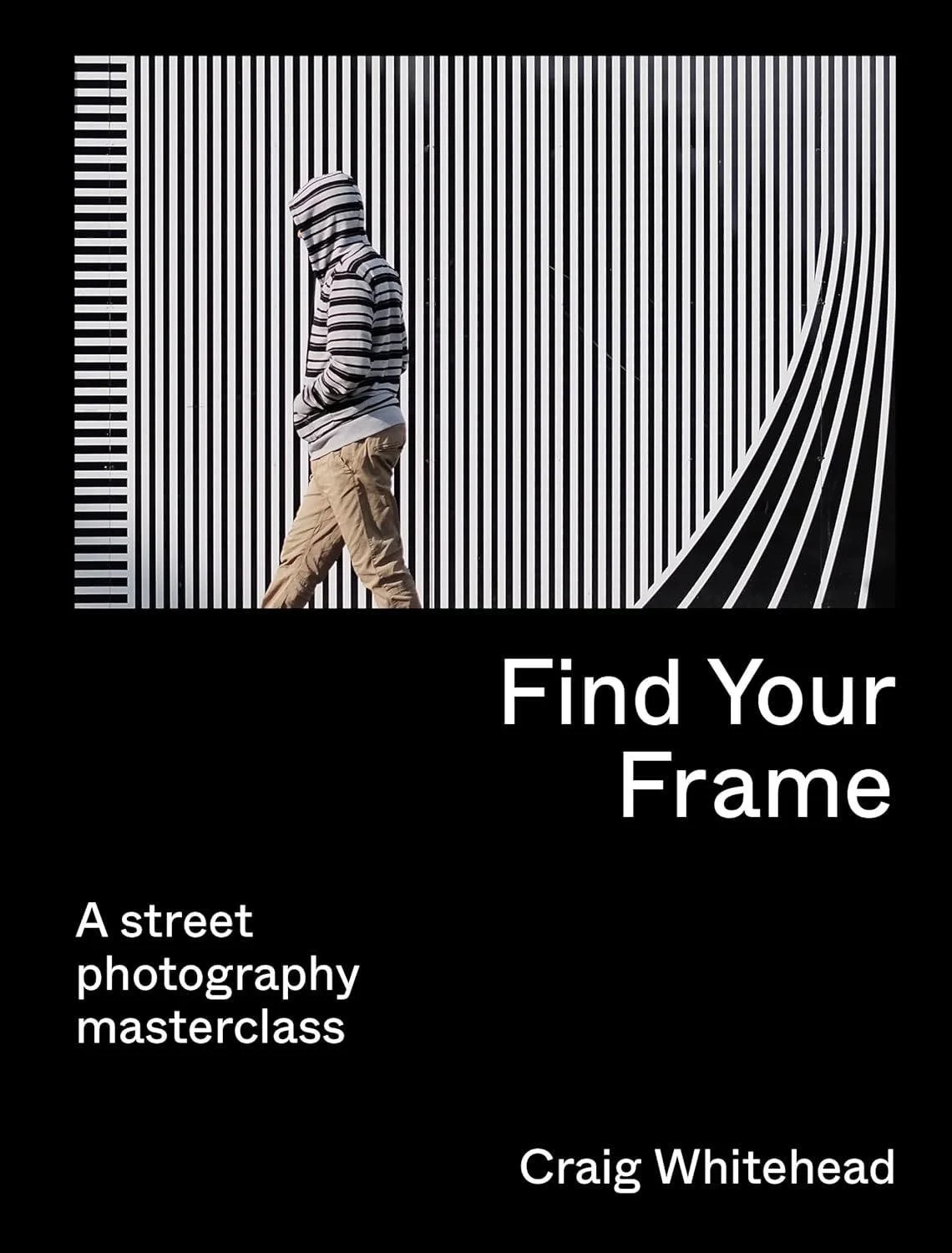
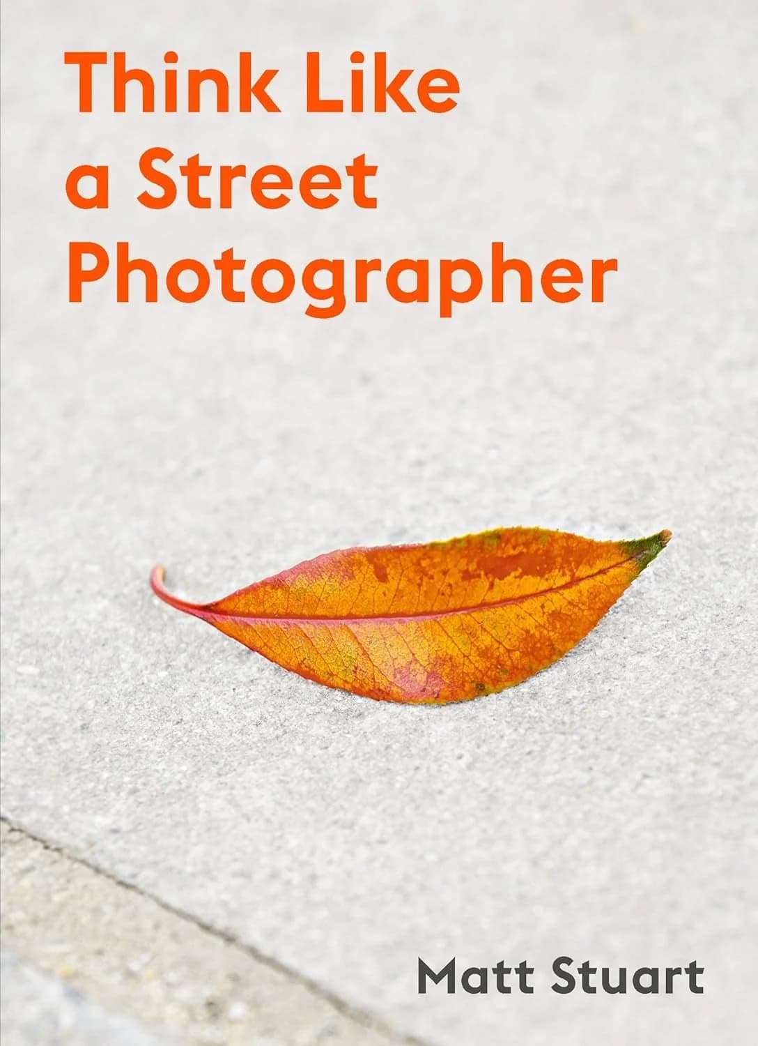
Matt Stuart’s Think Like a Street Photographer and Craig Whitehead’s Find Your Frame both shaped how I think about capturing everyday life through a lens. Each book explores how observation, timing, and intuition come together to form compelling street photography, which became the focus of my own project.
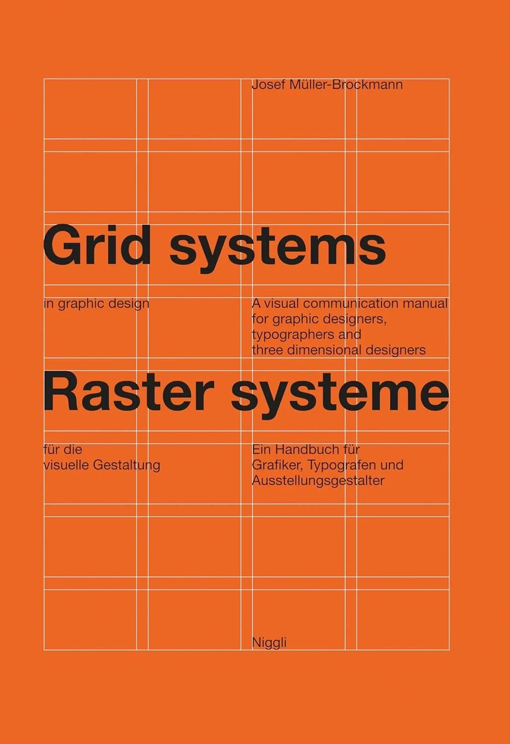
For the design of Streetline, I aimed for a Swiss-inspired aesthetic built on a strict grid and minimal visual elements. I continue to draw inspiration from Josef Müller-Brockmann’s Grid Systems in Graphic Design and chose a clean neo-grotesque typeface to reflect that discipline and precision.
I also find constant inspiration in my favorite bookstore in San Francisco, William Stout Architecture Books. I love browsing the aisles, studying cover designs, and absorbing the thoughtful details that make each book a unique expression of design.
Choosing a camera
For this project, I committed to carrying a dedicated camera and chose the Ricoh GR IIIx after extensive research. It is small, deliberate, and minimal in design, with just enough control to encourage focus without distraction. I appreciate that it allows me to create custom recipes and the shots require minimal editing. Using a dedicated camera means there are no push notifications, no quick edits, and no instant sharing — which helps me stay present and intentional while shooting.
Printing and production
There are many services designed for quick, template-based photo books, but I wanted to challenge myself and maintain full control over the design. When I noticed that fellow photographer Daniel Gynn had self-published a book, I reached out to ask about his process, including one key question: “What company did you use to print?“ That conversation led me to Mixam, a printer that offers detailed templates and incredibly patient customer support.
Working with Mixam taught me valuable production lessons. Their templates helped me understand bleed, quiet, and trim areas, and I applied those values directly in Figma to design each page.
Designing the book
I quickly learned that Figma is not ideally suited for professional print work because it cannot export in the CMYK color model required for high-quality printing. Fortunately, a plugin called Print for Figma solved most of these challenges for just twelve dollars per month. The plugin helped me set up proper print guides and export production-ready PDF files.
For the layout, I used a conservative twelve-column grid that offered both structure and flexibility.
I began by experimenting with wireframes and created eight possible layout options that allowed me to highlight each photo’s composition and balance.
Once I started applying photos to the selected layouts, the book began to take shape.
I continued refining both layout and sequence across Figma pages until I was confident the book was ready for print.
Applying my photographic style
Creating wireframes and laying out a series of photos across dozens of pages is only the beginning. The ultimate goal is to communicate photographic style and intention to the reader. How do you naturally frame your shots? What elements, angles, and perspectives do you return to again and again?
When I pick up a camera, I instinctively frame scenes using the rule of thirds. I always keep a 3×3 grid visible in my viewfinder or on the camera’s screen to help guide composition.
Below is a photo from Hawaii that demonstrates the rule of thirds. The sky perfectly fills the top third, the land fills the bottom third, and it slightly extends into the middle third, creating balance and calm.
In Essaouira, Morocco, the sky fills the top third, people move through the bottom third, and a wall occupies the middle third. My favorite detail is how the arch aligns with an intersection point, grounding the scene.
In Hakone, Japan, the composition contrasts organic and industrial forms. Nature surrounds Gora Kaden, but a metal structure juts into the frame, filling one third and creating tension within the image.
In Barcelona, people sit in the left and right thirds of the frame, separated by a vertical structure that occupies the center third. I love how balance and asymmetry coexist in this image.
At Casa Vicens in Barcelona, I stood at the base of an incredible staircase and pointed my retired Fujifilm X-T2 upward. The photo captures rhythm, depth, and motion. It remains my favorite image I’ve ever taken.
As the layout evolved, I began experimenting with spreads that played with the grid itself, placing single images across two pages. This allowed one photo to live as two connected frames. In the example below, a man enters a crosswalk and looks across the book toward parked cars.
In another spread, a man enters a train car on one page, while on the facing page, a seated figure completes the composition.
The final spread features people walking and biking outside Salesforce Tower on one side, mirrored by the intricate webbing of Salesforce Transit Center on the other. The continuation across pages creates motion and connection through structure.
Designing the cover
After finishing the interior pages, I turned my attention to the book’s exterior: the front cover, back cover, and spine. This was the part where I allowed myself to have a little fun. I’ve always loved the typeface I use on my website, so it felt natural to use it here as well. It’s Söhne by Klim Type Foundry, a modern neo-grotesque that balances precision with warmth.
My goal for the cover design was to keep it minimalist yet strong. The layout includes my name, the year, the book’s title, and my favorite photo from the collection. The name Streetline came to me while brainstorming aloud: “street photography, lines, leading lines, street, lines… Streetline. Boom.” I plan to continue using this structure for future books to create a consistent visual identity.
How should the book feel when opened?
I spent an inordinate amount of time thinking about what the reader should experience upon opening the book. Should it begin with a large photo? Should “Streetline” appear again? I wanted this moment to feel intentional and memorable.
For years, I followed Marcin Wichary’s journey as he created his book Shift Happens. His newsletter was both insightful and entertaining, and I often revisited it for inspiration. I remembered one entry where Marcin described a booklet he designed for an event at the Computer History Museum. By placing the same content in identical positions on consecutive pages, he created a fascinating visual rhythm as the book opened.
Inspired by that idea, I decided the best opening for Streetline would be silence. Two blank pages. I wanted the reader to feel a sense of curiosity and anticipation — a quiet invitation to continue turning pages. Adding blank pages increased printing costs slightly, but the experience was worth it.
Foreword
Before showing any photographs, I chose to delay the reader’s experience a bit longer by including a short foreword that explains the design and purpose of the book. In it, I describe why I chose the Ricoh GR IIIx, outline a few design details, and express gratitude to several people who supported me. I also dedicated the book to my late father, Steven Klein, whose passion for books about art continues to guide my creativity and curiosity.
Bringing the book to life
Once all of the pages, along with the front cover, back cover, and spine were complete, I exported the final PDFs using the Print for Figma plugin and uploaded them to mixam.com.
Mixam includes a preview feature that simulates flipping through the book with a page-turning animation. It was especially helpful for visualizing how photos would interact with the book’s center and how each spread would flow from one page to the next.
Where two pages meet
One topic I found especially important to understand was how to ensure photos retain their detail when spread across two pages. When an image crosses the center of the book, I repeat a small amount of data near the hinge to help preserve alignment once the paper is trimmed and bound. For example, with this crosswalk photo, my goal was to have the lines match perfectly across both pages after production.
This method worked well in Mixam’s digital rendering feature but was inconsistent in the printed book. Some photos aligned perfectly while others were slightly off. It is a small detail, but one I want to perfect in future projects. Learning how to anticipate and design for these production nuances has been one of the most rewarding parts of this process.
Black vs. rich black
One lesson I unfortunately learned the hard way was the difference between standard black and rich black. In Figma, I assumed that setting the text color to black and exporting with the Print for Figma plugin would produce solid black text in print. I was wrong. Thoroughly wrong. If you have experience with printing, you are probably shaking your head right now.
If you look closely, you can see that the black text in the printed book actually contains a slight tint of color. Infuriating.
As it turns out, Mixam provides a helpful support document explaining the difference between standard black and rich black, including how ghosting can occur when the ink mix isn’t configured properly. If only I had known.
Options, options, options
For the size, I wanted the book to feel like holding a stack of typical printer paper, so I chose A4. The rest of the production options were somewhat instinctive, based on Mixam’s descriptions. I selected thick paper to make the book feel sturdy and substantial.
Production specs:
- Size: A4 (8.3” × 11.7”)
- Paper type: Satin
- Paper weight: 100lb
- Binding: Perfect (PUR)
- Number of pages: 56
- Cover paper type: Satin
- Cover paper weight: 130lb
- Cover printing: Grayscale
- Cover finish: Matte anti-scruff
Each book costs $15.07 to print, and I decided to list them for $24. $25 sounded too high. That is genuinely how I landed on the price. After paying $4 for USPS Media Mail and $3 for a padded envelope, my profit per book is $1.93.
That isn’t a lot of money, but profit was never the goal. Breaking even is perfectly fine with me. What matters most is the joy I feel knowing that people have my book in their homes. As of March 2025, I am proud to say I have sold 31 copies.
Promoting Streetline
Streetline is the first of what I hope will be many creative products. My next goal is to begin selling prints that I can produce from home. To support this, I created a new page on my website simply titled Store, where all products are sold using Stripe Payment Links. I highly recommend Stripe as an easy and elegant way to accept payments and gather customer data.
To promote Streetline, I shared posts on my Instagram feed and story. While exploring Instagram’s settings, I discovered that anyone can set up an Instagram Store, which seemed like a fun challenge to try.
I also announced the book on Threads, which received a few interactions, but I was most surprised by the response on LinkedIn. Several acquaintances and former coworkers purchased copies after seeing the post, proving that professional networks can also support creative pursuits.
Volume II
I have a few goals for this year’s book, which has officially become an annual tradition. I want to be more adventurous with grid selections and explore new ways to structure the pages. I also plan to use a more robust tool for production — it might be time to return to Adobe with either Illustrator or InDesign.
The most exciting challenge will be to tell a cohesive story through photos. Streetline was intentionally spontaneous, with each page standing alone. For the next volume, I want to weave a single narrative that connects the entire book.
In addition to exploring layouts and tools, I plan to expand my camera selection. Since I now work at Meta, I want to experiment with the Ray-Ban Meta smart glasses, which offer a distinctive perspective that includes the photographer’s hands in the frame.
As an avid Apple product collector, I also want to include a few photos taken with a true Apple camera: the QuickTake 150. With its modest 640×480 resolution, I will need to get creative to make the most of it.
The Leica Sofort 2 has been another delightful addition to my collection. I brought it to a cousin ski weekend in Utah, printed photos throughout the trip, and spread them across a table each night. By the end of the weekend, the table was completely covered in prints, turning photography into part of the fun.
Lastly, I recently picked up a nostalgic camera to share in the kids’ excitement for retro photography: the Canon PowerShot SD1100. Its photos feel timeless and familiar, like college memories revisited.
Get blendin’
When it came time to promote the book, I wanted to go beyond a simple Figma export. I decided it was time to relearn 3D software. The last time I touched a 3D app was back in summer school in 1994, when I learned Strata Studio Pro and Bryce 3D. This time, I chose Blender, which I had heard was both approachable and powerful. After dozens of ChatGPT prompts and a few calls with a coworker, I finally managed to attach PNGs to a rectangular prism. I placed the book above a plane, added a light source, and positioned a camera just right.
Then I got hooked. The experience reminded me of my days using Macromedia Flash, so I began experimenting with keyframes to make the book spin and levitate. I love how the object’s shadow shifts as it moves — a small but satisfying detail that brought the scene to life.
Thank you
Alas, we have reached the end. If you have any questions, please feel free to reach out. I would love to share what I learned along the way. Designing, printing, and ultimately selling copies of Streetline has been one of the most rewarding experiences of my design career. It was the first time I fully designed and created something for myself and my loved ones.
Thank you for joining me on this journey, and don’t forget to buy a book.
Case studies
- Leading AI-First Accounting
- Leading an AI-First Mobile Vision
- Designing and Self-Publishing a Photography Book
- Leading the Einstein Copilot Launch
- Leading the Mobile Builder Team
- Leading the Salesforce Mobile App Platform Redesign