This transformation is exemplified by the Rabbit r1, an innovative personal AI assistant. Its Large Action Model (LAM), a type of “universal controller for apps,” not only learns your preferences, but performs actions aligned with them: anticipating your needs and seamlessly orchestrating tasks across various apps. Imagine planning a weekend getaway. Once trained on your preferences, the r1 could manage everything—from flights and hotels to restaurant reservations and activity bookings—crafting a seamless tapestry of experiences rather than a disjointed series of app interactions. Or train it to streamline paying bills, avoiding the need for dealing with a phone tree or unresponsive online forms.
It’s fair to believe that a possible future of interacting with computers is driven more by natural language queries that can actually achieve results instead of requiring users to click or tap dozens of times. The question I have is how will these systems convey complex outputs and confirmations? I strongly believe a role for user experience designers in this future is to ensure that important information like costs, flight schedules, hotel rooms, and other purchases are communicated to users with clarity, familiarity, and branding.
For example, if I want to book a suite at the Four Seasons in Philadelphia between May 3 and May 6 with a massage on Saturday at 2pm and a late checkout, how will an AI-based interface express that information for me to review before confirming? As of today it could look something like this:
Item
Selection
Hotel
Four Seasons
City
Philadelphia, PA
Room type
Suite
Dates
Friday, May 3 - Monday, May 6
Massage
Saturday, May 4 at 2:00PM
Late checkout
Monday, May 6 at 4:00PM
This is certainly an efficient way to convey a lot of information, but it’s awfully drab considering I am trying to book a vacation. Today when using the Four Seasons website I get photos of the room and hotel, information about the spa, rates for different sets of days, options to upgrade, the ability to use loyalty points, etc. I think the convenience is welcome, but I am losing a lot of the experience as a result.
Fortunately this can also be solved with AI. We must seek to build interfaces that can convey complexity in a way that humans actually enjoy. AI should be expected to render beautiful, enticing pages instantly when given a set of data. Querying a hotel’s website, retrieving options, and displaying results in a bulleted list is not the end of the AI’s task. Imagine if the apps we used today just displayed API calls or giant blocks of text. As designers we bring elements like empathy, elegance, tone, and consistency to ensure users can complete tasks. The same applies to a world where we interact with AI instead of apps.
The future is not text; it’s everything the user needs to see in the moment to confidently make a decision.
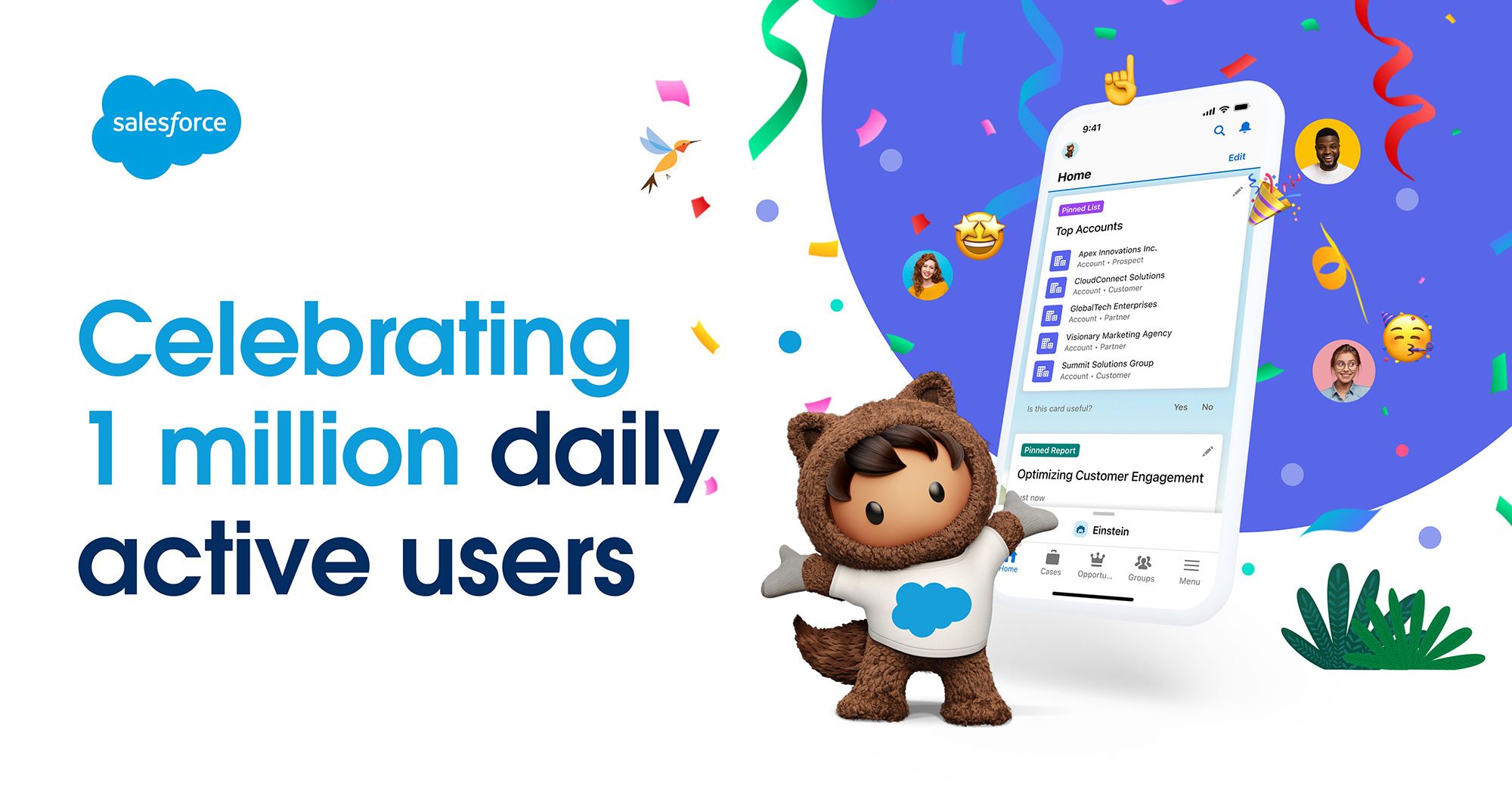
When Sheena Lee and I set out to redesign the Salesforce Mobile App in 2018, we aimed to design and build a consumer-grade enterprise app. We tackled the information architecture, color scheme, typography, haptics, and, of course, plenty of animation. To see it thriving today after exceeding 1 MILLION daily active users is so incredibly rewarding. Thank you to the small army of engineers, researchers, accessibility experts, and marketers who helped make this app become what it is today. And a massive thank you to Chelsea Hassler, Shepherd Yang, and Abby Sigler for continuing to make this app an ongoing success.
I first discovered Marcin Wichary from his Medium posts. As a Medium employee he wrote extensively about a subject I so rarely encounter: details. His style is to go very deep on a subject and make it exciting. This includes software, typography, and even bridges. Here are a few notable posts written by Marcin that inspired me to become a better designer and put more effort into details:
A Bridge Too Far where he writes about running across every New York City bridge in a single day.
I was thrilled to hear he was going to write a book about keyboards. Knowing his ability to hunt down the history behind small decisions that impact us today, I knew this book would be special. I also believed his book would be an opportunity to learn about a tool I have used every day since my parents purchased a Mac LC in 1990.
One could assume the story ends here. Marcin wrote a book, I purchased it, and now it’s in my home. This is not the case. Not even close.
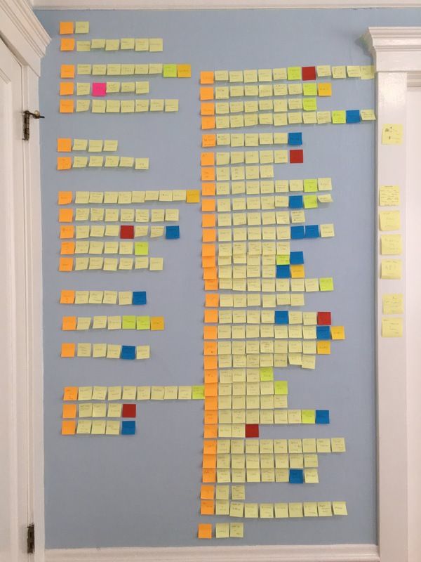
Marcin started a newsletter in 2017 and wrote detailed stories about writing chapters, rewriting chapters, buying old keyboards on eBay, and discovering particularly unusual keyboards. A post would conclude with a photo of the keyboard he was using to write the post with. At first I thought this was a goofy addition but I grew to love it. Every post felt unique. I would read knowing that the conclusion would be a photo of a whacky keyboard I had never seen before. Along with his stories about traveling to museums and interviewing retired engineers, the occasional photo of a wall covered in post-it notes tracking the book’s progress was also shared. Clearly, this was a daunting task.
The book became more than a book as the years passed. It was an odyssey: an unending journey filled with quests, anecdotes, surprises, setbacks, and celebrations. Finally, in 2023, the Kickstarter campaign launched. Marcin got incredible press after the launch. I watched as the dollar amount climbed hour by hour until it was fully backed and the campaign’s extras started to unlock. With this excitement also came a small sense of dread. Was the journey coming to end? The books would eventually materialize and knowing Marcin’s style there would be an onrush of posts about finalizing details, printing, packaging, and shipping books. But then what?
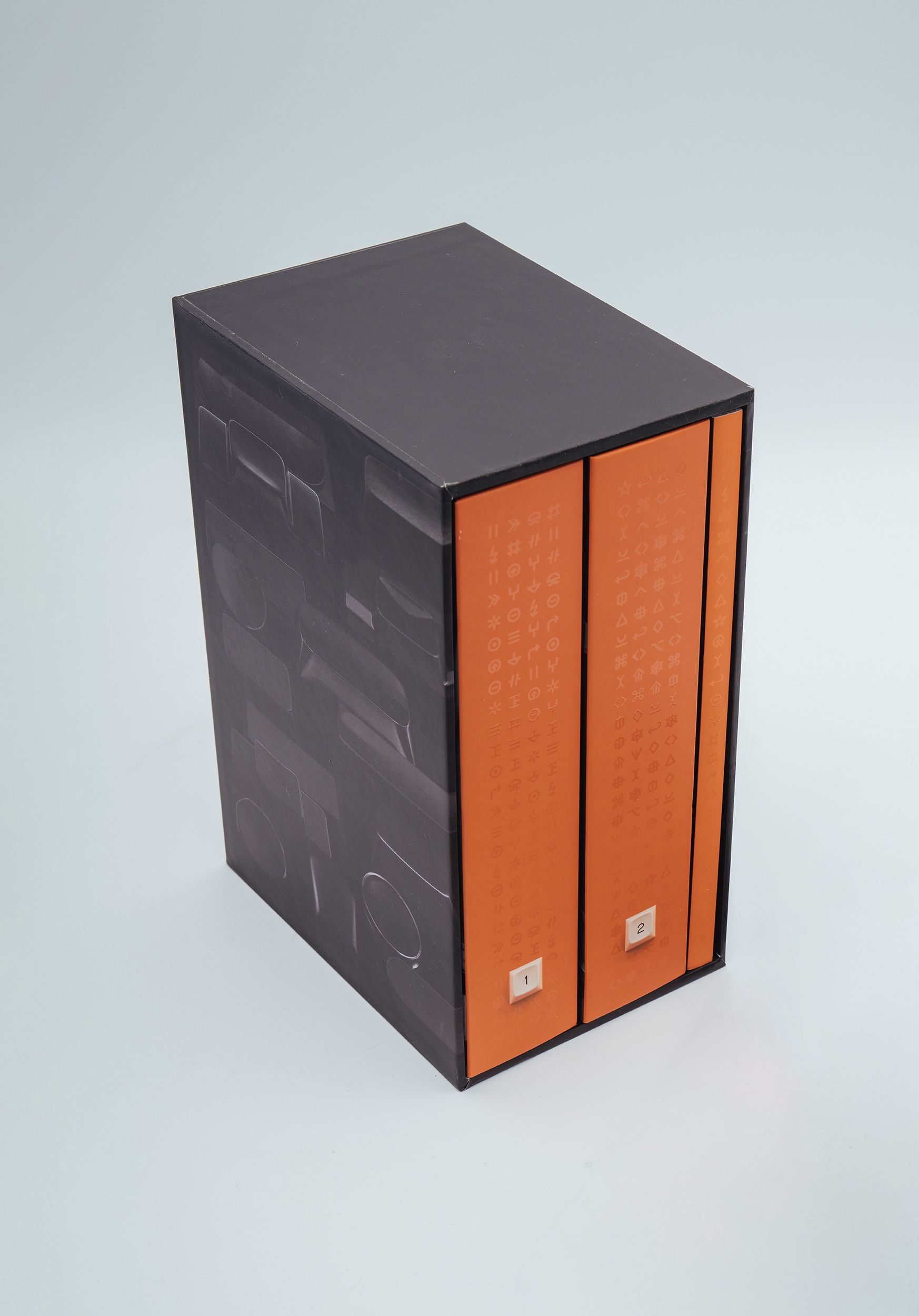
The books (Marcin ended up releasing the book as two volumes) are now in my home. I see them every day since they reside next to a few other special books near my desk like Kenya Hara’s Designing Design and Josef Müller-Brockmann’s The Graphic
Artist and His Design Problems. As I feared the journey ended. Marcin found a way to continue sending updates by sharing customers’ photos of new, crisp books in homes. For me the books patiently wait for a childless vacation where I can dig in. My two year old daughter occasionally asks, “Can I look at the keyboards?” We flip through one of the books until she gets bored and asks to look at “Massimo” meaning Gary Hustwit’s Vignelli: Photographs.
I’m sure Marcin is relieved to end this eight year adventure, but I have a feeling he’s not done.
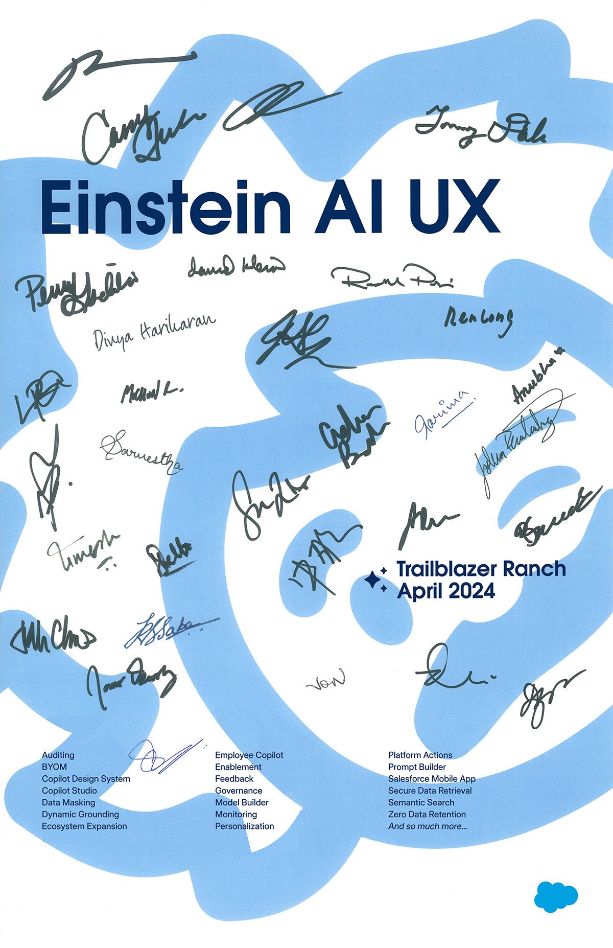
In 1982 when Apple was developing the original Macintosh, Steve Jobs had each team member’s signature engraved on the tool that molded the computer’s plastic case.1 This ensured that every Mac included the team’s signatures on the inside. It’s a bit tricky to accomplish this with software, but l became inspired after seeing Figma employees sign a poster for their plugins feature launch.
I collaborated with Esther Linky and Dana Jones to design a poster, and invited designers on Al Cloud and Experience Services to sign their names to commemorate the launch of Salesforce Einstein Copilot. It was a tremendous achievement to unite artificial intelligence and CRM data with trust and privacy as core tenets, and I’m so proud of the team.
Arun Venkatesan, writing about camera gear on his blog, helps me reflect on my own camera journey:
To the novice me, believing that gear mattered and accumulating it helped me come to my own conclusion. Along the way I tried a wide variety of cameras — old, new, cheap, expensive, film, digital, fixed lens, interchangeable lens, etc. This variety of gear helped me build up of a wide library of skills. It’s with these skills under my belt that I feel confident with any gear. Yes, I’m happy with my current multi-lens setup, professional lighting, tripods, stands, etc. But, I’d also be happy with just one camera again.
Camera purchasing conversations generally include a few variables like cost, portability, functionality, etc. Over the years I discovered a missing variable when deciding what camera to purchase or take on a trip: my own personality. What camera meshes with the way I approach shooting?
For me portability is important, but I have also learned that I thoroughly enjoy access to dials. My Fujifilm X-T4 has dials for shutter speed, aperture, and ISO. No menus or unlabeled dials are needed to make adjustments. However, I have also learned that friends don’t enjoy waiting for me to swap lenses during a fun
moment.
Similar to Arun, experimenting was necessary. Purchasing the best/popular/cool camera won’t guarantee good photos (trust me), nor will it guarantee fun. If photography is a hobby and not a job, fun is a crucial factor.
Arun also discusses developing a personal style:
It’s with the Q that I started to discover my photographic style. I had a vision not just for how I wanted to shoot a photographs, but also how I wanted to edit them. I transitioned from using other people’s presets to crafting my own.
For years I chased perfection in photography. Perfect lines, colors, angles, scenes, etc. Eventually I discovered that imperfection builds character, tension, and intrigue. Give yourself the freedom to make mistakes because you don’t know which mistakes actually become strengths.
WWDC 2024 is approaching, and we all assume Apple will share how AI will impact their hardware and software. Expectations are incredibly high. I thought it would be a fun exercise to think through a variety of approaches that Apple can take based on what we have seen from Google, Microsoft, OpenAI, and others.
It’s important to note that while Apple may be behind in incorporating AI into its various operating systems, they have used machine learning for several years in a few crucial areas. For example, detecting faces in photos in iOS 11 and using a transformer to improve autocorrect while typing in iOS 17.
The big questions for the next phase of Apple’s AI efforts are:
What should AI do for users?
What should AI feel like for users?
How can developers leverage Apple-provided AI?
Option 1: A Better Siri
Similar to Apple claiming autocorrect would be more reliable in iOS 17 by using a transformer, Apple could similarly claim that Siri is now better without making any changes to its interface in any operating system. Users know how to invoke Siri, they have a decent idea of what its capabilities are, and expectations are low. If Apple can increase accuracy and consistently return results better than “here’s what I found on the web,” this could be a win. In this case Siri would also become conversational by allowing users to ask follow-up questions which is now expected behavior based on competing products like ChatGPT.
The Better Siri approach is extremely risky though. Apple will be perceived as behind for another year as Google and Microsoft continue to expand their AI offerings with new interfaces and capabilities while Apple’s AI will be trapped inside of Siri. Google already released Gemini as a standalone product, AI-powered search results, new generative text features in Google Workspace, and a growing list of AI features specific to Android. Microsoft, thanks to its partnership with OpenAI, is also moving extremely fast with an AI-powered Bing, Copilot in Windows, and Copilot in Office (Microsoft 365).
This approach could expand what users can do with Siri, but I’m afraid without substantial changes to the interface it will not change how users feel about using Siri. It also may not get developers excited to reinvest in SiriKit if their customers continue to have a generally negative outlook on Siri.
Option 2: A New Destination
Siri has always existed on the periphery. You invoke it, get a snippet of information (or quickly take action), and leave. Users do not stay in Siri long enough to be productive, develop ideas, or complete complex tasks. This can certainly change. Siri can transform into a destination with permanence. Perhaps Apple will release a new Siri app users can launch, interact with for more than a few seconds, and return to at a later time to continue working.
A more likely direction for an AI destination is to replace a core home screen interaction like swiping left to right to access a more advanced Siri interface (and remove the redundant widget screen). This would feel more connected to the OS as a part of SpringBoard vs. an app that can be moved or deleted.
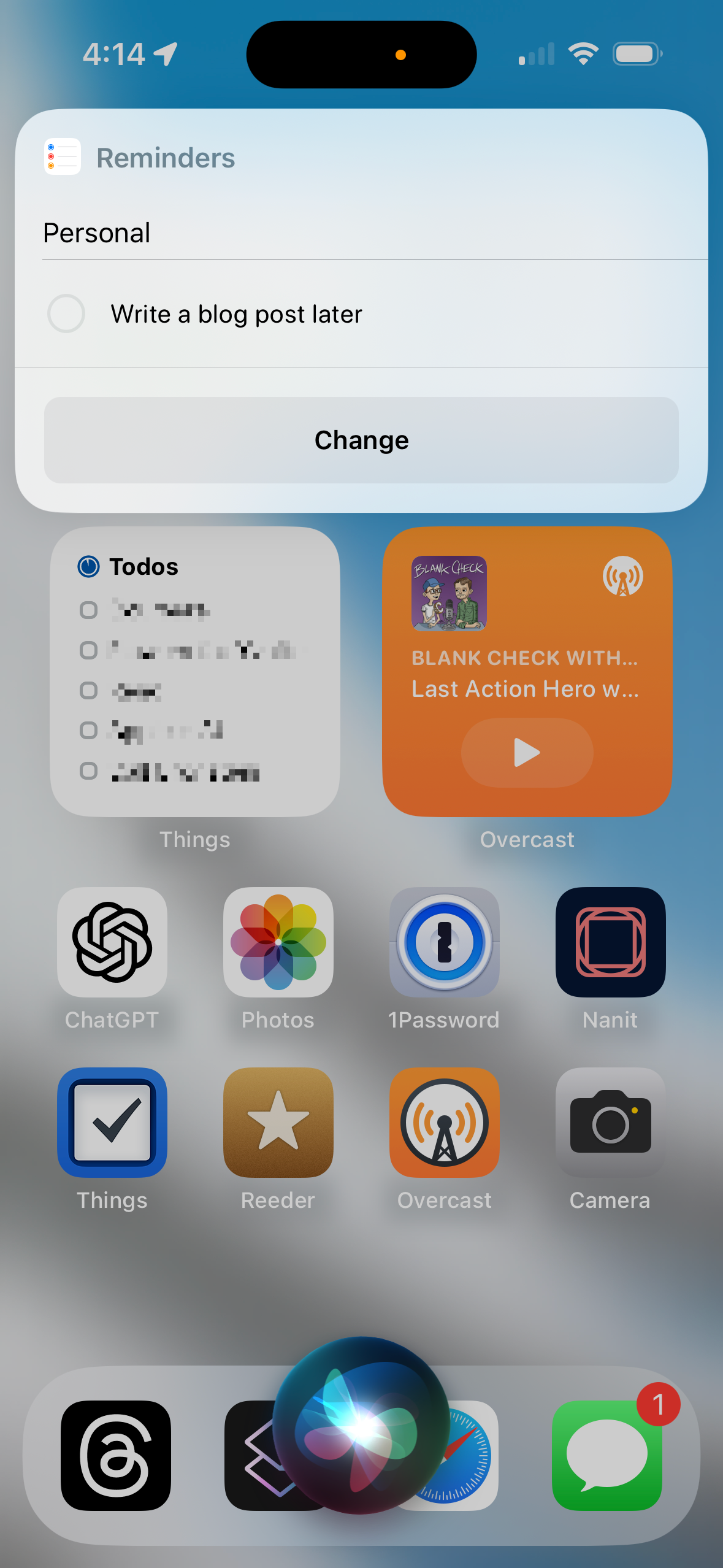
Would users see this new interface if they said “Siri” or held down the power button? Siri already has the ability to complete quick tasks, ask clarifying questions, and show confirmations without taking over the screen. Moving from the temporary, partial screen state to a full screen state seems like a step backwards. I like how Siri currently only covers the necessary pixels to accomplish a task. For example, today I can say “Siri remind me to write a blog post later” and I only see the temporary Siri animation followed by a Reminders confirmation component. What would be gained by going full screen here?
If Apple did release a Siri app or a more permanent experience what would it actually do? Would it feel conversational? Would it allow you to view prior queries, actions, and confirmations? Would developers have the ability to integrate with it? Would it preemptively collect and display information you didn’t know you needed to see? Surfacing helpful information already exists in several ways. For example, when you enter the search interface on iOS “Recent Searches” may appear, or when you park a car that was using CarPlay a notification appears to remind you that your parking location was stored. Do we need more of this in a centralized location? Also, what would an AI destination look like on macOS and watchOS? Would macOS have a new app in the dock by default in the next major release? Clearly many questions need answering, and a designer could explore concepts forever. However, I do not believe a destination is the direction Apple will take for AI because it
should be accessible everywhere; not confined.
Apple does occasionally release new apps, but they always have a very clear purpose. Journal is for documenting your life. Clips is for making fun videos. Podcasts, Music, Books, etc. A Siri app is for… talking to Apple’s AI? Why would I use this app over ChatGPT? Perhaps Apple’s conversational, LLM-powered app allows me to interact with the vast amount of personal data Apple has access to: calendars, contacts, email, browsing history, iMessages, photos, etc. Maybe GreplinCue is coming back!
Option 3: A New Layer
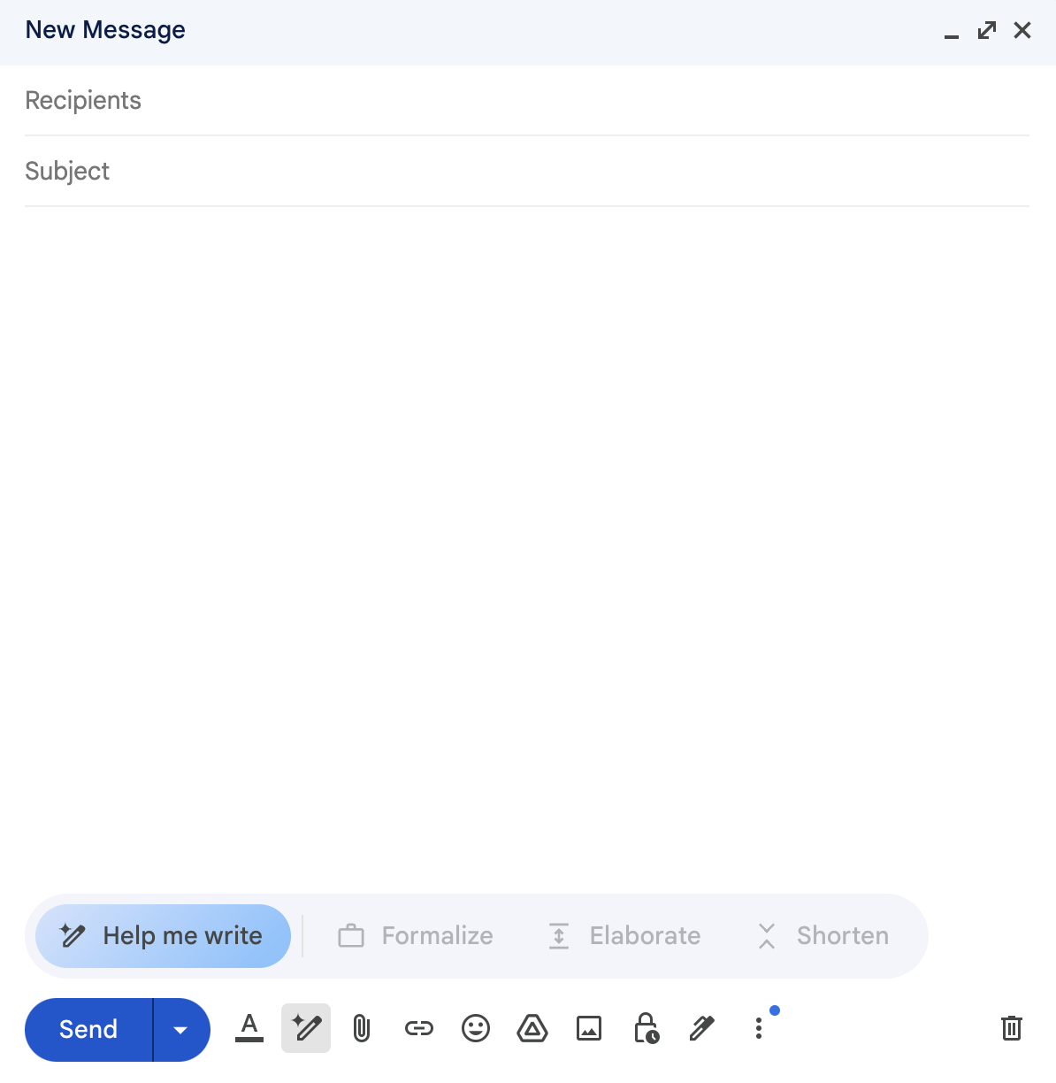
A theme across the majority of recently launched AI products is generative text. For example in Gmail I can ask AI to help me draft an email. Once I have a draft I can further augment it using AI by selecting options like “formalize,” “elaborate,” and “shorten.” I assume more freeform options like “make it fun” are coming. We’ve already seen this in Humane’s demo video, What is Ai Pin. In the video Bethany Bongiorno, Humane’s cofounder, asks AI to make her message “sound like Gen Z” (oy). Oh and if you own a Pixel 8 or Galaxy S24 you can use Magic Compose to draft text messages on device thanks to Gemini Nano. Yes, this is going to all be confusing for a few years. That is why we need Apple to package it in a consumable manner.
I believe generating text is both feasible and the key to Apple catching up to Google and Microsoft on the consumer side. Wherever the user has a blinking cursor users should be able to invoke Siri and speak a few words to receive help with writing text. This addresses the question of what users can do with Apple’s AI, and it will feel exciting because AI will now be available everywhere vs. stuck in an app or website. Instead of launching the ChatGPT app, composing a few prompts to achieve a satisfying result, copying text, launching another app, and then finally pasting text, users can interact with AI instantly. This will also introduce AI in a consumer-friendly way to potentially hundreds of millions of people.
For developers I assume there will be an opportunity to offer up data or functionality that Siri can access as a way to contribute to users’ queries. For example, today in ChatGPT if I ask, “Can you get URLs to Wikipedia for each Mac that launched in 1995,” I do not actually get a list of URLs. Instead I get a list of Macs that launched in 1995 (the Power Mac 9500 and PowerBook 5300) and a link to “List of Mac models” on Wikipedia which includes all models. I consider this a failure. If I’m in iOS and I have the Wikipedia app installed, perhaps there will be a way to reliably respond to this query using an LLM-powered Siri.
A more exciting scenario (and a bit more difficult to believe is possible) is accomplishing complex tasks using Siri. Imagine I launch Things, my favorite tasks app, with the goal of creating tasks to prepare for all of tomorrow’s meetings. I say, “Siri make a task for each event I have tomorrow.” Things can now ingest my calendar data, make an array of events I have scheduled tomorrow, and then create a list of tasks populated by the event array. This is now starting to sound like a supercharged Spotlight in addition to providing generative text.
The New Layer direction is sound because it expands Siri’s capabilities for both users and developers without making large changes to each OS. Users constantly see blinking cursors, they know how to invoke Siri, and with the power of an LLM they can (hopefully) speak naturally with satisfying results. The New Layer meets users where they are: in creation mode. While actively writing I will have a way to ask for help. For the interface I assume there will be both a confirmation step to insert the new text, and a way to augment it with an additional command similar to Gmail’s functionality discussed above.
The Siri Brand
People who think Apple will rebrand Siri have not clearly studied Apple’s history, nor have they worked in branding before. The cost to rebrand is exorbitant and will cause confusion for years. Imagine Apple supporting two words to invoke an assistant! Eventually they would remove one? Or imagine announcing “Siri” stops working when new versions of iOS, watchOS, macOS, tvOS, and visionOS launch later this year and users are expected to immediately learn the new word.
I agree with the general consensus that the brand is not particularly well-received, but it is strong and familiar. My guess is people hear “Siri” and think of timers, a confusing voice they occasionally hear from a watch or phone, or a thing Apple makes that they tried many, many years ago. They do not think intelligent, reliable, fun, helpful, etc. I asked a few people who are not in tech “What do you think of when I say the word ‘Siri?’” Here are their responses:
40s, female, marketing executive: “I think of something that does not work.”
70s, female, interior designer: “Annoying. I do not like it.”
Teens, female, high school student: “My phone and Apple.”
Of course Apple has rebranded a few products so there is precedent: Apple Computer became Apple Inc. (2007), Mac OS X became macOS (2016), iTunes became Music (2019), iTools became .Mac (2002) which became MobileMe (2008) which became iCloud (2011), and iPhoto became Photos (2015). Apple is a different company that it was even 5 years ago when Music launched. As a result a rebrand seems very difficult to imagine. A more likely change is the introduction of a paid tier of Siri like Siri+. Perhaps for $5 per month you gain access to an LLM-powered version of Siri across your devices.
My Dream for Apple
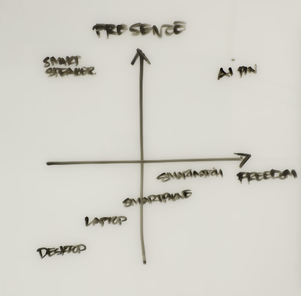
Imran Chaudhri, Humane’s other cofounder, explains his hypothesis for the future of compute in Ai Pin Explained. He believes presence and freedom are key themes. In other words, users should have access to infinite data and functionality without constantly looking at a screen. I think this is a possibility, but not necessarily in this decade. Another possibility is we become even more dependent on our phones and computers because of AI.
If we imagine a world with infinite compute, I can have a personalized AI that is trained on all of my data. Everything. Every document I’ve written, message I’ve sent, photo I’ve taken, etc. Only Google, Apple, and maybe Meta can achieve this through their operating systems, apps, and services that we love or heavily rely on. Imagine instead of interacting with Siri I could interact with myself. Based on everything I’ve ever done with a computer, what would I write or click on next? Perhaps creating a Persona with the Vision Pro is step 1, and step 10 is imbuing my Persona with an LLM that is… me.
For years I have felt a tension across iOS, macOS, and watchOS between simple, subtle interfaces and vibrant, complex interfaces. We have beautiful, high pixel density screens surrounding us all day every day. Should they be used to their full potential through the cramming of widgets, windows, and complications? Or should they exist on the periphery, whispering a minimal amount of data?
Since dark mode first appeared in macOS Mojave in 2018 and iOS 13 in 2019 I was hooked. I prioritized apps that supported dark mode, customized dock and app icons to be dark, and even used plugins to make some web apps dark. Emphasizing blacks and grays pushed me to become a computer minimalist, reducing the amount of toolbars and icons to let content stand out. Who needs icons and buttons when one can just memorize keyboard commands anyway. One could argue I took this a bit far (as I usually do with computing trends).
With iOS this dark mode minimalism manifested by only using 1 screen of apps, and reducing the number of app icons on the Home Screen to just 8 alongside small calendar and task widgets leaving plenty of unused space. My wallpaper and lock screen were either all black are a subtle gradient from dark gray to black depending on my mood. On macOS I meticulously chose which apps earned a place in the dock to ensure it was always as thin as possible. My wallpaper was randomly selected by Unsplash with an emphasis on dark, minimalist, architectural photos.
Over time I felt like beauty and joy were missing from my digital life. What if I allowed a spot of color in a few places? What if I… turned off dark mode? Years had passed since I even tried light mode. I flipped the switch on my iPhone and was instantly reminded of how computers are supposed to look. Light! I felt reconnected and rejuvenated. My devices felt fun again. iOS and macOS were reborn.
The one device where I continued to struggle was the Apple Watch. Since its screen is always on it constantly draws attention. My kids’ eyes find their way to it for no reason while talking or plying. When weighing the interface’s beauty vs. its ability to distract, I ultimately believe its vibrancy and complexity should be reduced. The watch should not shout “look at me!” It should exist on the periphery. It should be patient.
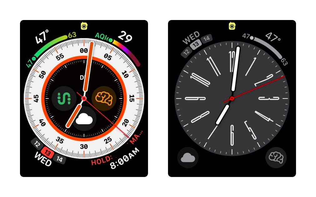
When I access the watch I should not be distracted from my primary thought process. I need to quickly and subconsciously glance, ascertain the information I am seeking, and gracefully return to be present with my task or conversation. As a result I transitioned from Modular Ultra and Wayfinder to Metropolitan. It’s elegant, and I find the elongated clock digits align with my enjoyment of crisp graphic design. It’s the face I think Massimo and Lella Vignelli would choose.
Earlier this month Remy and I traveled to Park City for the annual Binswanger Cousins event. The tradition started with her grandparents twelve years ago (and coincidentally one of the trips is where my sister in law met her husband). An important thing to know about the Binswangers is they take partying very seriously. Costumes, games, ceremonies, and plenty of laughter.
Notably the group held a small pseudo-religious service to celebrate the 2 year anniversary of my horrific accident on that mountain. I shattered my tibial plateau while skiing down Big Stick with a 10 week old baby expecting me to be a functioning parent. We all went to the approximate spot of where I fell and secretly hung up a token on a tree. I can’t wait to revisit it next year.
As the photography enthusiast I took on the responsibility of documenting the shenanigans using my dinner party camera: the Leica Sofort 2. I learned a few things about the Sofort after using it for several hours:
People love seeing printed photos in real time. Holding them, photographing them, rearranging them, etc. It was a huge hit.
The camera has very limited storage, and you cannot take photos when the storage is full. I found myself constantly sneaking away from the festivities to manually transfer photos to my iPhone so I could delete them from the Sofort. One way to remedy this is to insert a micro SD card to provide additional storage. This gives you a lot more flexibility (and allows you to enjoy the fun).
Overall it felt unreliable. Photos would occasionally appear blurry and I was unable to figure a cause or pattern.
It’s slow. Operating it, transferring photos, using the menu, etc. Slow.
The next step is figuring out how to make a collage with all the tiny prints.
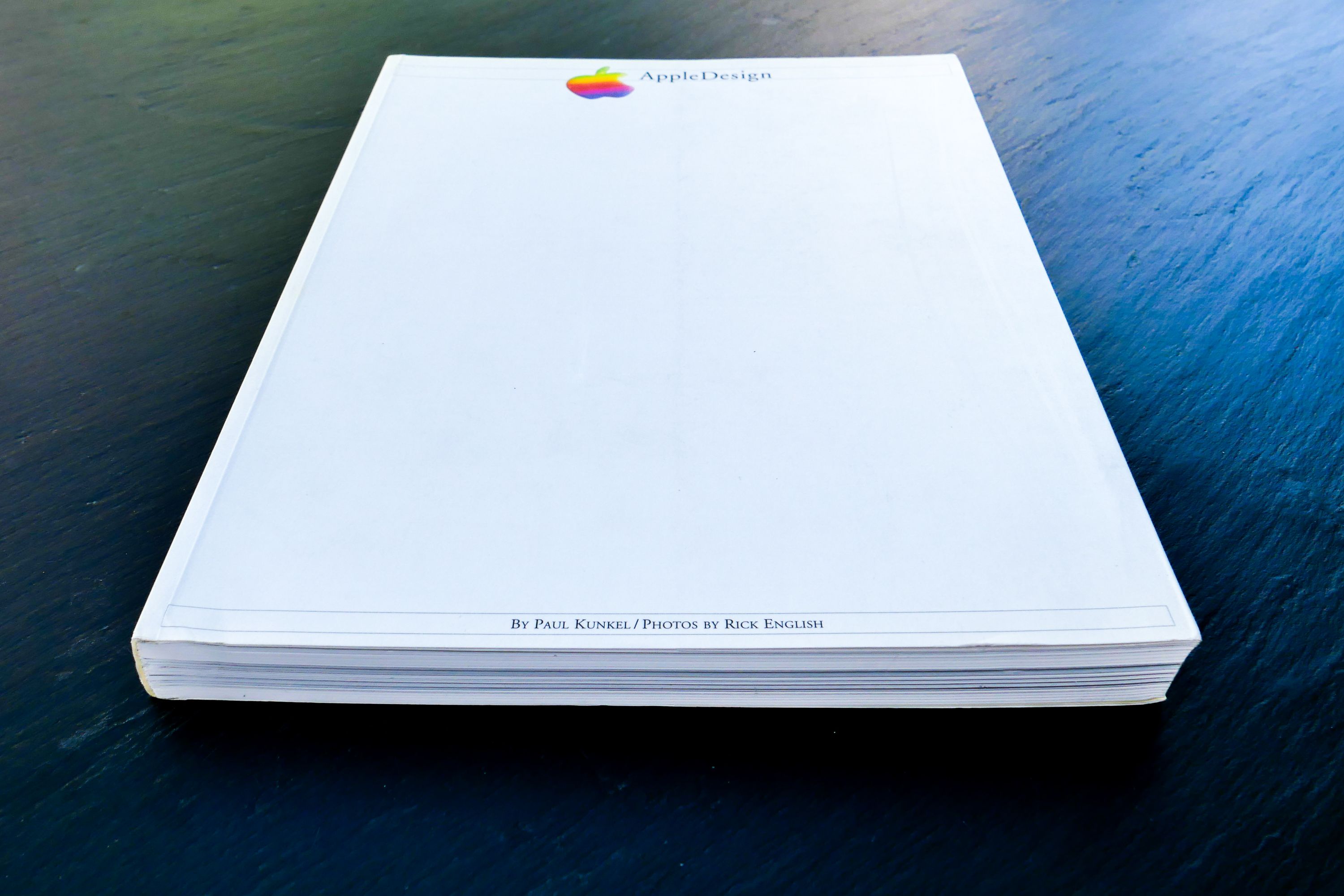
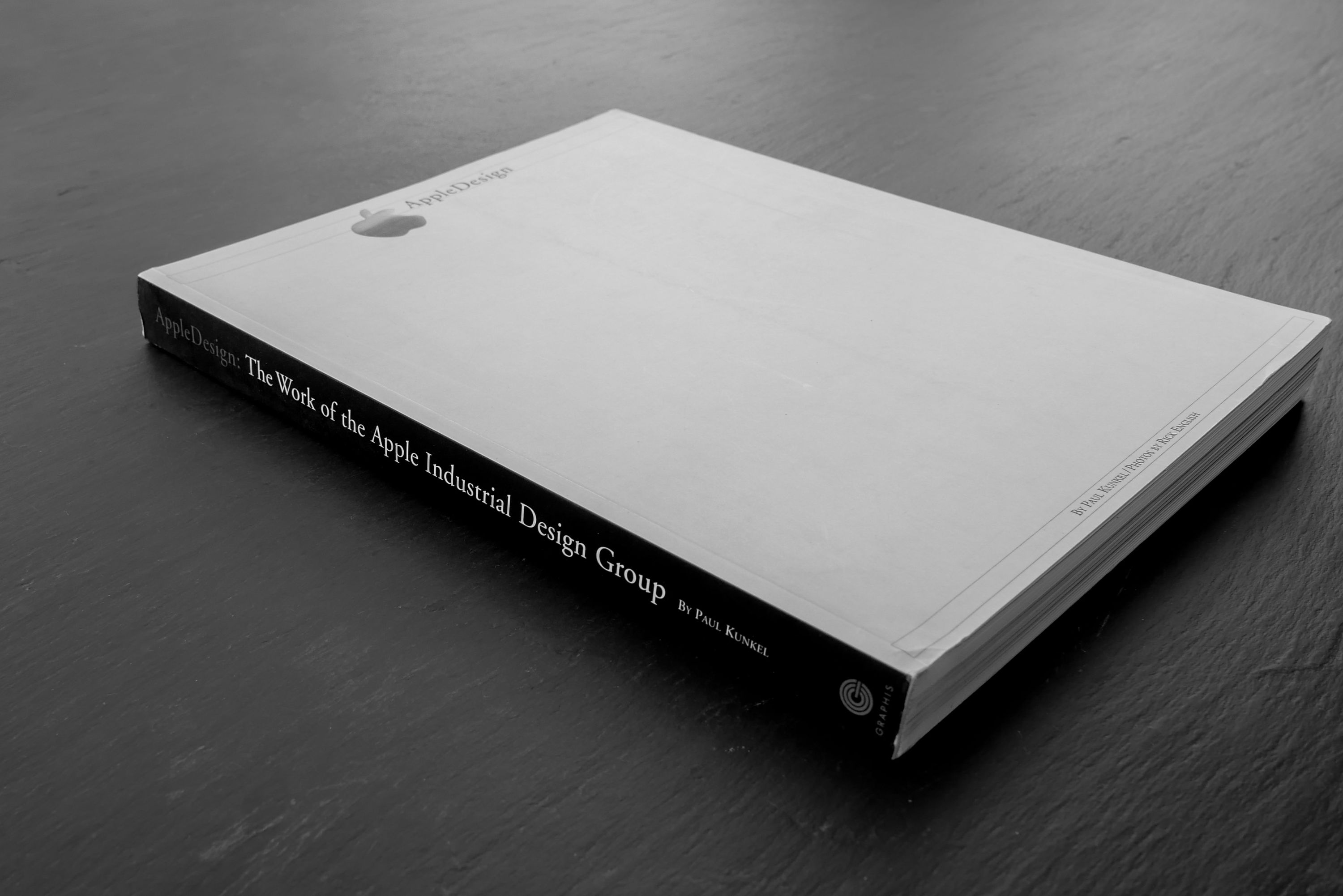
I decided to expand my Apple Collection (“Museum” and “Collection” are interchangeable at this point) to include books in addition to desktops, laptop, peripherals, displays, etc. I found a copy of AppleDesign: The Work of the Apple Industrial Design Group. It’s an incredible book filled with gorgeous photos of products and prototypes.