Yesterday was the 40th anniversary of the Apple Macintosh’s launch. I recommend watching a few minutes of Steve Jobs introducing the Mac at De Anza College in Cupertino, CA on YouTube. While watching try to imagine a world where computers didn’t have a graphical user interface; just a blinking cursor begging you to enter commands. The Chariots of Fire theme song feels cheesy when watching in 2024, but in the moment I can imagine it felt appropriate.
“I remember the week before we launched the Mac,” Steve recalled in 2007. “We all got together, and we said, ‘Every computer is going to work this way. You can’t argue about that anymore. You can argue about how long it will take, but you can’t argue about it anymore.’”
This is how I always felt when I was growing up. In the early 1990s (and to be honest through college) I argued with kids and adults about why Apple computers were superior machines. Yes, superior. One could argue I was a bit pompous as a child during these conversations, but I was so passionate about Apple. Windows machines could always do more, but the software was ugly and the hardware was clunky.
While visiting friends’ houses we would sit in front of Macs for hours and just figure out what they could do (in addition to playing Maxis games). We didn’t have modems yet so we were forced to poke around the system with apps like ResEdit. Macs were approachable. Elegant. My friends and I never tried to tinker with a PC. They were built for parents and work. Macs were for us.
The Upgrade podcast collected some of my favorite Apple enthusiasts to discuss the anniversary along with their first Mac, favorite Mac, favorite Mac software, favorite Mac accessory, and their least favorite Mac (the hall of shame). I put together a list as well.
First Mac
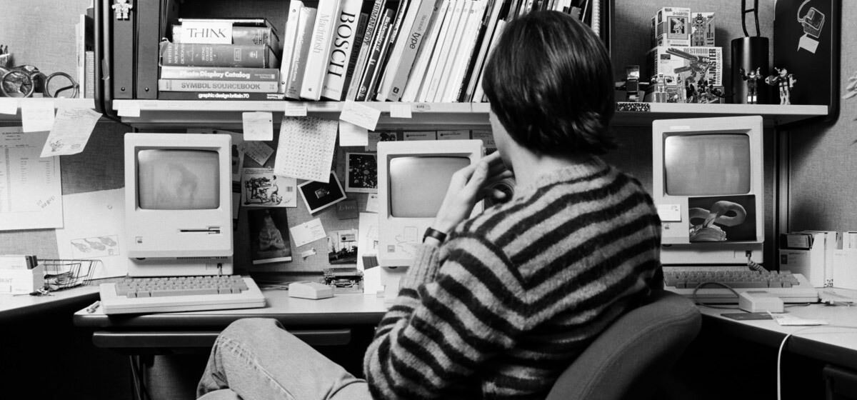
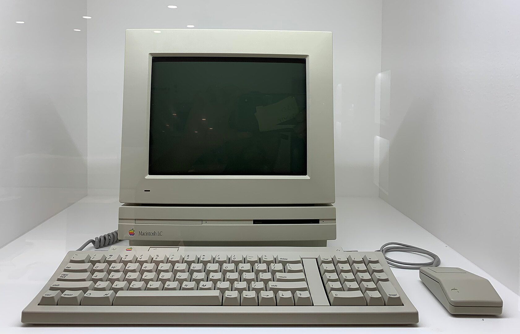
My first Mac was the Mac LC with a 16 Mhz 68020 processor, 40 MB hard drive, and 2 MB of RAM. This is where it all began for me. I remember listening to the national anthems of every country on it and feeling amazed that I had access to so much information. Playing with Kid Pix made me feel like an artist. Perhaps I should find one for my collection.
Favorite Mac
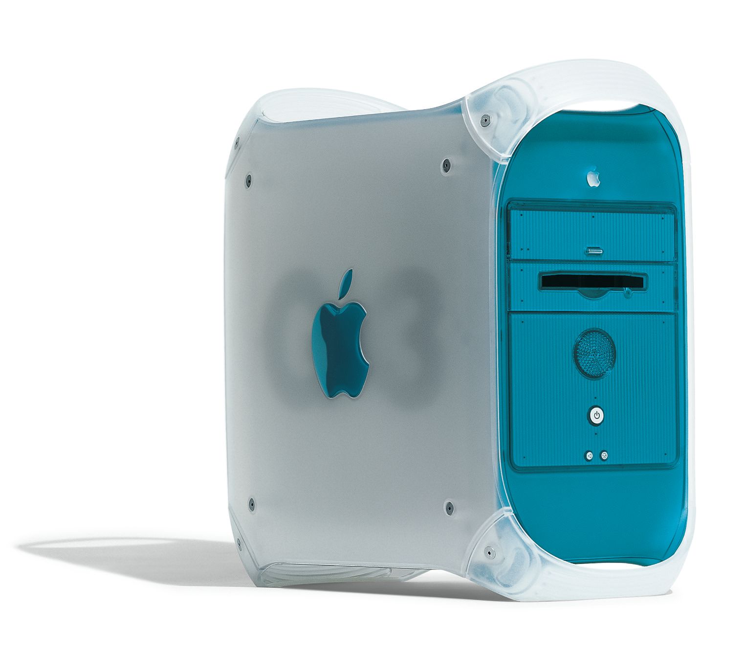
My favorite Mac is the Power Mac G3 Blue and White with a 400 Mhz G3 processor, 6 GB hard drive, and 64 MB of RAM. I had it configured with a built-in Zip drive too, and over the years I filled all the RAM slots and added a couple extra hard drives inside. This computer was a beast. It acted as a bridge between the Classic and OS X eras which was a particularly exciting time in Apple’s history. My parents were kind enough to ship it to New York for my freshman year of college where I quickly learned that a tower and CRT monitor combination was not suitable for a tiny dorm room. The best part? I still have it.
Favorite Mac software
Technically this isn’t the original Marathon, but it’s a great screenshot.
My favorite piece of software is Marathon. Hours and hours were joyfully spent playing this game against friends at Crystal Springs summer “school.” I was fortunate to spend a few summers in front of Power Macs learning how to create animations in Macromedia Director and rendering 3D scenes in Strata Studio Pro (when we weren’t playing Marathon of course).
Favorite Mac accessory
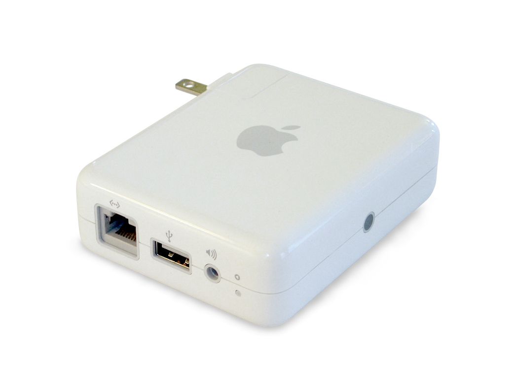
My favorite Mac accessory has to be the Airport Express. It was the perfect product for a college student, and I was a senior when it launched. We had laptops, speakers, and giant mp3 collections. The problem was figuring out how to play music wirelessly from any computer in the house or apartment. The Airport Express arrived and everyone could easily play music from iTunes without disconnecting their laptop, moving it to the living room, and reconnecting. It was also a fun party trick! In 2004 no one even imagined wirelessly playing music. It was seamless. It was cool. It, dare I say, just worked.
Hall of Shame
This category is tough. Does one select an unreliable model? Or a model that had a problematic keyboard? My gut tells me the Hall of Shame should be awarded to the Power Mac G4 Cube. Let’s be very clear: the Cube, its speakers, and its matching Cinema Display are GORGEOUS. Cramming the computer into an 8 inch cube was extremely impressive. However, I have some issues.
When this computer launched I was selling Macs at a local third party Apple retail store. The Cube was set up right by the front door. Everyone was clearly impressed by its design, but I don’t recall ever selling one. One person came to the store to complain that the capacitive power button on the top was too easy to accidentally press. He would randomly turn off the computer! Then there were the cracks. The computer didn’t have a fan and its healing solution was unable to adequately cool the acryclic glass enclosure. As a result it was likely to eventually crack. At $1,799 (with a $499 display) it was a tough sell considering its expandability limitations and low performance compared to its G4 tower sibling. This may all sound like nitpicking, but the cracking exterior is unforgiveable.
I adore Minimalissimo and recently saw that they added a new Stream page to the website. Introducing the Stream:
But what if you come to Minimalissimo to get inspired? What if you have an appreciation for minimal design and you simply want to immerse yourself in the content? What if the goal is not to search anything specifically, but rather to stumble on something you didn’t know you were looking for?
I have always wanted a way to quickly grab images or screenshots, drop them into a folder, and have them appear on this website. No text. No tags. No descriptions. Just stashing away things that I think are cool. When Minimalissimo shared this update I was inspired to finally add it here, but with a name that resonates with me: Stash. Enjoy!
Joaquin Phoenix takes Samantha on a boat in the movie “Her.”
During a flashback episode of Mythic Quest, C.W. Longbottom walks by an electronics store that has Pong running in the window. His friend sees a video game; Longbottom sees the future. He instantly realizes that if a video game has 1 pixel moving across the screen, someday there will be millions.
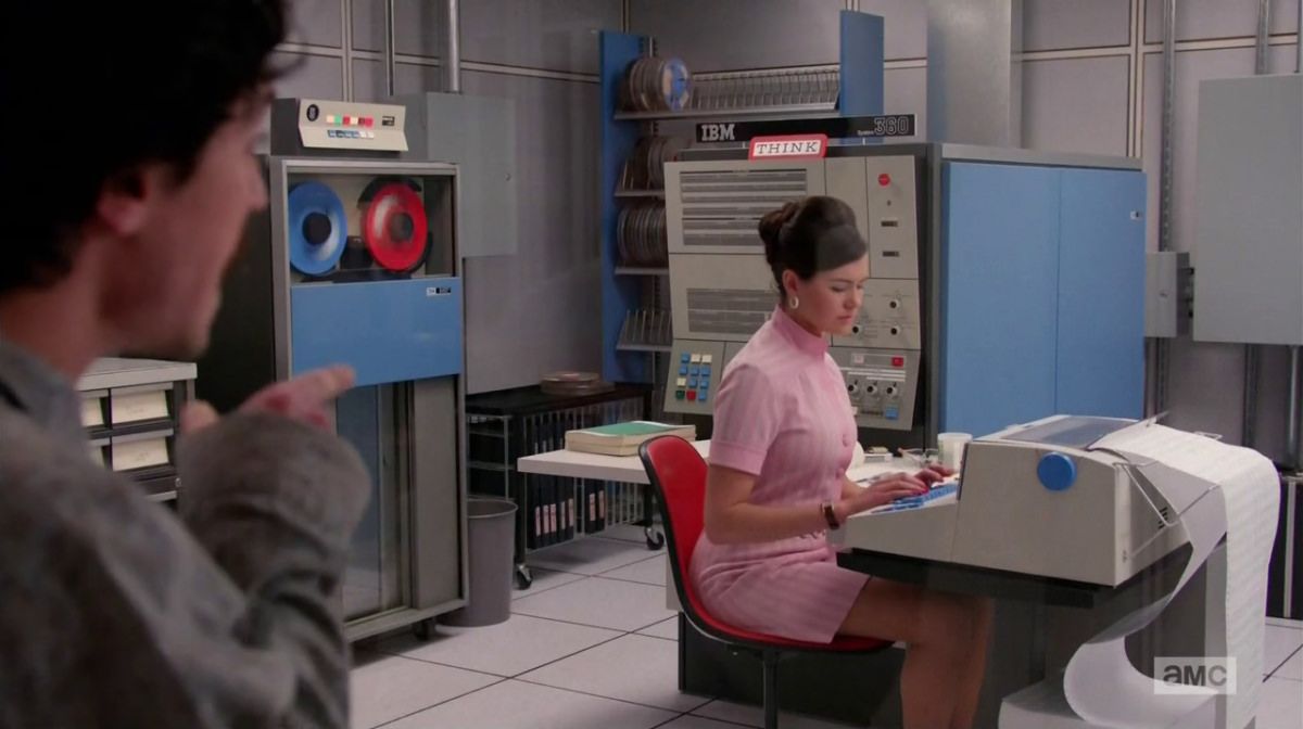
I have been reflecting lately on the explosion of artificial intelligence throughout the past year, and wondering if there are ways to connect it to past developments in technology. For example, in the 1960s popular mainframes like the IBM System/360 only sold in the hundreds of thousands of units. Now millions of people sit in front of computers all day every day. Many have both personal and work computers along with tablets and smart home displays.
The IBM System/360 was featured in an episode of “Mad Men.”
The Motorola DynaTAC (also known as the Zach Morris or Gordon Gekko phone) was too large to fit in a pocket and way too expensive. Now more than half of the global population has a cell phone, and it seems like most people walking around outside are buried in a screen.
Gordon Gekko in the movie “Wall Street.”
When the iPhone launched there were literally 10 apps: Phone, Safari, Mail, iPod, Calendar, Photos, Clock, Calculator, Weather, and Maps. Now, of course, apps are the glue for all computing. We order groceries, travel, collaborate, play, and even meet our spouses (hey babe!) all with the help of apps.
iA Writer is how I write for this website and there it is.
We started with just a few computers, a few phones, and a few apps. Now we seemingly have infinite number of each. Today’s AI landscape feels similar to those eras (although I can only speak to phones and apps myself having lived through those years). We have a few AI models and products in addition to the bits of AI scattered throughout the industry that we do not think about. What does the world look like when we have infinite access to AI?
One direction I can imagine is a single, personalized, omniscient presence similar to Samantha in the movie Her. This AI will be able to interact with other people, companies, apps, services etc. on my behalf. I can trust it with all of my information, records, and finances. This sounds a bit like science fiction, but so did cell phones in the mid-twentieth century when Vannevar Bush wrote about the memex in As We May Think.
A more short-term idea is each company has its own AI that we interact with through apps. Google’s Bard will someday handle our email and calendar while Meta’s AI (which does not have a name yet) will find new ways to entertain us. Perhaps the AIs will talk to each other, but I am hesitant to believe that since we have strayed so far from the golden years of open APIs. Every company is desperate to own and control a fortress of data.
In my opinion the most likely scenario we’ll see in the next few years is the AI craze calms down, some professional roles are permanently replaced by AI, and the apps and products we use for work and leisure are enhanced by AI. Our lives do not drastically change otherwise. We become more efficient at school and in the workplace, but our creativity and ingenuity continue to set humanity apart.
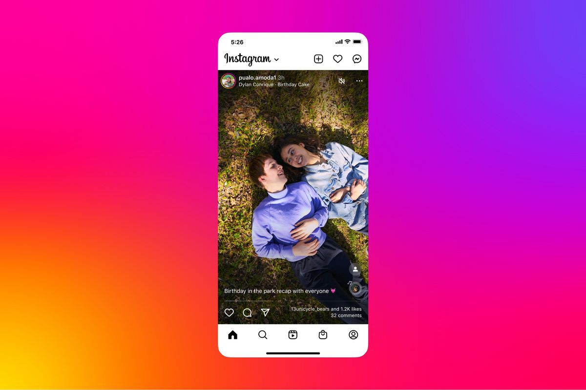
In 2022 the Instagram team announced they were “testing a new, immersive viewing experience in the main Home feed.” As a self-proclaimed mobile app design connoisseur, this piqued my interest. Clearly this was an attempt to replicate TikTok’s UX of showing one piece of media per scroll. For Instagram this would be differentiated since the app supports both photos and videos whereas TikTok is designed for video consumption only.
The test failed, and I have a hypothesis as to why: context.
Take a close look at the press image Instagram shared when the new interface was announced.
I still reflect on the brilliance of making Instagram’s interface black and white.
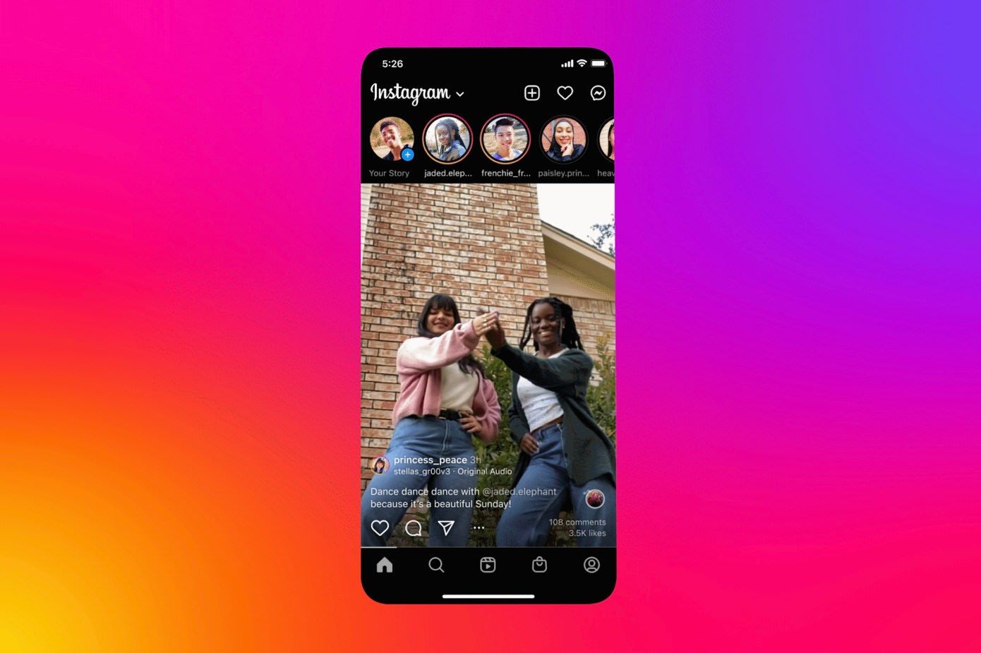
When the new interface actually launched, there was one subtle difference that fundamentally changed the app’s mental model and broke how users consume content.
Someday I hope to learn more about that Shop tab.
Do you see it? The profile photo of the account that shared the content moved from the top to the bottom of the screen. This one change doomed the experiment by removing context from every piece of content.
Instagram launched in 2010. The interface of course changed over time with the addition of new features, and the gradual shift in aesthetics from Apple, Google, and the design industry. However, a few things never changed. For example, the placement of the profile button in the tab bar has always been in the lower right corner, Home has always been in the lower left corner, and in the Home feed the profile photo of the account that shared a piece of content has always been in the upper left corner of the content.
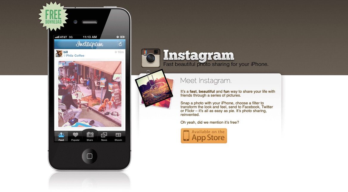
Take a look at the screenshot in the first iteration of Instagram’s website.
In 2010 I believe I was still sharing photos to Flickr through email.
There it is. When Burbn became Instagram the profile photo appeared above the top left corner of the photo (remember when Instagram only supported sharing photos?).
Since 2010 Instagram users have been trained to instantly and subconsciously look at the top left corner of content to ascertain: (1) who shared this and (2) do I need to look at this account’s content right now or can I scroll to the next item. Sometimes I’m not in the mood to look at a certain celebrity’s third carousel of vacation photos so I scroll without hesitating. As discussed above, when Instagram’s TikTok experiment launched, the profile photo moved to the bottom of the screen. Consuming content in the Home feed became jarring because I consistently did not have context.
Allow me to demonstrate with a wireframe.
Left: original feed. Right: experimental feed.
Before the experiment launched my eyes would slightly move from the top of the screen down to the profile photo, and I would make a decision about the importance of the content based on the profile photo. Then I would establish context and set expectations based on my previous experience with the account’s content before looking at the photo or video. I would briefly enjoy and then swipe horizontally if a carousel or vertically for the next item in the feed..
The experimental interface confused me by removing the account photo from the top left position. I would move my eyes downward to look at the content, become surprised or confused, and then feel required to rationalize the content. I would try to recreate the experience of the original feed by establishing context which required seeking the profile photo. My eyes would move to the bottom of the screen, analyze the profile photo, and then look back up at the content again. Scroll. Repeat. This was extremely frustrating. Instead of consuming 10 photos or videos in the feed, I had to rationalize 10 photos or videos.
Now let’s look at TikTok’s placement of the profile photo: the middle of the right side of the screen.
This works perfectly for TikTok because its users expect and are accustomed to relevant content as a result of the incredibly accurate algorithm. The account that shared the video is secondary and looking at the profile photo to establish context is unnecessary. A video’s context comes from its connection to a user’s interests instead of the source. One can use TikTok forever without ever following a single account and be entertained every day. The same is not true for Instagram where following accounts and building a community has been the primary method for gathering personally relevant content since 2010.
I believe that if the original experimental interface with the profile photo in the top left position were tested, it would have had a greater chance for success. Perhaps not successful enough to become the default interface for all Instagram users, but definitely enjoyed by more. Personally I would be delighted to try using the immersive Home interface again and remove the profile photo’s position change as a variable.
The Instagram team deserves a lot of credit and respect for trying this. It’s easy to not experiment. It’s easy to let interfaces become stagnant. Designing, building, testing, and deploying a change is hard and risky. I hope other companies take risks more often as a result.
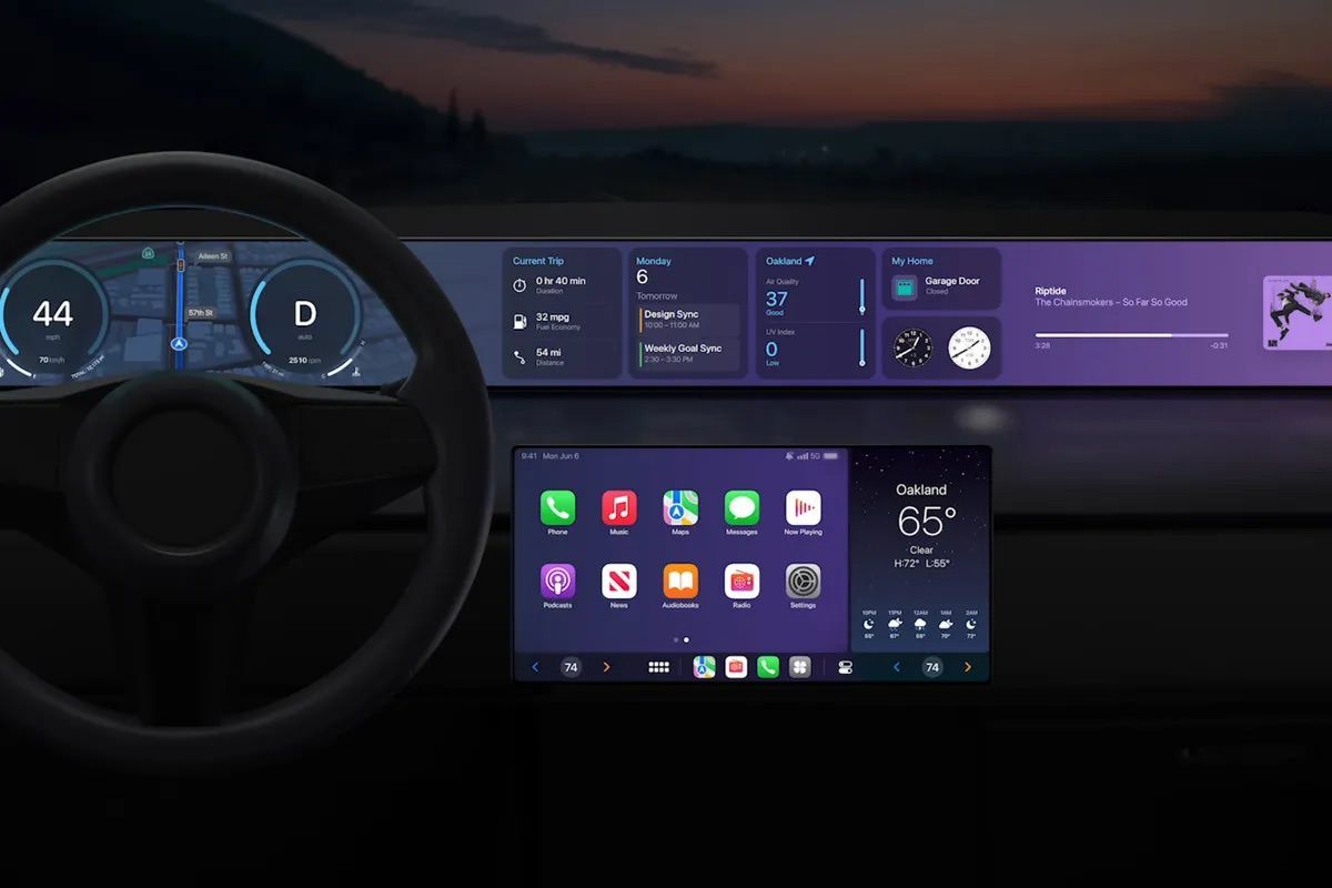
During WWDC in 2022 Apple shared a mockup of the next generation CarPlay interface that would control most of the car’s functionality instead of just launching apps and being confined to a single screen. This is meant to compete with Google’s efforts to stretch beyond Android Auto with Android Automotive. Yes, Android Auto and Android Automotive are two different products.
WWDC 2022
Recently Apple shared refreshed mockups specific to Porsche and Aston Martin (hopefully BMW and Subaru someday) which will have the new experience first.
December 2023
A few observations on what changed over the last 1½ years:
Gradients to patterns: Instead of one gigantic gradient we now have a wallpaper with a simple pattern. This feels less distracting while achieving a higher contrast.
Smaller displays: Instead of a display that stretches across the entire dashboard we now have multiple smaller displays. I assume a dashboard-wide display would be prohibitively expensive. There is also so much wasted space, and cramming more content onto the display would just lead to further distractions. Smaller displays that focus on specific tasks allow the driver to quickly and accurately tilt their head, briefly focus, and shift focus to back to the road. A gigantic display could be more difficult to use when one needs to look at a specific area or for a button waiting to be pressed.
Reach: In 2022 the area of the screen in front of the passenger seat was reserved for showing music data. I’m surprised the screen in front of the passenger seat would now include buttons. Is the driver expected to lean over, reach, and accurately press a button while driving? This could be challenging and dangerous. If one accidentally presses the wrong button, one would need to reach over, reach, and tap again, further taking attention away from the road.
The question I continue to ponder is do we need more pixels in cars? Of course it looks cool. But what if instead of more pixels Apple and Google made voice control instant and reliable with a much deeper integration into the car? Why can’t I say “hey car turn up the temperature” or “gimme directions to the Shell station on 19th?” Technically these are both possible today, but not with the simplicity and reliability I expect while driving.
In college I co-authored a paper called Context of Use Evaluation of Peripheral Displays. Two Information Science PhD students and I tried to define what makes a good peripheral display. For a driver the windshield is the primary display and everything inside of the car is secondary (or on the periphery). One of the core aspects of a successful peripheral display is to ensure it is a glanceable. What strikes me about these mockups is how incredibly not glanceable they are. There’s so much information presented which will likely interfere with driving safely.
A more interesting challenge for car designers would be to decrease information density and the overall number of pixels. There’s an infinite number of things to present if one continues to increase screen surface area. What if a car had zero pixels? Or the displays were greyscale instead of rich in color? Perhaps a driver could choose to hide the display when it’s not necessary. Maybe everything the driver actually needs could temporarily appear in a HUD and then disappear leaving the driver alone with their thoughts and the open road.
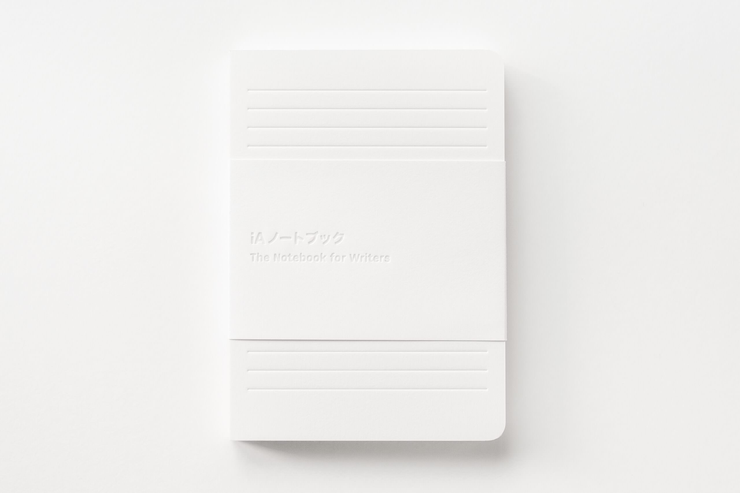
As a long-time user of iA Writer (I’m literally writing in it right now) and fan of iA, I was delighted to see the announcement that a tangible paper notebook was coming: Notebook for Writers. Of course it’s beautiful. I appreciate the subtle guidelines on each page, and the description is exactly what I would expect from this team:
We wanted guidelines in the notebook, serving as a temporary scaffold to support your writing without causing distraction. The design had to reflect the core spirit of iA Writer: simple, clean, uncluttered. The use of ink had to be exclusively reserved for the owner’s handwritten text. After exploring different approaches, the decision to adopt delicate watermark guidelines became clear, even though its implementation demands high technical expertise and attention to detail.
To be honest I have tried to become a notebook person many times and failed. Moleskines in multiple sizes and shapes, conference and meetup giveaways, and even a black notebook paired with a white pencil didn’t work. Perhaps I’ll try again.
Opal Camera recently launched Tadpole, their second product. It’s adorable. When their first product, the C1, appeared I immediately signed up for the waitlist. It was exciting to see a startup working on a webcam that both looked cool and
had a “DSLR quality” sensor. I waited. And waited.
When the C1 finally arrived I had already constructed a complex camera setup using my Fujifilm X-T2, and even found a way to eventually simplify it with fewer parts. The image quality was flawless. I had hoped that the C1 would be somewhat close to the Fujifilm, but it was only marginally better than the LG 5K’s built-in webcam. Opal’s software for adjusting the camera’s settings was powerful but slow. The camera would get very hot, and its mount was not reliable. It actually fell off of my display a few times and became dented.
I eventually gave up and sold the C1 once Continuity Camera launched. I highly recommend using your iPhone as a webcam instead of any third party cameras including DSLRs. The biggest challenge was securing it to the LG 5K display or MacBook Pro, but that was solved when Belkin released the iPhone Mount with MagSafe for Notebooks and Mac desktop and displays. Yes those are exceedingly long product names.
Setup is easy because there is no setup. When a Zoom, Google Meet, FaceTime, etc. call starts the iPhone camera activates. Place the camera on the Belkin mount and done. I recommend connecting your phone to power to ensure its battery doesn’t deplete by the end of the workday.
Considering Opal couldn’t make a good webcam with a large sensor, I recommend avoiding the smaller (but still pretty) Tadpole.
A look back at key products to help me determine if I should order a Vision Pro on launch day or wait for v2.
I’ve been thinking a lot about whether or not I will order a Vision Pro when it becomes available or if I will wait for v2. Based on early reports it sounds magical. I have not heard a single person who has used the device say otherwise. However, it is incredibly expensive. At $3,499 it would be the most expensive computer I’ve ever purchased (including a maxed out PowerBook I bought at the end of my Apple internship in 2002 with a 25% discount).
While chatting with a friend about the pros and cons of waiting, I began reciting the differences between a few first and second generation Apple products. “Wait a minute,” I said. “This would be a great blog post! Let me check some details.” I thought it would be fun and helpful to take a close look at several products and get a sense for how often it’s actually worth waiting. We can see what features were the highest priority to immediately add. I decided to focus on a few key v1 products: the Macintosh, PowerBook, Power Mac, iMac, iPod, MacBook Pro, iPhone, iPad, Apple Watch, and AirPods.
I’ll be honest. Much of this analysis is swayed by my current age, disposable income, nostalgia, and where I was in life when these products were announced.
TLDR: I’m going to buy a Vision Pro even though I should wait for a v2.
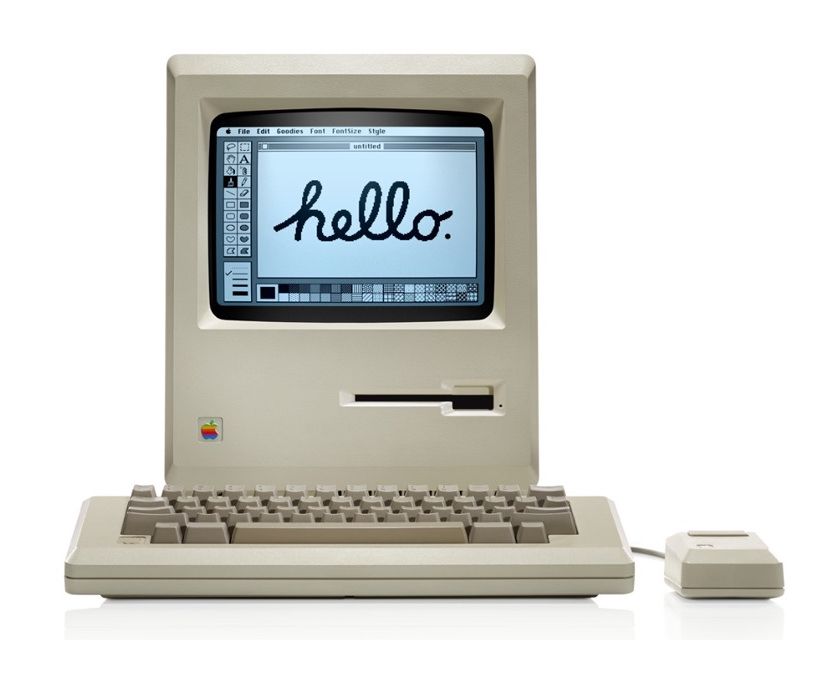
Macintosh 128k vs. Macintosh 512k
Since I was born in 1983 I didn’t get to experience the rise of GUIs and personal computers with the Macintosh. In the late 1980s I remember playing with gigantic, noisy, ugly Compaq and Toshiba boxes that ran DOS at friends’ houses while at school there were slick, elegant, and easy to use Macs.
Here are the differences between the original Mac 128k and its quickly arriving successor, the Mac 512k:
Spec
Mac 128k
Mac 512k
Mac 128k
Mac 512k
Launch Date
January 1984
September 1984
RAM
128 KB
512 KB
Latest Mac OS
1.0
3.2
Cost
$2,495
$2,795
Just 8 months after the Macintosh 128k’s debut the 512k model was released. The big change was an increase in RAM which improved performance and allowed the Mac to run more software including future versions of Mac OS. However, the Mac 128k was not a new product line in an existing category like an M3 MacBook Air. It was a paradigm shift; a new way of using computers. The excitement after the 1984 Superbowl commercial must have been immeasurable. Perhaps this a result of hindsight and my selfish desire to build out my museum, but I believe I would have purchased a Mac 128k on launch day and not waited for v2.
Macintosh 128k vote: buy
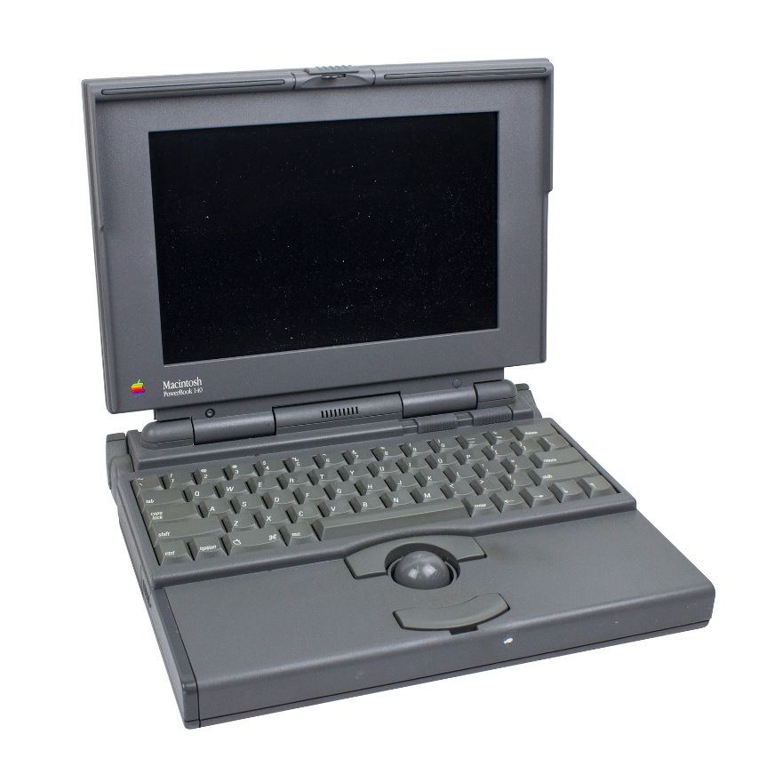
PowerBook 140 vs. PowerBook 145
I first encountered a PowerBook in either 1993 or 1994 when I began playing the alto saxophone in elementary school. The music teacher connected a PowerBook to a MIDI keyboard to play accompanying music. For a kid who was excited by computers it was extremely cool to see a computer working with other hardware.
Note: I chose the 140 and 145 because there was no successor to the 100.
If you waited just 10 months you got a faster processor, more RAM, and a lower cost with the PowerBook 145. Similar to my views on the Mac 128k, this was another revolution in computing. Apple released the Macintosh Portable in 1989, but it was wildly expensive at $7,300 ($17,200 adjusted for inflation) which seems slightly unrealistic. The PowerBook was smaller, lighter, and more affordable. You could now take your Mac off your desk and work on the go! I don’t think waiting for v2 was worth it.
PowerBook vote: buy
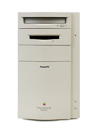
Power Macintosh 8100 vs. Power Macintosh 8500
I first encountered a Power Mac in a lab at summer school where I learned about building websites, graphic design, animation, and 3D modeling using applications like Strata Studio Pro, Bryce 3D, Photoshop, and Director. On Fridays we got to play Marathon and Warcraft II all day. It was a good summer.
When the Power Mac line was announced we already had the very capable Quadra line. The 601/604 PowerPC processors were exciting (my dad’s Performa 6115 had a 601 and my Performa 6300 had a 603e), but I think it was safe to wait a year for a v2 while continuing to rely on the weathered but experienced 68040. Waiting got you double the storage, double the RAM, a graphics card, better expansion, and the much more powerful 604 processor.
Power Mac vote: wait
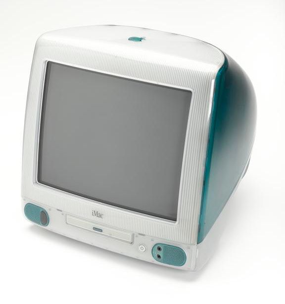
iMac vs. iMac (Slot Loading)
In the late 90s I had aging Performa 6300 with an optional AV card that served me quite well. My priorities were playing Marathon and writing essays. The platinum design language was ready to be replaced.
At that time I worked at a local third party Apple retail store named Computerware and sold a lot of iMacs. People loved the colors and simplicity. Everything you needed was in the box. Jeff Goldblum elegantly explains this in a commercial, “Presenting 3 easy steps to the internet. Step 1: plug in. Step 2: get connected. Step 3: there’s no step 3.”
Note: I chose to skip the iMacs released 4.5 months after the initial launch due to the extremely short timespan and hardware similarities. They feel more like a bonus round than a v2.
The original iMac in its beautiful bondi blue case was a statement and it belongs in museums. Apple was back and computers were fun again. Specs? Who cares! Well, I did. Disc drives were quickly becoming useless thank to the internet, but I still relied on a SCSI port for several more years thanks to the Iomega Zip drive and a CD burner. I was not ready to jump on the USB bandwagon. The updated specs that arrived in the slot loading model the following year were worth waiting for in addition to seeing how the industry reacted to USB.
Waiting also got you a faster processor, more storage, and more RAM. The bondi blue color option was no longer available, but graphite was.
iMac vote: wait
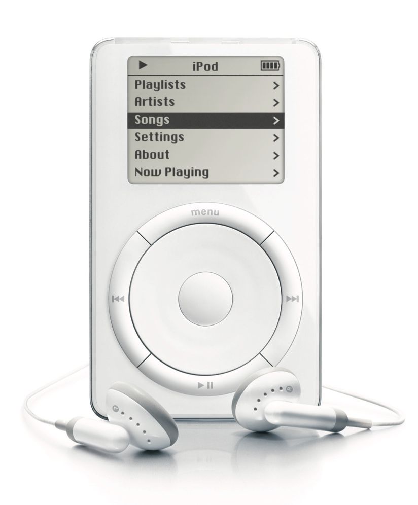
iPod vs. iPod (Second Generation)
When the iPod was announced I was a freshman in college. Mp3s were playing in every dorm room, at every party, and I assume in every dining hall. Legally? Doubtful. At some point most of us stopped ripping CDs and turned to Napster, Scour Exchange, Kazaa, LimeWire, etc. At Computerware I sold a few Creative Nomad Jukebox mp3 players that were intriguing but unappealing. There was clearly another paradigm shift occurring, but a solution to manage, transfer, and traverse a large collection of mp3s had not presented itself… yet.
By the time I arrived at college I had embraced and experimented with a variety of ways to collect, organize, and listen to music. In 2001 I had already moved on from a Rio 500 and heavily invested in a Sony MiniDisc player. I gleefully walked around campus with a little notebook of discs and swapped them multiple times each day. The MiniDisc ecosystem combined with a very easy way to quickly download mp3s in my dorm room made me hesitant to immediately purchase an iPod. I felt it was safe to wait until a v2 (which I definitely purchased). Once the iPod was paired with the iTunes Store there was no going back.
iPod vote: wait
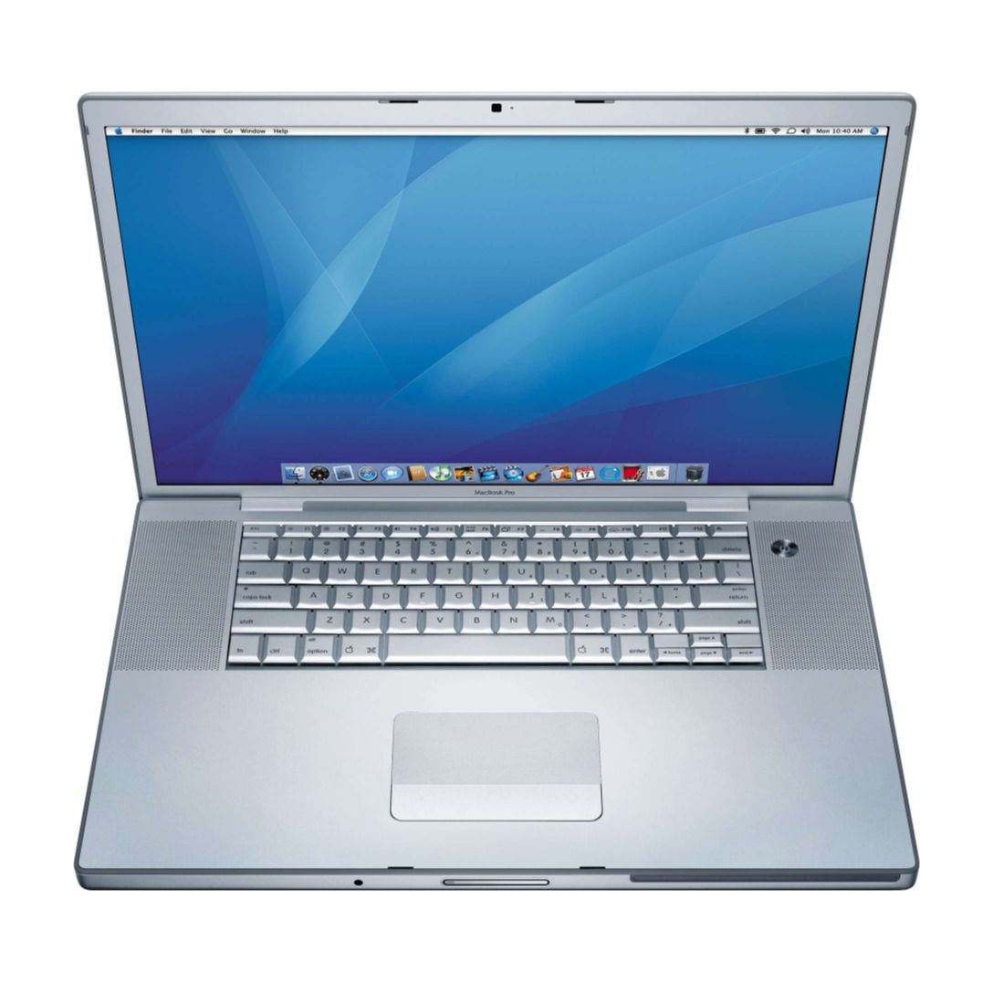
MacBook Pro vs. MacBook Pro (Refresh)
The MacBook Pro replaced the beloved PowerBook G4 Titanium. Yes, the titanium paint scratched easily. Yes, there were issues with the little magnetic hook that kept the lid shut. Yes, the fans roared when I played Medal of Honor. But it felt so good to say the word “titanium” when describing a laptop. For my freshman year in college I convinced my parents to ship my Blue and White Power Mac G3 from California to New York. It was gigantic in a tiny dorm room. After my summer internship at Apple the following year I purchased a PowerBook G4 Titanium which was more suitable for a student lifestyle. A few years later Apple surprised the industry by announcing a transition from PowerPC processors to Intel processors, and the first Apple laptop with an Intel
processor was the MacBook Pro.
It’s worth reflecting on the MacBook Pro name considering it started in 2006 and we still have it in 2023. The PowerBook name lasted 15 years (1991-2006). The MacBook Pro name has lasted even longer! We’re at 17 years and there’s no sign of changing it. I would argue there was an opportunity to create a new name to coincide with the Apple Silicon transition, but that didn’t happen.
When the MacBook Pro was announced we were all using titanium or aluminum PowerBook G4s, and they were fantastic machines. Coworkers at the startup I was working for at the time had 12, 15, and 17-inch PowerBooks. Sticking with the PowerBook avoided any software hiccups during the transition from PowerPC to Intel architecture. Waiting just 10 months also got you the Intel Core 2 Duo processor which significantly extended the life of the computer. It was clearly safe to wait for v2.
MacBook Pro vote: wait
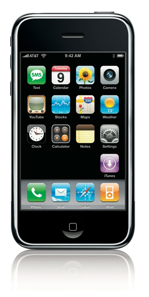
iPhone vs. iPhone 3G
When the iPhone was announced I was using a boring Motorola v551 flip phone. I had run through a series of Ericsson and Sony Ericsson phones that synchronized contacts and calendars over Bluetooth with iSync. Eventually those capabilities on candybar phones fell out of fashion with the rise of pre-iPhone smartphones. The leaders at the startup I was working for had a variety of these devices. Blackberries, Treos, BlackJacks, etc. One would think as a tech enthusiast I would have purchased one, but I vividly remember disliking all of them. The Sony Ericsson T68i and T610 were tiny and powerful. The smartphones mentioned above were gigantic and barely more capable. It didn’t seem like a valuable tradeoff. Then January 2007 came and
Jobs delivered arguably his best keynote.
Here are the differences between the iPhone and its successor, the iPhone 3G:
Spec
iPhone
iPhone 3G
iPhone
iPhone 3G
Network
EDGE
3G
Storage
4 GB
8 GB
GPS
✓
Latest iOS
3.1.3
4.2.1
Launch Date
July 2007
October 2008
The iPhone was obviously a day 1 purchase. No question; no hesitation. I did not have experience with 3G connectivity so I didn’t feel like I was missing out. EDGE was painfully slow but it didn’t matter. The experience of using an iPhone was worth living with the slow (and unreliable) AT&T network. Also Google Maps worked surprisingly well without GPS.
I saw an iPhone up close 3 months before launch at a car meetup in San Jose. There was an Apple VP showing off his Ferrari, but everyone there was more interested in the pre-launch iPhone he was demonstrating. Launch day came and I lined up outside the Palo Alto Apple Store for 2.5 hours before it opened. I got one. It was exhilarating.
iPhone vote: buy
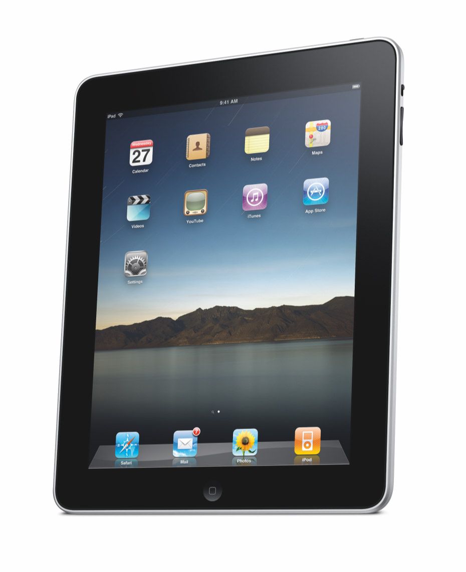
iPad vs. iPad 2
For a few years pundits praised computer companies for producing cheap, crappy, miniature laptops referred to as netbooks. They had poor specs, tiny screens, and terrible keyboards. Heck if you weren’t careful and selected the cheapest option a netbook would show up running Linux. People assumed (and hoped) that Apple would join the fray with its own take on the netbook. Fortunately they never did. Instead, Apple waited until the netbook faded away and the tablet category arrived. Microsoft debuted its “slate” computer at CES in 2010, and, after years of speculation regarding a more portable portable computer, Jobs introduced the iPad.
Here are the differences between the iPad and its successor, the iPad 2:
Spec
iPad
iPad 2
iPad
iPad 2
Processor
A4
A5
RAM
256 MB
512 MB
Cameras
✓
Latest iOS
5.1.1
9.3.6
Launch Date
January 2010
March 2011
Jobs sat in a Le Corbusier Grand Confort Lounge Chair on stage, reclined, and held up the iPad. I was sold. The first casual computer. I wanted both the chair and the iPad, and, somehow, the iPad was a shockingly affordable $499 compared to the rumored $999. With the accompanying iPad Keyboard Dock I believed I had unlocked a new productivity setup. However, the iPad was and continues to be a consumption product. I have never embraced it as a primary computer. I just love moving files around and looking at multiple windows simultaneously too much. The iPad wasn’t another paradigm shift, but it still had a magnetism and curiosity that made it a launch day purchase.
iPad vote: buy
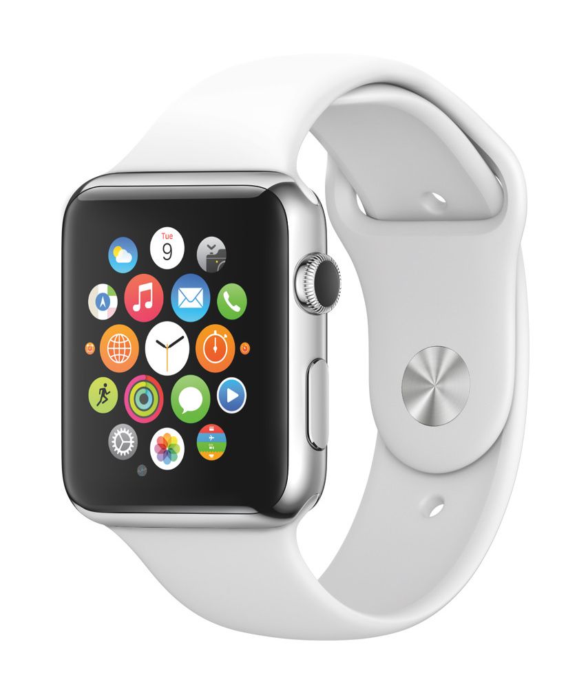
Apple Watch Series 0 vs. Apple Watch Series 2
When the Apple Watch was announced I was proudly wearing a TO watch by Issey Miyake. I still love that watch despite the difficulty of telling time when the lengths of the hours and minutes hands are reversed. I had dabbled in the smartwatch category by backing the Pebble on Kickstarter in 2012. I wore it for a bit but quickly found it clunky and unhelpful. I recall the notification tap feeling particularly cheap.
Years had passed since the iPad launched and the industry was curious as to where Apple would venture next. The announcement was fun but left many questions unanswered. What would an app experience be like on such a small screen? Do I even want to send my pulse to a friend? Most importantly, will the battery last all day?
To be candid I purchased an Apple Watch on day one, but upon reflection I do not believe it was vital compared to some other Apple products. Both the core functionality and third party apps were slow and the battery life was mediocre. In terms of software it took a few iterations of watchOS for Apple to learn what the watch excelled at and focus. Hardware quickly improved though. Series 2 pushed the battery life towards an acceptable capacity where I wasn’t worried it would deplete to 0% if I did a long workout.
Apple Watch vote: wait
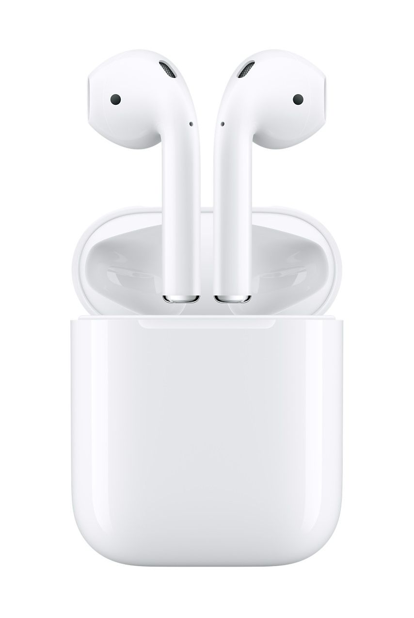
AirPods vs. AirPods (Second Generation)
I love headphones. Love. When Shyp was around I would buy headphones, try them on, and immediately call Shyp to pick them up for a return. Before the AirPods and AirPods Pro launched I was a happy Bang & Olufsen Beoplay H3 owner. They were elegant and I enjoyed their sound profile. I dabbled with Bluetooth headphones starting in 2013 for running, but still used wires for calls and commuting.
The first generation AirPods were fantastic. Perhaps not a paradigm shift or leap in computing, but they certainly reset the Bluetooth headphone industry. Now almost every pair of Bluetooth headphones follow the same concept. Cases had been used as charging mechanisms in the past, but sound and satisfaction of placing the AirPods into the case and shutting it were unmatched. It was absolutely not worth waiting almost three years(!) for a v2. Although I did purchase the v2 version because I’ll always jump at improvements to connectivity and battery life.
AirPods vote: buy
Tally
Let’s review the list and votes:
Tally
Buy
Wait
Buy
Wait
Macintosh
✓
PowerBook
✓
Power Mac
✓
iMac
✓
iPod
✓
MacBook Pro
✓
iPhone
✓
iPad
✓
Apple Watch
✓
AirPods Pro
✓
5 votes for “buy” and 5 for “wait.” An even split. I’m surprised by this! Before conducting this exercise I assumed there would be fewer “wait” votes. I’ve learned nothing except perhaps I’m more mature than I realize.
Vision Pro’s Value
When applying this breakdown to the purchasing decision for the Vision Pro, it’s worth noting which items in the list were exorbitantly expensive and which were affordable. For example, the Macintosh and PowerBook were way more expensive than the iPod and iPhone. At $3,499 the Vision Pro is not a product one buys on a whim.
But what about value? I use my iPhone and AirPods Pro constantly so the value to cost ratio is reasonable. Will I wear the Vision Pro for 8 hours per day during the work week? I can’t use it in meetings if someone else is in the conference room. That would be awkward. If it makes me more efficient at work and video calls become more enjoyable, perhaps it’s worth investing in just for work. I certainly won’t wear it at night if I want to stay married. I also won’t wear it during weekends since I have two kids under three. No time for dad to play with his toys.
Assumptions About a Vision Pro v2
Based on all the products discussed above and the components in the Vision Pro I think we can make some assumptions regarding inevitable improvements in a v2:
It’s weird to toss around a word like “magic” when referring to tech products. The word should be reserved for moments when the future becomes obvious. For example, the first time I used a web browser the world felt infinite, and it was obvious that I would use a web browser every day. The first time I streamed video in a web browser content felt infinite, and it was obvious I would watch videos every day. I wonder if the first time I see a blinking cursor and start typing on a virtual keyboard in a Vison Pro will computing feel infinite?
Image credit: Apple
Raymond Wong describes his experience with Spatial Video as “emotional” in a recent post on Inverse:
…These convos are very precious to me, so to see them replayed with a sense of presence really tugged at my heartstrings. At one point, I fought back a few tiny tears if only because there were three Apple reps sitting next to me… At a certain distance and window size, spatial videos can look life-sized. But even when I “pushed” the video window farther away (enabled by looking at the bar at the bottom of the window and then pushing it farther from me), seeing my mom in 3D made me emotional.
Outside of productivity and entertainment, it sounds like the Vision Pro can create “emotional” experiences unlike any other computing platform. That’s where I see the magic potential. Lately my daughter insists on calling grandmothers, aunts, uncles, and cousins on FaceTime during breakfast every day. I’m delighted that she can see family members around the country whenever she wants. A few years ago this required a laptop, webcam, and iChat AV. Before that it was even trickier. Now it’s a single tap on a device we all carry. Perhaps Spatial Video will be the next leap in human connection.
Decision
It’s hard to believe after writing all of this I’m still wavering. Acquaintances who have used a pre-launch Vision Pro claim it’s incredible. They insist waiting for a v2 is unnecessary and, knowing me, unlikely. Let’s be honest here: I’m going to buy a v1. I’m just not sure if it’s going to be day one or after I get to play with one.
Thank you, Remy, for proofreading and shouting “What? You’re buying a Vision Pro? I don’t think so.”
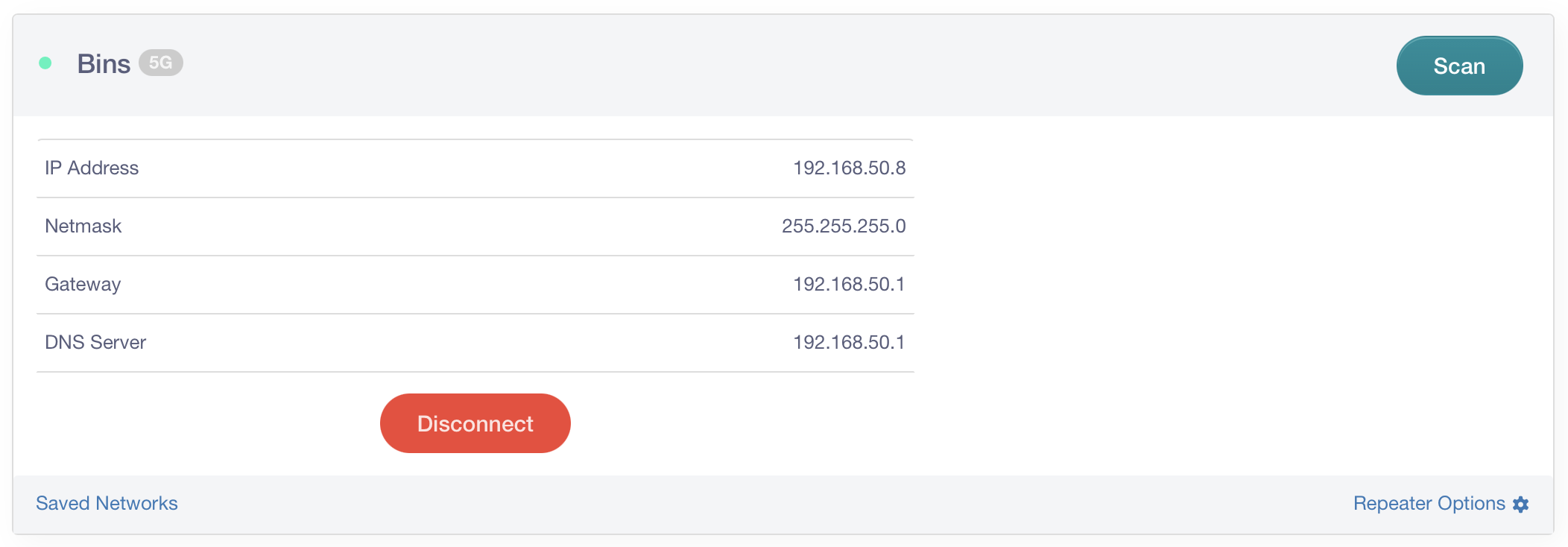
I love gadgets, and becoming a parent greatly expanded the number of products I get to research, configure, and maintain. This also means I occasionally have an opportunity to go deep on a new technical problem. The latest example is with the Nanit Pro Camera. It’s a small WiFi camera you mount to the wall or place on a stand, and it allows you to see live
video of your baby using a mobile app. This is different from a EuFy Baby Monitor (yes two cameras pointing at the same baby) which broadcasts to a dedicated monitor using RF instead of WiFi. Using a EuFy is helpful because you don’t need to launch an app to see what’s happening in the baby’s room; you just glance at the portable monitor.
It’s important to understand the difference: the Nanit broadcasts the video feed to a server while the EuFy broadcasts to a local device.
My wife, son, and I recently visited Philadelphia so he could meet his great grandmother (don’t say that “nasty” word around her) and only brought the Nanit. The hotel provided a crib and we used a SlumberPod (a must for all parents who travel
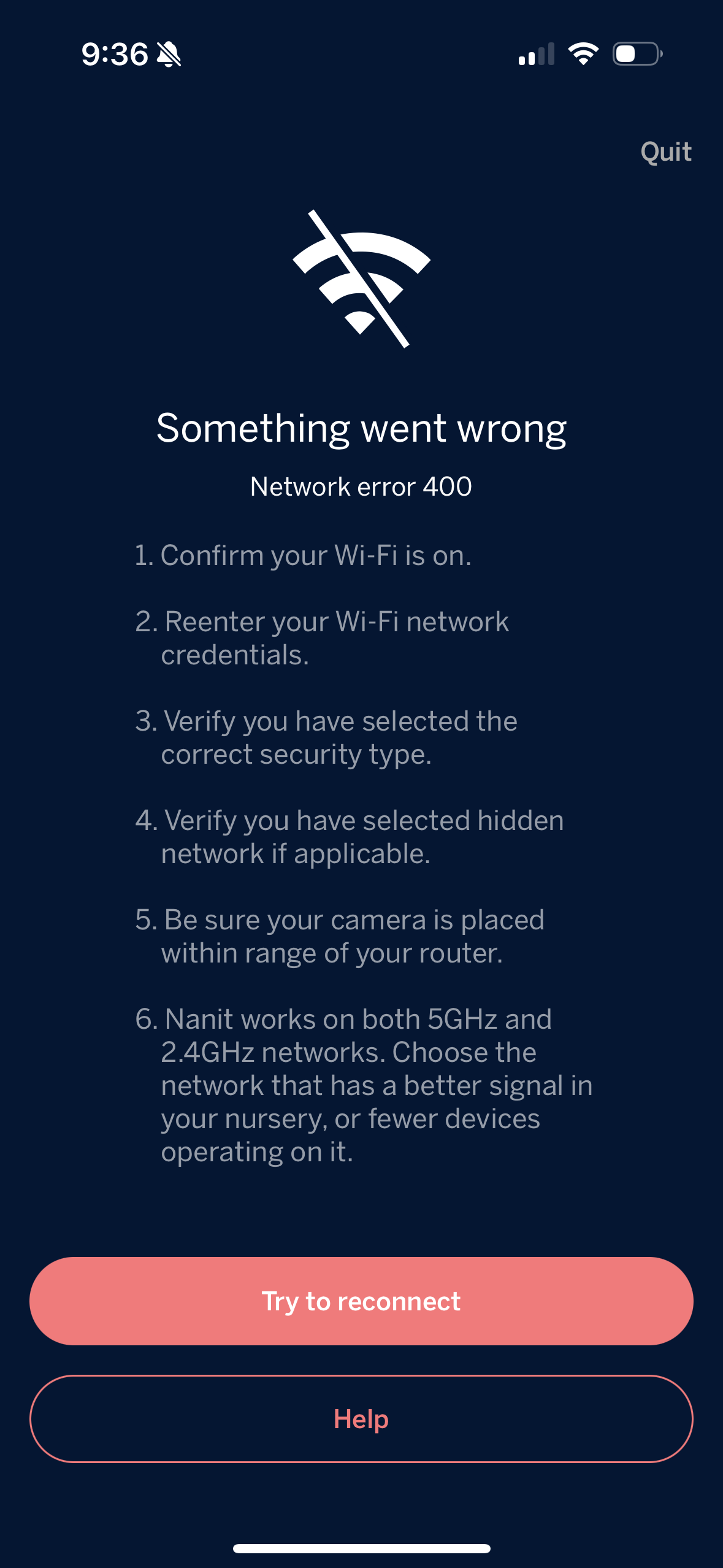
with babies) to ensure Wolfe had a dark environment to sleep in. After constructing the SlumberPod, which conveniently has a small pocket to place a camera in, I began the process of connecting the Nanit to the hotel’s WiFi network. This is where the trouble began.
The hotel’s WiFi did not require a password. You simply connect to the open network and authenticate using your last name and room number in a webview. We’ve all seen this before at hotels, offices, airports, etc. The problem is the Nanit’s network settings require both an SSID (network name) and a password. There is no way around this. Fortunately the hotel also offered a password-protected network so I tried that and consistently encountered “network error 400.” The only way to make this work was to get around the passwordless network.
Those margins are a bit overkill
I searched DuckDuckGo, asked ChatGPT for help, and browsed Reddit. Nothing. Other users complain about the password requirement, but Nanit has not offered a solution in the app. Finally I checked Nanit’s documentation and learned that their cameras don’t work with “captive portal” networks which use a webview to authenticate. The way to make it work is by using a personal hotspot or a travel router. Now I was intrigued!
Personal Hotspot
Let’s start with the personal hotspot because this took some thinking and tinkering. Here is the process I came up with:
Activate the personal hotspot on my iPhone
Connect to the Nanit with my wife’s iPhone
Configure the Nanit’s network settings to talk to my iPhone’s hotspot WiFi network
Now whenever I turned on the personal hotspot on my iPhone, the Nanit would automatically connect to the phone after a few seconds, and start broadcasting the video feed to the server. This technically worked but the Nanit would chew through my data plan if I left the camera connected to the hotspot network all night. I had to find a better solution.
Travel Router
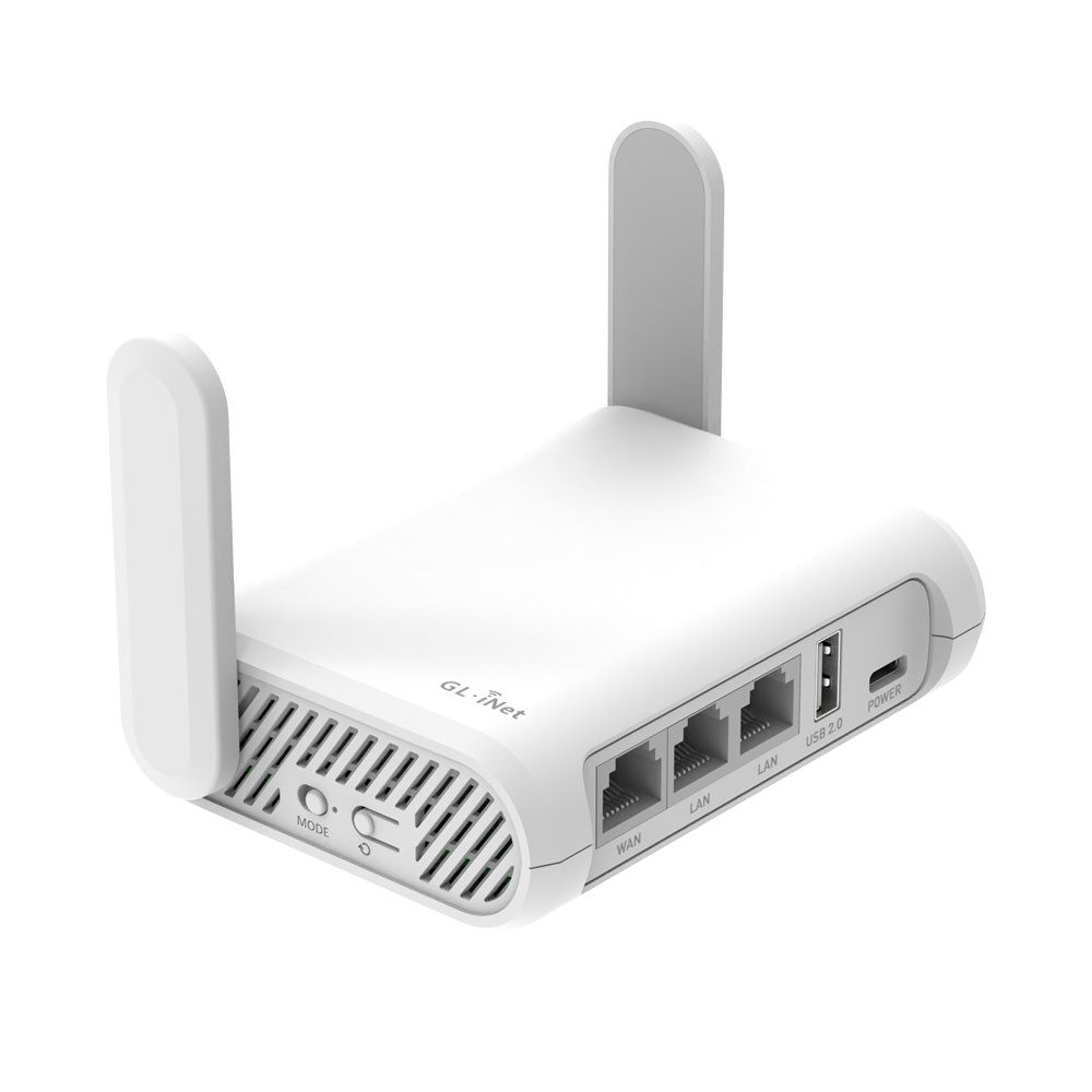
I recalled listening to an episode of The Vergecast and the hosts discussed the convenience of traveling with a portable router. If you use the same SSID and password as your home router, all of your devices will automatically connect to the portable router. Phones, tablets, laptops, and, most importantly, Nanit cameras. I was delighted to finally have a reason to buy another tech product.
I ordered a GL.iNet GL-SFT1200 on Amazon for $39.90 and luckily had an option for one-day shipping. I was impressed by both its low cost and small size. It’s perfect for throwing into a suitcase. If a future trip includes my wife and I both on video calls, I will probably purchase a
version that can handle more bandwidth. However, for a single Nanit camera I assumed it would suffice.
GL.iNet GL-SFT1200
The next step was to configure the router to extend the hotel’s WiFi network into a new network with my home’s SSID and password. This would allow the camera to connect automatically as discussed above. Here are the steps I followed:
Connect the router to power
Connect your laptop to the router’s WiFi network which starts with GL-SFT1200...
Open a browser and go to 192.168.8.1 (yes that should look funny to my old Linksys WRT54G owners)
Set an admin password for the router
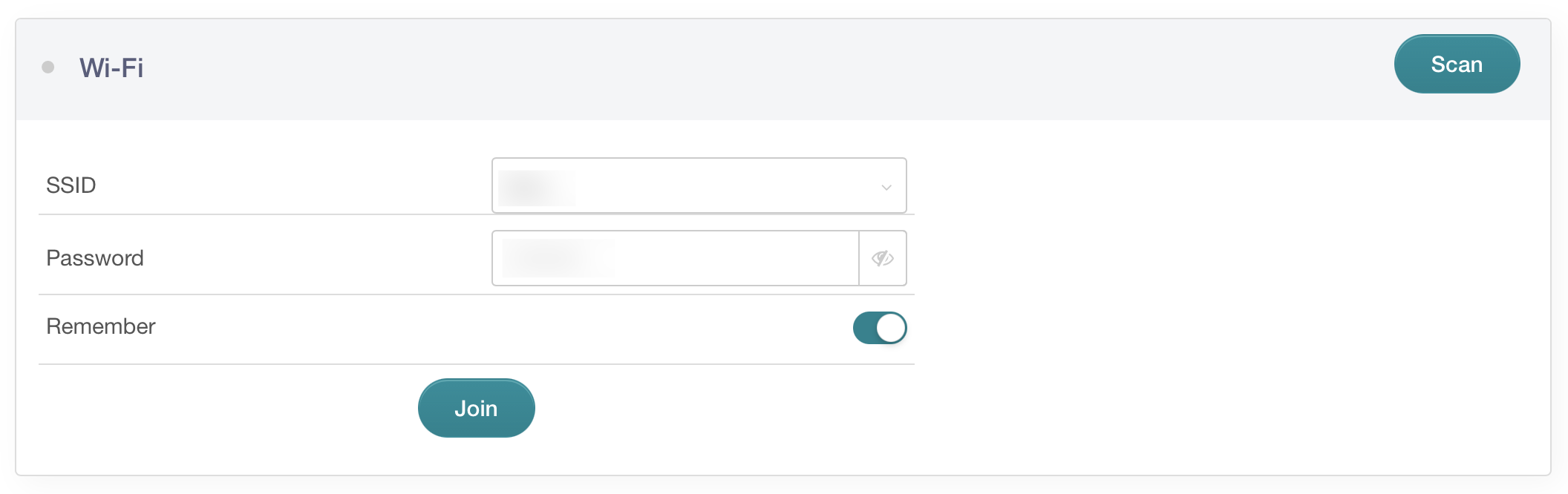
Now you’ve reached the admin portal. The goal is to make the GL.iNet extend (or repeat) an existing WiFi network. Click “Scan” in the Repeater area to set this up.
Use the dropdown menu to select the SSID of the WiFi network you want to repeat and enter its password.
Wait a few seconds and you’re done. Seriously. It’s that easy.
I checked the Nanit app and… boom. Live video.
This worked beautifully for extending the hotel’s WiFi network. If you have access to an existing router it’s even easier. The entire family recently took a trip to an Airbnb in Carmel which had a bunch of eero routers. I simply connected the GL.iNet (gosh that’s a bad name) to an open ethernet port on the eero and I was done. Both Nanit cameras automatically connected to the GL.iNet’s network. Zero configuration. Zero frustration. Two sleeping kids.
I highly recommend purchasing one of these for your next trip. Your family will appreciate all of their devices instantly connecting to the internet.
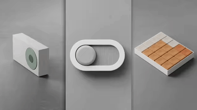
I recently read an article on Fast Company titled “These charming tools are a radical vision for how you’ll use your computer.” The article discusses a concept created by Approach Studio that asks the question: What if we updated physical interfaces for the digital ages? How might they look different? I watched the video and gifs several times and reflected on why I appreciate certain physical products: tactility.
One can appreciate, grow attached to, or even love the way certain products feel when interacting with them. For example, pressing the start engine button in a car you enjoy driving, turning a knob on a coffee grinder, or even feeling haptic feedback after tapping a button in a beautiful mobile app. Think about the power button or switch on a product that is a part of your life. For example I vividly remember the switch on the back of my Mac LC and the button on my dad’s Performa 6115. Each had a particular feel and sound that contributed to a moment of anticipation before the old Mac OS startup chime. (Of course that sound sometimes meant dread if I was waiting to use Microsoft Word for writing an
English class essay.)
Approach Studio goes further than presses and sounds by bringing concepts we have learned since the dawn of mobile computers out of the digital and into the physical. These demos are easy to quickly scroll through, but I want you to take a moment to reflect on how each can be an improvement to the home.
Image credit: Approach Studio
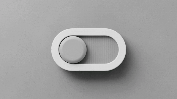
First, think of a typical switch that you flip every day. Perhaps a small and subtle light switch or an old thermostat’s mode switch for example. Now imagine a switch that provides colors to indicate its state, has a slight tension as you slide it, and ends with a reactive bounce to feel alive. This would be more enjoyable to use because of its playfulness, and it would add character to your home with its aesthetics. (Ideally one would be able to customize the color. I’m not sure my wife would approve that shade of green.) Something in your home that you observe and touch every day should both look appealing and feel good to control.
Image credit: Approach Studio
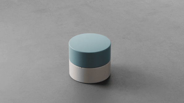
Next, think of some dials you turn. Fans, thermostats, stereos, etc. When the factory ships a product with dials they are a fixed size forever. What if instead a dial could adapt to specific tasks? This is reminiscent of Steve Jobs’ initial explanation of the iPhone’s large, multi-touch screen in 2007. Instead of fixed buttons which Blackberry, Motorola, Handspring, and Samsung phones had, the iPhone could adapt to different tasks. Approach Studio demonstrates this with a dial that grows and shrinks depending on how accurate the user needs to be in the moment. A small dial is ideal for a low number of options (adjusting a lamp’s brightness from 4 to 5), and a large dial is preferable when the user needs to be accurate (adjusting from 66 to 72 degrees on a thermostat). A dial that can grow and shrink depending on the user’s needs can allow one dial to control multiple products.
Image credit: Approach Studio
Lastly, if you are currently on a laptop and desktop computer, try hovering over a few links or buttons. Go ahead. The hover state is a subtle way computers can alert the user that there are more options behind this element, this area can be clicked on, etc. (In my opinion software designers occasionally rely too much on hover states that require the user to move the mouse to an element before discovering additional options. Designers also occasionally place crucial functionality behind a hover state that is inaccessible on touchscreens. This is solved by assuming that the user is OK with being forced into the hover state after a tap which makes touchscreen users less efficient. Tap and hold? That doesn’t work either because Safari and Chrome have built-in functionality for tap and hold. Basically, avoid using hover states.) However, when used properly, hover states can add delight and surprise to an interface.
Now imagine if physical objects had hover states similar to software. Not only would they feel alive and fun, but they would also have more accessible buttons. Your finger would travel a shorter distance allowing you to press more buttons in less time. This could start with Microsoft Excel experts who need to enter data quickly, and it could lead to other innovations in the home. Arming and disarming a security panel for example. Of course the trend is to slap screens on everything, but products that are designed for specific purposes could be improved with this innovation.
I would love to see some of these ideas incorporated into a future elgato Stream Deck.
Last year I convinced the family to dress as Steve Jobs for Halloween which included my 1 year old daughter wearing a very cute pair of tiny New Balance shoes. While holding my daughter (who was chomping on an iPad nano from my Apple Collection) and posing for photos I remembered and reenacted a very specific moment from the iPhone keynote in 2007. Jobs’ presentation remote stopped working, and he had to kill time on stage while people backstage fixed the problem.
He told a quick story that I believe was also discussed in Steve Wozniak’s book, iWoz, where Wozniak built a device that disables nearby TV antennae (it’s hard to believe all TVs used to have them). They pranked students in UC Berkeley dorms by tricking them into thinking awkward poses while holding the antennae would fix the TV’s reception. Jobs demonstrated one such pose for just a second before learning that his presentation remote was fixed and continuing to talk about the iPhone.
You can watch Steve tell this story and catch the pose starting at 1:15:16.
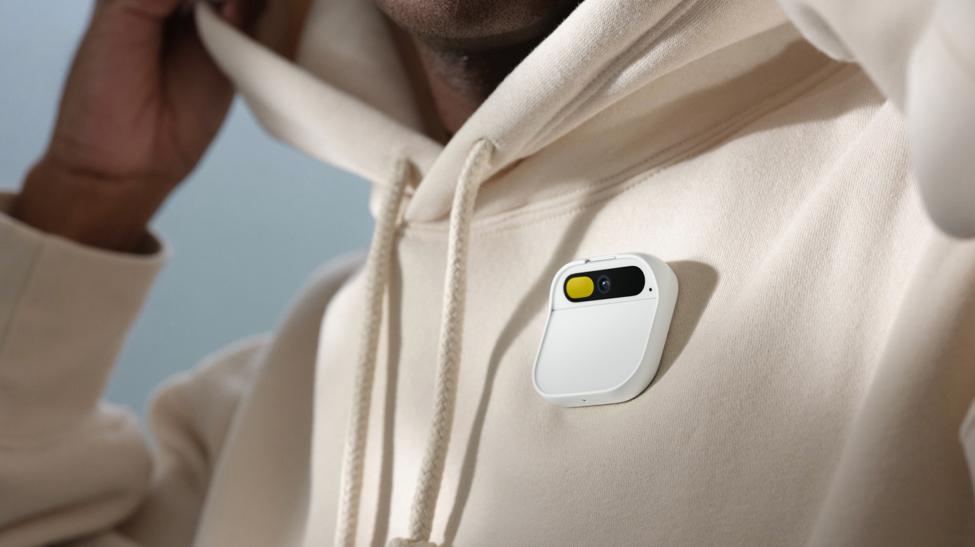
It’s beautiful. The team at Humane deserve tremendous credit for building something with such precision and a keen sense of aesthetics. The design of the Ai Pin and its peripherals like the charging case, attachment options, and battery booster is inspiring. When one reflects on the intersection of fashion and technology only a few companies and products come to mind: Sony with the Walkman, Apple with the iPod (of course), Beats Electronics with the Beats by Dr. Dre Studio headphones, and others. Perhaps Humane will join this list.
I am seriously considering purchasing an Ai Pin. However, I have some questions and concerns:
Using the Ai Pin requires telling everyone a new phone number. This means I will now have two phone numbers: one for the iPhone and one for the Ai Pin. I am obviously not giving up my iPhone anytime soon. This is reminiscent of the 1990s when people had car phones. To reach someone one would call a house line and then a car line. To be honest this was not super common, but I recall a few friends and relatives who had car phones.
How can I see and share photos? I have kids, nieces, and nephews now! Leaving my iPhone at home means no more sharing to iCloud Shared Albums or seeing updates in albums I’m a member of. I’m fine giving up Instagram or waiting until I’m at a computer, but shared albums are too important at the moment. Grandmas need to see photos of their grandkids! I suppose I could take photos with the Ai Pin and then instruct it to send them to the grandmas via text. What about cousins and aunts and uncles and friends?
Organizing the family with my wife is a full-time job. We constantly text each other to ask for help, make suggestions, send reminders, etc. That will become much more difficult without a keyboard. Perhaps we can rely on the Apple Watch to accomplish this?
The Ai Pin lasts only four hours before recharging, so it’s crucial to carry around an extra battery booster (or two?) that is charged. This means one must be vigilant with charging the battery boosters every day and also carry them around. This seems doable on a workday when I have a backpack, but what about the weekend? Currently at the end of the day I place my iPhone and Apple Watch on the MagSafe Duo Charger on my nightstand. I suppose I will need to make space for the Ai Pin charger which can charge both the Ai Pin and one battery booster. What about an extra battery booster? I’m genuinely concerned with this balancing act.
I could go on but the point is clear: the Ai Pin raises too many questions. It seems daunting to make such a drastic change to my daily life. One can argue how additive it is, but it’s certainly also subtractive. Do the AI features outweigh losing access to apps and a screen? How much will my productivity decrease? Is there a future I cannot see yet where AI supercharges productivity more so than innovation in today’s apps?
Take a step back to the late 1990s. We transitioned from encyclopedias and landlines to modems and pagers. Accessing information was limited and cumbersome. Then the cell phone arrived and it was purely additive.
For music we had cassette tapes, CDs, and eventually mp3s. When the iPod arrived we already had computers, a Firewire port, and a collection of mp3s. Most importantly we listened to digital music. Not only was the iPod additive, but it also enhanced an activity we already knew and loved. We were accustomed to carrying around devices that could play music too. The iPod merely replaced them.
The Ai Pin is a drastic change. I predict that the majority of buyers will continue to carry their mobile phones for the foreseeable future. Maybe by 2025 we will see the beginning of a transition to the Ai Pin as a sole device, but Apple and Google will continue to innovate and keep us hooked. Is hooked the right word? It seems too negative for how we perceive our phones.
It’s important to note simply saying that the Ai Pin will improve over time as its AI capabilities develop is not a strong argument. OpenAI’s ChatGPT, Google’s Bard, and others will also continue to innovate and become a deeper part of all the apps we use today. That could make our mobile phones even stickier. We have not even seen what Apple is working on regrading the latest and greatest with AI.
I have a decision to make. Meanwhile I’m so excited for the future.