Designing and shipping production software with AI agents
Fujifilm X-T4
The camera that made me love shooting again.


In under a year I designed and shipped a native macOS app to the Mac App Store, a browser extension to both the Chrome Web Store and the Mac App Store, three open source components into the shadcn registry directory, a web app, a three-device voice memo pipeline, and the site you are reading, which received 1,020 updates in its first 14 weeks. I designed every pixel, and AI coding agents, mostly Claude Code, wrote nearly every line of code.
By day I am a hands-on design leader. This is the after-hours proof of what that means now: a designer with (self-proclaimed) taste and a set of clear opinions can carry an idea all the way to a store listing without waiting for an engineering team. The craft did not get cheaper; it moved.
The early years
When I was young I was fortunate to have parents drag me to small art galleries in San Francisco most weekends, and as a result I believe I subconsciously developed an understanding of beauty and craft early. When a Macintosh LC arrived in my home, I poured myself into every pixel, folder, and Control Panel. I insisted that my summers should be spent learning how to use Photoshop and other complex applications like Strata, Director, and Bryce.
Fast forward to college where I studied Economics and Computer Science, and after graduating I quickly joined a startup in Palo Alto, CA to work as a QA engineer. The startup’s focus was home automation and home security, and going truly deep in the space required learning to expertly build systems. I cut and stripped speaker wire to assemble security panels, installed complex setups in homes, and performed thorough competitive analyses. At one point my tiny apartment had three live security systems.
When the startup hired its first designer, I immediately volunteered to help him with small tasks. I was hooked. Designing simple interfaces to accomplish complex tasks came naturally, and, perhaps equally important, writing detailed specification documents felt joyous. My title was updated to “UI Designer” and a career was born.
As a designer my career has traversed home security, home automation, social networks, 3D photography, Bluetooth beacons, and enterprise platforms. I could effectively design software but not build anything beyond my own websites. When agents arrived I finally got to test a hypothesis: if the code is no longer the bottleneck, then taste, direction, and stubbornness about details should be enough to ship real software.
A key lesson from my design experience is people want to get work done, not wrestle with software. As a result I am obsessive about reducing complexity, and allowing people to maintain focus on their primary task.1 This approach especially applies to my projects, which replace manual and complex apps or processes with something fast and simple:
- QuickTake replaced a decade of notes apps that never fit. Obsidian, Tana, Reflect, etc. All heavy apps riddled with distracting features.
- Intake replaced the laborious ritual required for updating my blog: copy text, switch apps, paste text, fix formatting, save images, move images, and write image paths. This ended most blog posts while they were still browser tabs.
- DK components replaced work for others that lived and died inside this site. The lightbox I fussed over most is now installable with one command.
- The site itself replaced a hosted blog where publishing felt like filing paperwork. Now Obsidian is the writing environment and
git pushis the publish button.
Each project tested my hypothesis against a different kind of risk: a platform I do not speak, distribution through two app stores, open source under other people’s scrutiny, and a production system I live in every day.
How the work gets made
Every project below came out of the same pipeline. An idea gets researched, Claude Code builds it, it proves itself on a private lab page, it survives review, and it ships with a push.
Three parts of the pipeline matter most:
- The lab. A couple of early problems I encountered with vibecoding were keeping track of experiments and quickly reviewing and iterating on a series of explorations. The lab houses these experiments before they are tested in context and published. It currently holds seventy-five sketches, and it is growing every day.
- The review. The agent writes the code, but the standards remain mine. I run the work through a stack2 of installed review skills, checklists for interaction craft, accessibility, forms, and performance, and I treat every finding the way I would treat a design review at work.
- The push. Every push regenerates the changelog, optimizes images, and rebuilds search. The friction of shipping is so low that the site has absorbed over a thousand updates in fourteen weeks.
QuickTake: a Mac app of my own
The first test was the hardest: a native app submitted to Apple’s review process. QuickTake is a notes and tasks app for a persona of precisely one person: me. The problem I am attempting to solve is enabling users to take notes and manage tasks within the same state. Tasks are global instead of trapped inside individual notes. With QuickTake one can hop between notes without losing sight of tasks. It is currently live in the Mac App Store.
Shipping it meant designing an app icon, learning about provisioning profiles and App Store review, and discovering that pixel-perfection in Swift is a different sport than an !important in CSS. Even attempting to change a sidebar text color resulted in a mountain of bugs. I have much more respect for developers than I did a year ago.
Intake: from browser tab to published post
The second test was distribution: a new store to learn about and a new set of icon considerations.
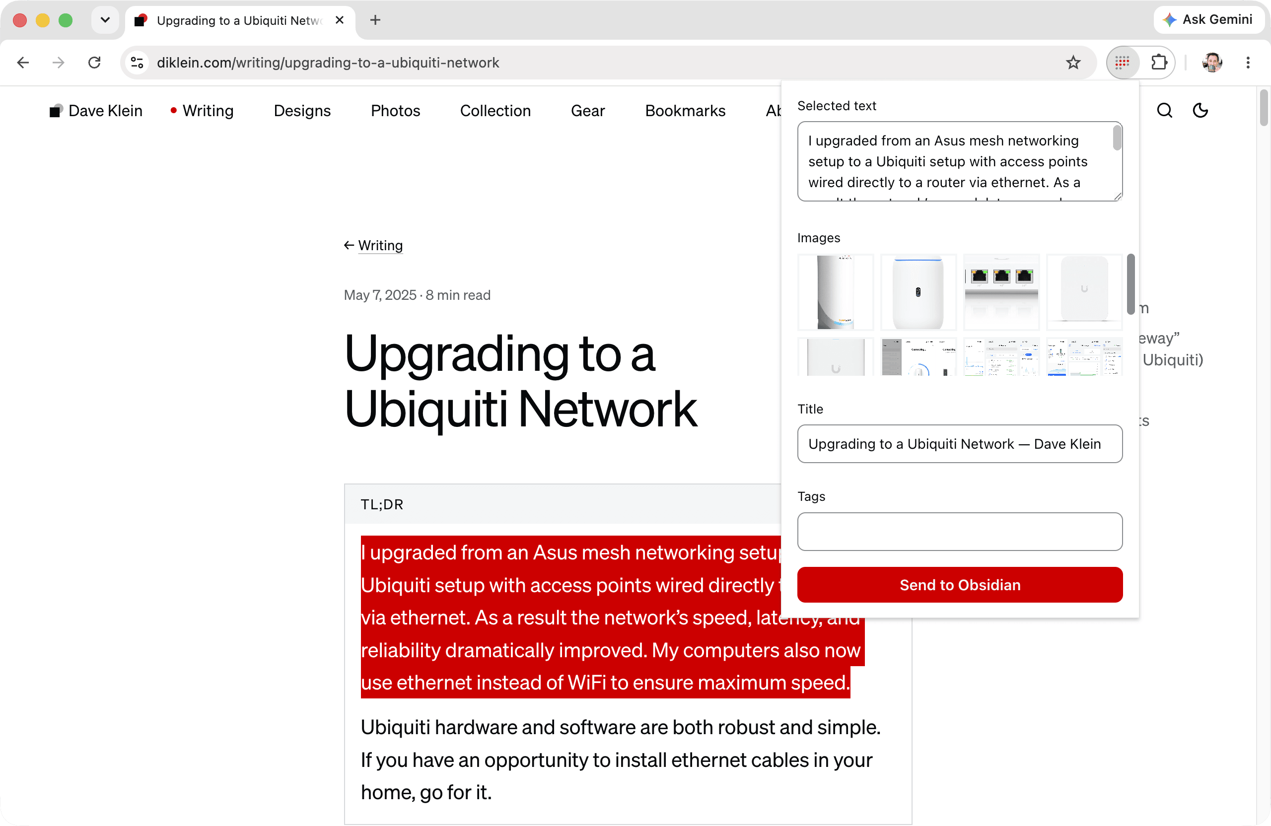
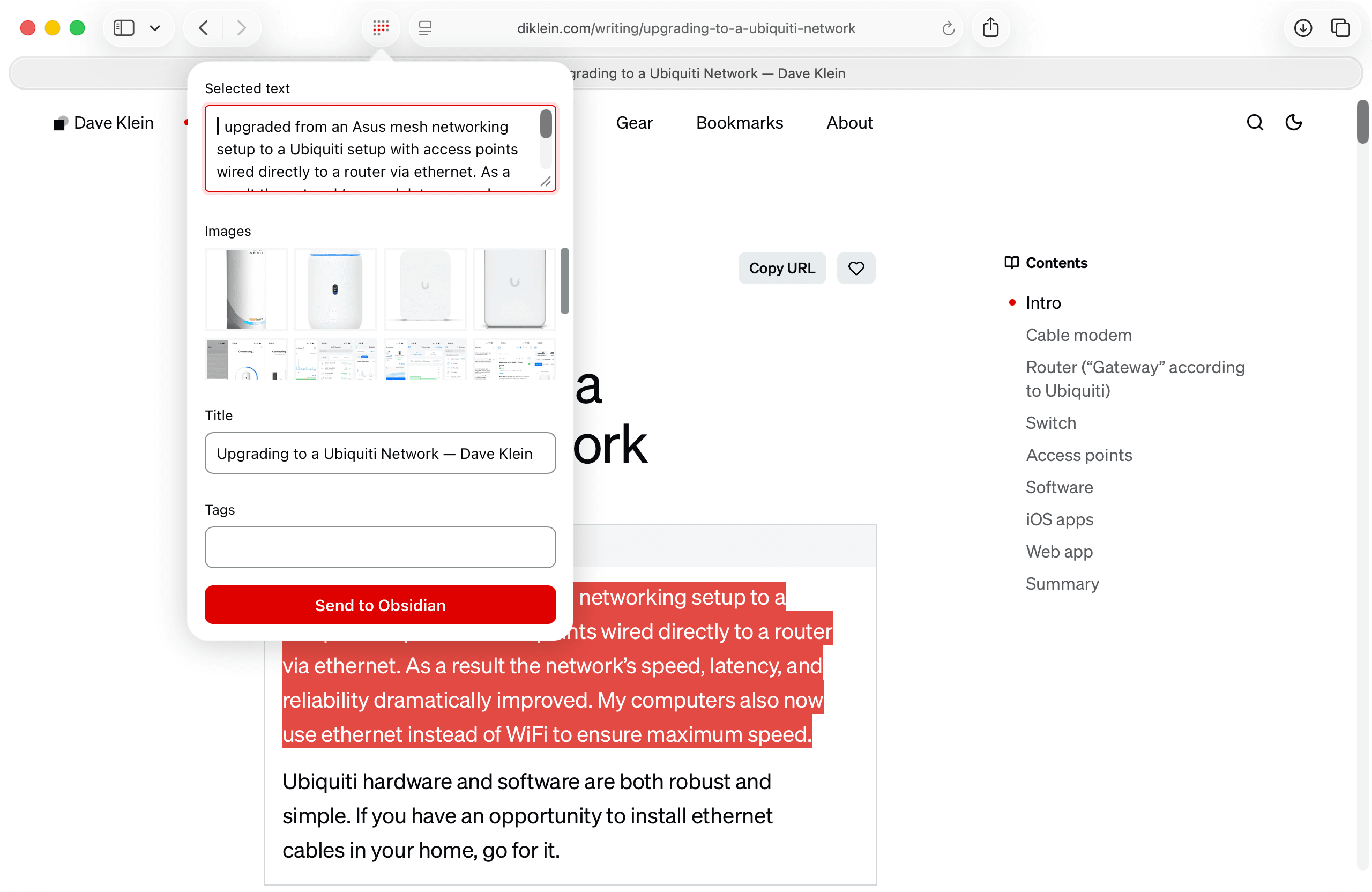
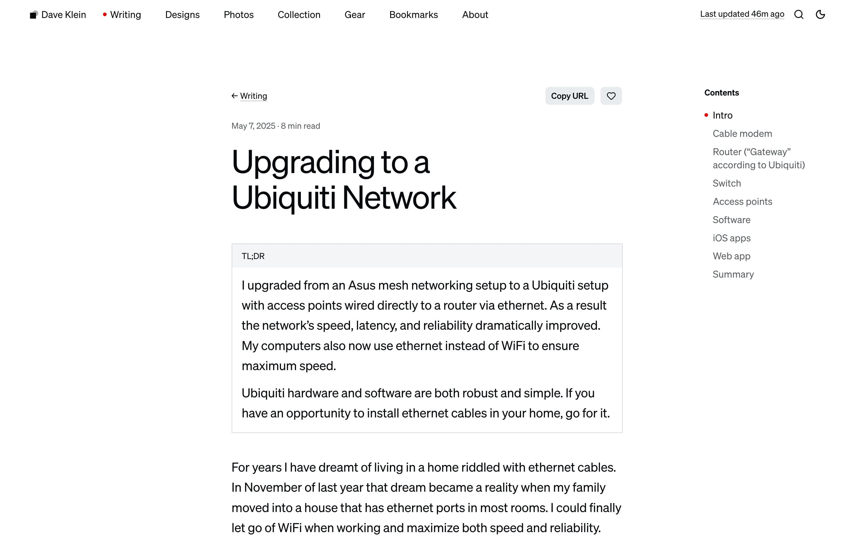
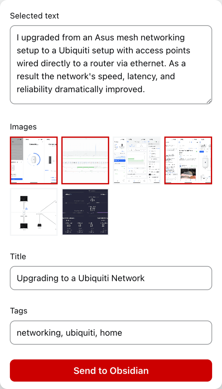
Most of what I write starts as a reaction to something I read in a web browser. The distance between “I noticed something” and “I wrote about it on my site” used to be long enough that posts died in browser tabs. My first extension, an attempt to automate the blog post creation journey, was a simple user experience but conceptually complex:
Intake simplifies both the design and implementation. Click the toolbar icon and the extension has already read the page: selected text I want to capture as a blockquote is inserted into an input, images can be added, and one click writes a Markdown file with templated frontmatter straight into the Obsidian vault. More importantly, files are no longer hopping around my hard drives. I believe it’s important for designers to consider the underlying structure when possible.
Intake is available on the Chrome Web Store and the Mac App Store. This required designing a full icon suite: a dock icon, toolbar marks for two browsers with unique sizing rules that also work in both light and dark modes, and store art. Every mark below is the shipped geometry.
DK components: pulling the plumbing out
The third test was scrutiny: sharing the most fussed-over pieces of this site with the world.
The DK prefix is an homage to NeXTSTEP’s NS. Each package is a piece of this site extracted, generalized, and distributed through the shadcn registry, where one command lands the source code in your project instead of living as a dependency.
DKMediaViewer
DKMediaViewer is the photo grid, lightbox, and carousel from my photos page. My goal was to create the ideal user experience for browsing photos: fast, fluid, and able to address the many ways people expect to navigate. For example, users may expect to navigate with arrow keys on desktop, swipe around on mobile, hit the escape key to close the overlay, etc. This demo is the real installed component, not a screenshot.
DKBezeler
DKBezeler bakes raw screenshots and screen recordings into device bezels from the command line. I used to add bezels by hand in Figma with a PNG frame that had a transparent hole where the screenshot went. This was an occasional nuisance considering screen sizes change and new bezels have to be downloaded. For videos this was a non-starter. DKBezeler now draws the bezel itself, from the millimetres on Apple’s dimensional drawings, for whichever iPhone took the capture. Nothing is downloaded, and a new phone is a few numbers.
My goal was to completely automate this task. If I want to add a screenshot or screen recording to a post or page, DKBezeler dresses it up before publishing, saving me time and guaranteeing pixel perfection. The decreased friction ensures I do not hesitate to add assets to the site.
DKProductCard
DKProductCard is my favorite invisible trick: paste a bare Amazon link in a post and a remark plugin turns it into a product card at build time. The markdown stays a shopping list while the page becomes a catalog. This allows anyone to quickly capture a series of Amazon URLs and not worry about rendering them as elegant cards.
All three live under the @diklein namespace in the shadcn directory. Getting there was its own lesson in understanding a community before contributing to it, covered in the failure stories below. Seeing my name in an infrastructure repo’s directory file still makes me smile.
This site: where it all comes together
The last test is the one you are running right now. This site is where the pipeline lives: a Next.js application that doubles as the publishing system for everything above. Obsidian is the writing environment, the vault is the repo, and every push is a release.
The ⌘ K palette searches every page and post, but I built it as much for navigation as for search. Checking the site’s Lighthouse scores after the weekly Sunday run used to mean navigating to About, scrolling down, clicking View dashboard, and clicking the Scores tab. Now I type scores and hit enter.
The photos lightbox is where I spent an unreasonable number of evenings on spring curves most people will never consciously notice. It is exactly the kind of work I love, and it is the work that became DKMediaViewer.
Behind the pages, small pipelines run on their own: a launchd agent watches for iPhone captures and bakes them into bezel frames before they reach the repo (DKBezeler), a nightly GitHub Action snapshots my bookmarks and Unsplash uploads, an iOS Shortcut posts my Kindle reading progress to the home page, and AI writes alt text, review notes, and Open Graph images on the way to production. Lastly, a weekly sync pulls Lighthouse scores from Google’s PageSpeed API into a public scores dashboard; 100/100 is the standard.
Three more, for the fun of it
P3 — Won’t Fix
As a designer I am keenly aware of UI bugs. I show them to my wife who patiently listens to me talk about how many pixels an interface is from perfection. P3 — Won’t Fix is a public gallery of software bugs I assume product managers closed as “won’t fix” (I have extensive experience with this). Anyone can submit a screenshot and, if it’s good, I publish it. It was my first real web app: a full submission pipeline through Vercel Blob, built to learn what modern web apps actually feel like to operate. If you see a P3 on this site, please let me know.
AtEase
In middle school, most Macs ran AtEase, an alternative interface for accessing applications. My version of AtEase is a macOS app with a companion iOS app and a headless Mac mini doing the thinking between them. I speak into Monologue for reliable transcriptions, and the transcript syncs through Monologue’s own service. Every five minutes my Mac mini polls that service through the Monologue CLI, and a new memo wakes an AI librarian that files each transcript into a shared vault as Markdown: ideas, tasks, and shopping items, sometimes splitting one rambling memo into three tidy notes. By the time I sit down at the MacBook Pro, iCloud has synced my new thoughts, already categorized, tagged, and linked.
Chaining tools together like this is an old obsession. It shows up whenever a goal sits one tool short of possible:
- Watching a movie and listening to a podcast at the same time
- Looking great on Zoom
- Shooting with a 1994 Apple QuickTake in 2025
- Connecting a Nanit camera to any WiFi network
- Posting my Kindle reading progress to this site’s home page
AtEase is the same instinct with AI in the chain.
The sketchbook
Below are three running exhibits, shown exactly as they live in the lab.
The magnetic pull
Every link and button eases toward the cursor on a soft spring and snaps home when it leaves, one set of physics applied across a whole nav. This was part of an exploration in micro-interactions. Even though I did not ship this, it was helpful to imagine, experiment, and feel what is possible.
Hover over each element and watch it lean towards the cursor
The mark
Controlling Blender through Claude Code feels magical. I explored a variety of ways to animate the site’s mark as a 3D object. This iteration starts at triple speed and slows as the mark settles into place.
The beacon
I explored many directions to make the home page feel alive. This iteration lays a faint field of dots over the site’s 12 columns, and one red node pulses and hops from dot to dot. These explorations helped lead me to an inevitable conclusion: do not add this amount of animation to the home page. Elements can stagger into place, but ongoing animations that distract from the primary task (reading) should not be included.
I design software and lead a team of designers at ServiceNow, focusing on tools to track and improve data quality. Outside of work I collect Apple products, snap photos, and write about tech. Every pixel counts.
What went wrong
Shipping real software means real failure stories. Here are three fun ones.
I woke up to a full hard drive. One night I handed the agent a large task and went to sleep. By morning my MacBook Pro had no free space left! Somewhere in the overnight set of tasks, approximately 250 gigabytes of data got written to the hard drive. Bedtime runs with Fable now have a tighter leash.
I approached the shadcn registry incorrectly. To get the DK components into the shadcn directory, I opened a separate pull request per component against shadcn-ui/ui. The better move, which shadcn himself helpfully explained in review, was a single diklein namespace registry that carries all of my components and any I ship in the future. That conversation reshaped the whole entry, and the namespace is what merged.
A throwaway page broke every deploy. The photos lightbox used to draw a border around each photo in that photo’s own dominant color, an effect I later replaced with the subtle neutral border it wears today. To check the results while tuning it, I vibecoded an internal page that computed the border for every photo in the library and laid them all out for one side-by-side review. It worked, but the way it read the image files convinced the build system that the page might need every image on the entire site. The build tried to ship all 1.14 GB of images with that single page, far over Vercel’s 250 MB limit. Deployments began to fail until I tracked down and deleted the one throwaway page.
Results and impact
- QuickTake is live on the Mac App Store.
- Intake is live on the Chrome Web Store and the Mac App Store.
- Three open source packages are on npm under @diklein, distributed through the shadcn registry.
- 1,020 shipped updates to this site in its first 14 weeks.
- 100/100 Lighthouse is the maintained standard, verified by a weekly PageSpeed sync to the public dashboard.
- P3 — Won’t Fix is live and accepting public submissions.
Lessons learned
- Deciding what not to build matters more than ever when build capacity is effectively infinite. Taste is the differentiator now, not access to engineers.
- The agent writes the code while the standards remain yours. Every “good enough” the model offers is a design review you are either holding or skipping.
- Store review, code signing, and provisioning are where solo shippers can get stuck. Fortunately Claude can help with these steps.
- Defaults are stale. Most of the delight in software you admire is custom-built, and now I know that firsthand because even the obvious animations had to be built.
- Building an app is an opportunity to build an extension of yourself. Your ideas, your preferences, your taste.
Footnotes
-
At Cornell I collaborated with two PhD students to study how people interact with primary and secondary interfaces. The result was a set of heuristics for designing software: Context of Use Evaluation of Peripheral Displays. I was fortunate to travel to Rome and present the research to hundreds of students, professors, and researchers at Interact 2005. ↩
-
I wrote about that stack in My Claude Code skill stack. ↩
Case studies
- Designing and shipping production software with AI agents
- Leading AI-first accounting
- Leading an AI-first mobile vision
- Designing and self-publishing a photography book
- Leading the Einstein Copilot launch
- Leading the Mobile Builder team
- Leading the Salesforce Mobile App platform redesign