For work I recently swapped my 2015 MacBook Pro for a 2019 Mac mini. As a result of transitioning into management I no longer need to worry about graphics cards and Sketch performance. The Mac mini is small and quiet (just like my new iPhone 12 mini).
Naturally I placed the Mac mini next to my LG 5K monitor. However, I recently observed that my monitor is far too low. A computer user’s eyes should point at the center of a monitor. After attaching my digital camera for proper video conferencing, the monitor was pushed to its lowest height setting. Every time I push it up it slides right back down again. Time for a new desk accessory.
When I reminisce about my Dad I focus on this one story when he was Executive Vice President, General Counsel, and Chief Administrative Officer at Lewis Galoob Toys Inc.
In 1990 Galoob announced a product called Game Genie and Nintendo wasn’t thrilled. The product allowed you to hack games with codes that dramatically altered the rules of the game. For example, in Super Mario Brothers you could enter a code that gave you the ability to fly instead of run. Or you could play the entire game with the Raccoon Suit.
Nintendo sued Galoob to try to prevent Game Genie from being released. My Dad represented Galoob in the lawsuit. He successfully argued that Game Genie’s changes were temporary, and did not create a new version of the game which would be copyright infringement.
Judge Smith has now ruled that Game Genie does not create a derivative work and that consumers would not be infringing Nintendo’s copyrights if they used it. And since the consumer is not infringing, Galoob is not contributing to infringement, Mr. Klein said. The judge also lifted the injunction against sales.
After the lawsuit my Dad came home with a box of Game Genies that I could take to school to pass out. I was a hero.
If you ever come to my house I’ll show you my mint Game Genie that is still in the original box. (It’s important to note that this is separate from my Apple museum.) My wife does not understand why I need the box. This might be the most contentious and entertaining part of our marriage.
Halide Mark II was released as a follow-up to the best iOS camera app in the App Store: Halide.
Usually a v2 of an app or product comes with some new features and a surprise or two. The Halide team, however, created a 10-part newsletter to demonstrate how to use the app. I love when a team dedicates resources to education and fun. Most teams would settle for in-app screens or perhaps a video. A newsletter that finishes with a shareable artifact is clever and innovative.
I recommend reading the Halide team’s incredibly thorough blog post about Halide Mark II as well.
Before the event I was skeptical that I would be excited by the announcements. My iPhone 11 Pro is perfect. It’s just as fast as it was the day it arrived. The camera is amazing. The battery life doesn’t seem to be degrading. In the days of the iPhone 4 and 4S you saw significant speed jumps year over year. Those days are gone.
iPhone 12 mini right? Or Pro? No definitely mini. I think…
5G
I was skeptical about 5G. It’s not rolling out nationwide yet (although one could’ve made the same arguments about LTE). Apple is usually late to these transitions too. The original iPhone didn’t have 3G when most phones did. Apple also waited an extra year to add LTE to the iPhone. I recall this being the right decision because coworkers’ LTE-capable Android phones were dead by 2pm.
I rarely leave the house these days. Who cares about 5G? We’ll be stuck at home for another year thanks to COVID. WiFi is what matters. That’s why I need to figure out which WiFi 6 router to purchase. Yes, Eero has one now, but I’d rather throw away all of my Eero products since Amazon owns them. Time to get on the Ubiquity train.
Mini
The big surprise for me was the iPhone 12 mini (it looks like it’s supposed to be a lowercase “m” based on Apple’s copy). I suppose it wasn’t a surprise but I don’t trust the rumors (I’m still waiting for that Apple pager rumored in 2001). I’ve wanted a smaller phone for years. I even picked up an iPod touch last year to run with. Typing on a smaller screen is certainly more difficult, but it’s so much lighter in your pocket. In the old days you could actually reach the upper left corner without maneuvering the phone through your hand. Hopefully those days have returned. The question is 12 Pro or 12 mini?
MagSafe
MagSafe, like the breathing sleep light and the hardware battery meter on the old PowerBooks, was a welcome innovation. I’m glad to see its return. However, in typical Cook era fashion, it’s not included! You must purchase a $39 cable in order to take advantage of this new charging feature. Fine. I’ll give in and also purchase the new Watch and Phone charging mat. I suppose this is what the AirPower team was able to come up with.
I’m also excited about the ecosystem of stick-on products that will result from MagSafe coming to the iPhone. I can imagine lots of wallets being retired.
Camera
The Pro vs. mini debate requires a hard look at the camera. Yes, the mini’s wide (read: normal) camera lens has a larger aperture, but you lose the telephoto lens which I use often. I suppose I’ll just need to zoom with my feet.
The mini also misses out on Apple’s no ProRAW functionality. I’ll need to wait and see what this means for Halide which I use whenever I want to take a serious photo.
Display
It’s great to see the Pro’s screen slightly increase in size. The 11 Pro has a 5.8” inch screen while the 12 Pro has a 6.1” screen. I honestly can’t imagine going back to a Max. It’s a behemoth now at 6.7”. Transitioning from an 11 Pro to a 12 mini will see a drop from 5.8” to 5.4” in addition to being thinner and lighter.
I’m a bit disappointed to not see 120hz come to the iPhone yet considering its been available on the iPad Pro for a few years now. Next year?
Shape
YES. Hard edges. We’re back to the iPhone 4/5 era also known as the “ice cream sandwich” shape. The curved edges are just a bit too slippery. If you read enough books about Apple you’ll learn that the iPhone 4 shape was the goal when the iPhone was first being developed. It just took a few years to get there. As a product designer it’s important to learn that v1 may not be your dream interface. It may take a couple years to get to the vision. Learn to live with this reality.
In the box
Good on Apple for removing the wall plug. Bad on Apple for not including a USB-C plug one time to help the world with the transition to USB-C.
Order
At this point I’m leaning towards a 12 mini with 256gb of storage. If the camera really is comparable to the 11 Pro I should be fine. Right?
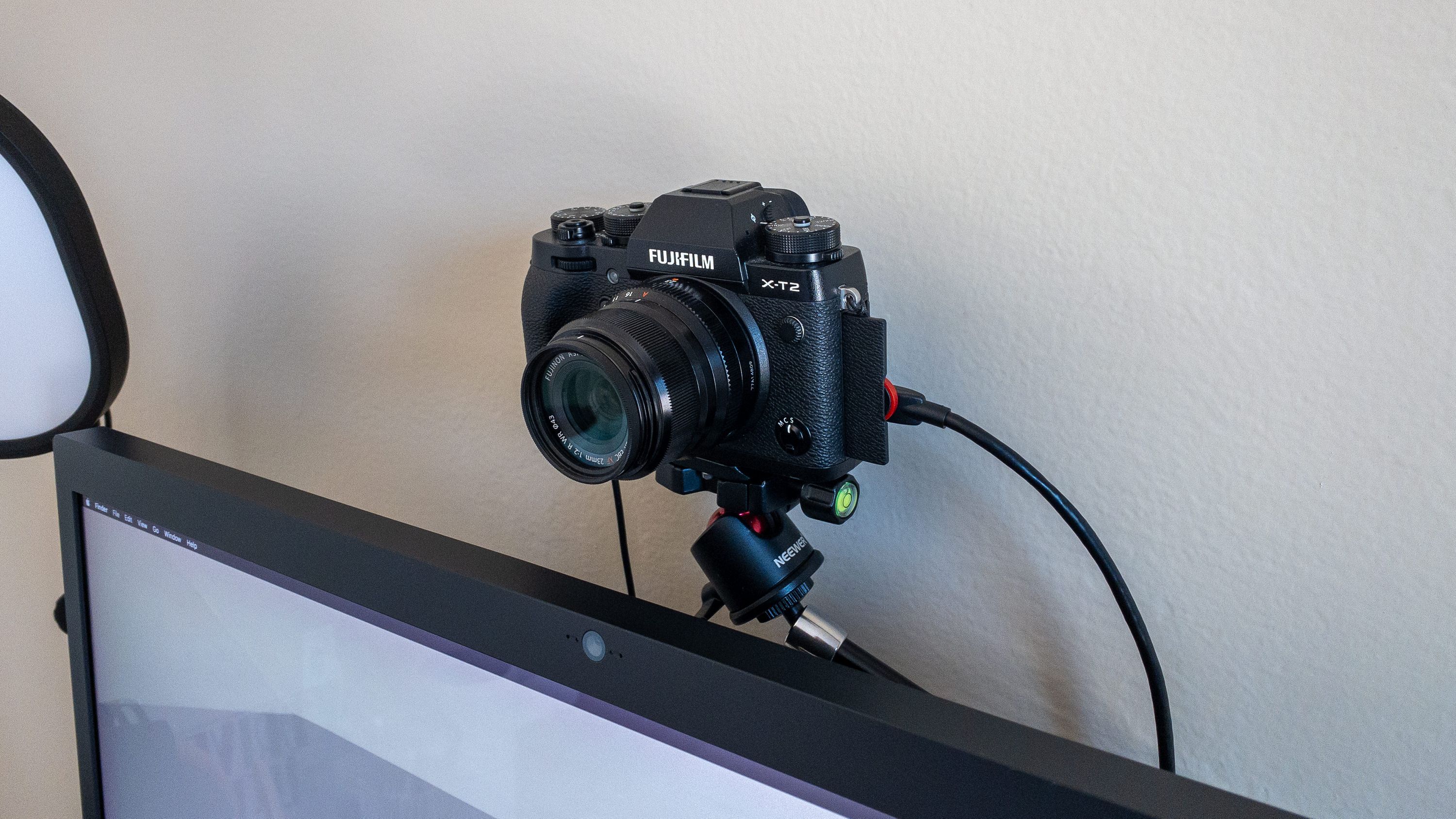
With a few products you can create a professional, lifelike appearance by connecting your fancy digital camera to your Mac and using it as a webcam.
My WFH setup. It might be time to retire the LG UltraFine 5K Display.
Due to COVID-19 we are all working from home this year, and, in the future, we will probably rely more and more on video calls to be safe and healthy. I’ve seen many articles with quick ways to improve your video quality: mount a tiny selfie light, connect a tiny external webcam, etc. This is like slapping a spoiler on your trunk and expecting to drive faster.
Recently I began exploring how to construct a setup similar to what executives use at home. The goal is to achieve a crisp image with an elegant bokeh effect behind my head. To achieve this you need a real camera, and a substantial light source if your room does not smother you with daylight.
Below is the list of products I used to build my setup. Do not fret upon looking at it. The goal for this post is for you to understand why each item is necessary.
Digital camera
Wide angle lens
Micro HDMI to HDMI cable
Camera AC power adapter
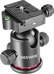
Neewer Metal 360 Degree Rotating Panoramic Ball Head
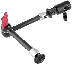
CAMVATE Upgraded 11″ Magic Articulating Arm
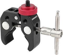
CAMVATE Super Clamp
Elgato Cam Link 4K
Elgato Key Light Air
Optional: Blue Yeti Microphone
Put it all together and you can look like me (stunning).
Camera
First, you need a digital camera and a wide angle lens to capture that gorgeous punim. I’m not going into detail about which camera to purchase because buying a camera is such a holy decision. Canon, Sony, Nikon, Fujifilm… there are many options and it’s something one should carefully consider. I’ve read a few articles that recommend the affordable Sony Alpha a6000, but hopefully you have a camera already so we can skip this part.
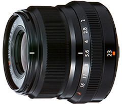
I use the Fujifilm X-T2 (latest model is the X-T4) with a 23mm lens (35mm equivalent with crop factor). You want a somewhat wide angle lens to ensure that the camera captures more than just your eyes and
mouth. A wider lens will capture your surroundings similar to your computer’s built-in camera.
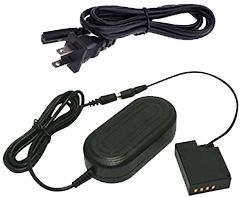
To avoid charging and swapping batteries every day, many cameras can use a trick battery that connects to a power outlet. One side looks like a battery, and the other side plugs in to the wall.
Double check your camera manufacturer’s website to see if your model can output video over an HDMI connection. Otherwise it may be time to purchase a new camera (again, not getting involved, but I’m very excited for you if that’s the case).
Take a breath. This is where things get mechanical.
Mount
You’re holding your camera now and thinking, “Dave, how can I get this thing to sit still and point at me?” My goal when I began this project was to mount my camera above and behind my LG UltraFine 5K
display. Sure, you can use a tripod and place your camera next to your monitor. The problem is your teammates will see the side of your face instead of looking your eyes.
There are 3 components to this setup: a clamp, an articulating arm, and a ball head. The clamp grabs on to your big monitor, the articulating arm allows you to raise and lower the camera, and the ball head can help you angle your camera so it’s pointing precisely where you want.
Fortunately, you can mix and match products from various companies because the method for connecting cameras to accessories is standardized. I went with a combination of Neewer and Camvate.
Neewer Metal 360 Degree Rotating Panoramic Ball Head with 1/4” Quick Shoe Plate
It’s important to put this little metal concoction together before worrying about your camera or display. Connect the ball head to the articulating arm. I’m aware that I awkwardly put this together.
Connect the arm to the clamp. Again, I am not smooth with this.
Twist all the levers to get an understanding of what they adjust. Loosening the arm’s lever allows the arm to expand and contract. Loosening the ball head’s lever allows you to spin the ball where the camera will eventually attach. Am I a hand model now?
Once all 3 pieces are screwed together, attach the clamp to the back of your display. Make sure it’s tight to ensure it doesn’t lean over when your camera is attached. Next, we’ll connect your camera to your computer.
Connect
The Fujifilm X-T2, like many other digital cameras, has a micro HDMI port. Use the micro HDMI to HDMI cable to connect your camera to the Elgato Cam Link 4K. Then, connect the Elgato Cam Link 4K to your computer. I’m using a 2015 MacBook Pro which has USB-A ports. If you have a newer MacBook you will need a USB-C to USB-A adapter to connect the Cam Link to your computer.
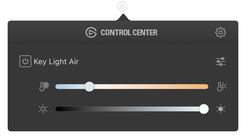
Light is what truly sets you apart from your coworkers. Even with great daylight, a strong, standalone light close to your face is crucial to improve video quality. Due to a desire to somewhat control the budget of this project, I went with the Elgato Key Light Air over the larger and brighter Key Light.
The one significant downside to the Key Light Air is its stand. Your desk must be larger enough to fit the light. The more expensive Key Light uses a clamp to connect to the back of your desk which is more convenient.
The Key Light Air also has a great little menu bar app for turning on and off, controlling brightness, and controlling temperature (a warm yellow glow vs. a cool blue glow).
When setting up your light, you want it to face you at a 45 degree angle and a bit higher than your head for a cinematic look. To accomplish this place the light at the corner of your desk or next to your monitor. To go deep on lightning I recommend watching a thorough YouTube video: Cinematic Lighting Techniques.
The Key Light Air requires AC power. There is no USB power option.
Software
Surprisingly, configuring all of this only requires a couple clicks. There are two applications needed from Elgato’s website:
Elgato Control Center. This app sits in your menu bar and allows you to control the light.
Elgato Game Center HD. There’s one setting I recommend changing and then you can forget about this app.
Elgato Control Center
You’ll need to experiment with the Cam Link Air’s brightness and temperature settings to see what works in your environment. The example below demonstrates the light leaning a bit towards the cool side and full brightness.
Moments before I join a meeting I click the power icon next to the words “Key Light Air.” When the meeting ends I turn the light off since it’s a bit distracting while trying to think.
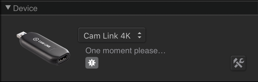
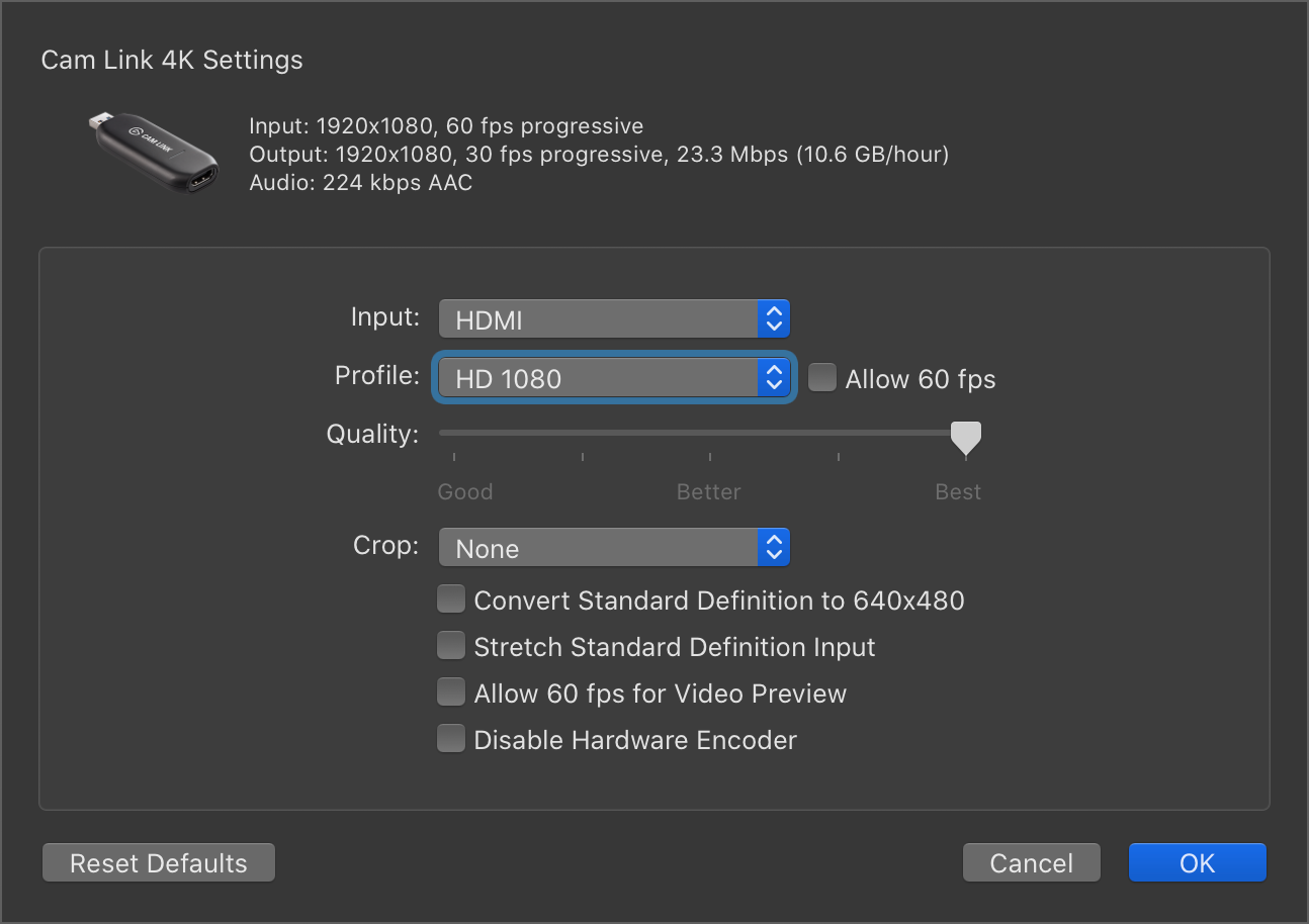
Elgato Game Capture HD
Game Center provides access to a few settings for the Cam Link. First, ensure the Cam Link is connected to your computer and then launch the app. Click on the small hammer/wrench icon in the Device area.
In the resulting popup menu, change the Profile dropdown from HD 720 to HD 1080. Click OK. You’re done. Quit Game Center. Forget it exists.
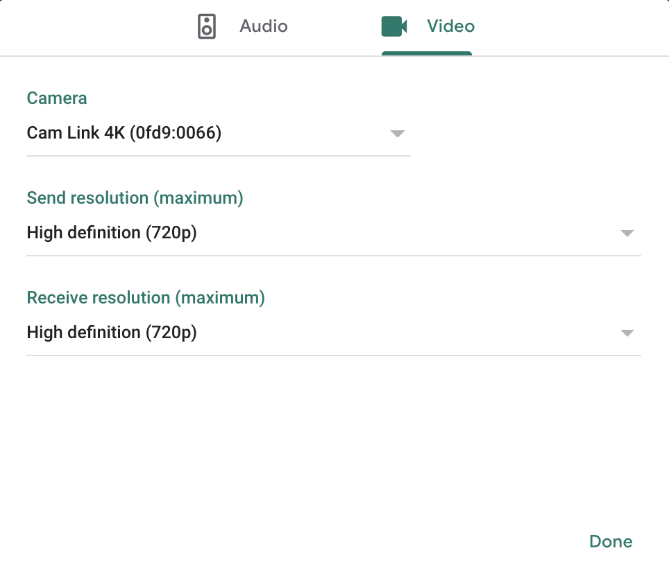
Google Meet
To change the camera source in Google Meet after joining a meeting:
Click on the ⋮ button in the lower right corner of the window.
Click on Settings.
Click on the Video tab.
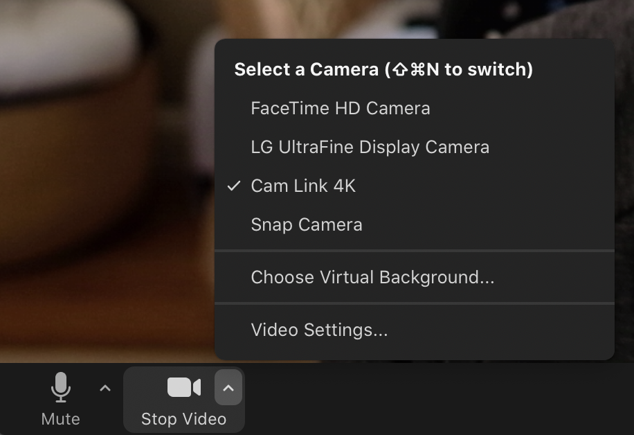
Click on the current camera in the Camera area. For me the current camera was “LG UltraFine Display Camera” since I normally use its camera.
Click on “Cam Link 4K” in the menu.
It’s OK if don’t see image in the preview area. You probably forgot to turn on your camera. I do this often.
Click Done and say “hi!” to everyone.
Zoom
To change the camera source in Zoom after joining a meeting:
Click on the little triangle inside the Start/Stop Video button.
Select “Cam Link 4K” in the menu.
Click on the little triangle again to close the menu.
Done. Now lead that meeting! Don’t be afraid to stick your neck out.
Camera Settings
There are a few settings I changed on the Fujifilm X-T2 to make this work. I also had to experiment a bit because one tutorial I read included incorrect information. I recommend searching for your camera plus the word “webcam” to see what settings you need to adjust.
Set the camera to video mode as if you were going to record a video.
Set aperture, shutter speed, and ISO to Auto.
Menu › Connection Setting. Depending on your camera’s firmware you will either see PC Connection Mode, Connection Mode, or PC Shoot Mode. On the next screen select either USB Tether Shooting Auto or USB Auto.
Menu › AF/MF Setting › Pre-AF set to On
Menu › AF/MF Setting › Face/Eye Detection Setting › Face Detection On
Menu › Connection Setting › USB Power Supply Setting set to On if available.
Focus mode set to AF-S.
I definitely did not have all of this memorized. I had to search for my camera’s manual and look up a bunch of these options.
Bonus: Audio
The focus of this post is clearly video, but high quality audio can also make a difference during conference calls. Please do not overreact. I will not lead you into a cave of audiophilia. The Wirecutter recommends a Blue Yeti microphone, and, coincidentally, that is the microphone I have owned for years to record a podcast that I have yet to record. However, if I were to purchase a microphone today, I would look to the Yeti Nano since the Blue Yeti is a bit large. Perhaps avoid the AmazonBasics Microphone.
One can experiment with microphones, stands, and articulating arms similar to what is discussed above. I will save you time and just recommend a USB microphone to avoid relying on your computer’s built-in microphone. An external microphone is not only more sensitive, but it can be placed closer to your mouth.
After purchasing and connecting your microphone, select it using the Google Meet and Zoom instructions above. The difference obviously is to select audio options instead of video options.
I recommend reviewing your microphones manual to ensure it is configured to focus on sources that are directly in front of the microphone. For the Blue Yeti this is named “Cardioid” mode, and the knob’s icon looks like a heart.
How to Watch a Movie and Listen to a Podcast Simultaneously
If you are a particularly nerdy individuals who enjoys watching movies while listening to director and cast commentary, you will love this. There are now podcasts that do the same! They start off with a few minutes of chit chat and you inevitably hear “OK here we go 3… 2… 1… play.” You click play on the movie at the same time and you’re good to go.
Blank Check: Special Features is one of these podcasts (also on my faves list). For $5 per month you can watch a movie and learn a bunch of random facts while being thoroughly entertained. The problem is I want to watch the movie on my iPad and listen to the podcast on my Mac. This requires software. Don’t worry; I did the research and figured out a setup for you. Three applications made by Rogue Amoeba are required:
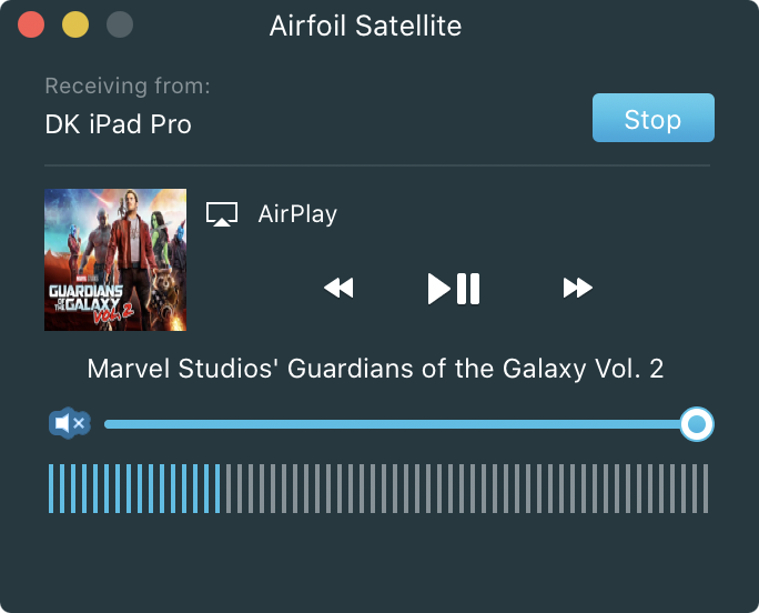
Airfoil is an amazing tool for sending and receiving audio between devices. It is not actively used in this setup, but its license unlocks the companion app. Airfoil Satellite allows you to receive audio from another device using AirPlay. SoundSource gives you granular controls over audio output on your Mac.
Airfoil Satellite
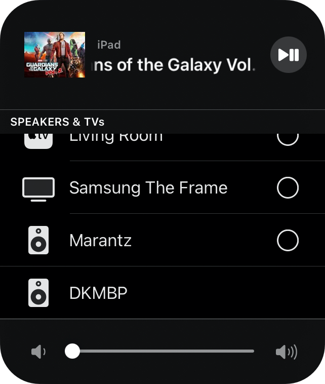
Again, I enjoy watching movies on my iPad, and listening to podcasts on my Mac. The goal is to hear both the movie and podcast audio in one set of headphones. First, launch Airfoil Satellite on your Mac. Then hop over to your iPad.
Start playing a movie.
Tap the AirPlay button to launch its menu, and, if Airfoil Satellite is open on your Mac, you will see your Mac in the “Speakers & TVs” list.
Tap on your Mac’s name. Mine is “DKMBP.”
Now the movie’s audio on your iPad should be playing through your Mac.
Neat, right? You can stop here, but the extra bit of control over each source’s volume significantly improves the experience.
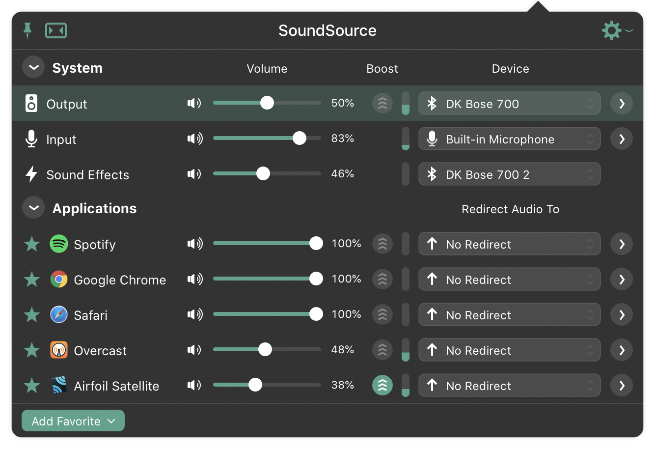
Soundsource
Open SoundSource on your Mac. SoundSource appears as an icon in the menu bar that unfortunately looks virtually identical to the macOS Sound menu bar item. Click on the SoundSource icon to open its panel and view a list of applications that are currently producing sound. I use Flotato to create a dedicated Overcast app for playing podcasts. If Overcast and Airfoil Satellite both used the same volume control, it is difficult to clearly hear both the podcast and movie. I need to slightly adjust the volume of one source to ensure I hear everything. Trust me: the commentary is worth it.
Play with the various volumes until you achieve a balance that works for you. Maybe you want to barely hear the movie and focus on the podcast. With SoundSource that is possible.
Let me know if you have any questions. Yes, I really do this.
Tim Pelan makes a delightful connection between this legendary movie and a TV show you may have heard of.
As far back as I can remember, director Martin Scorsese has been synonymous with wiseguys, mooks, goombahs, and spin-on-a-dime funny-how guys delivering a gut punch to the senses, all choreographed to a wowser wall of sound. Young pretenders like Quentin Tarantino and Edgar Wright certainly learnt how to make up a killer score not, conversely, on the streets, but at the church of St Martin. The rest is bullshit (but that’s another film). We’re here to talk about Goodfellas (1990), surely his most guilty thrill ride until The Wolf of Wall Street (2013), the white-collar larcenous flip side to the saga of Henry Hill, an initial outsider like the young, asthmatic Scorsese in Little Italy, who finds an in to the neighbourhood mobster way of life. Scorsese indulges in the seductive surface appeal of these dodgy foot soldiers, gradually peeling away the layers like finely chopped garlic to reveal the lousy, grifting, desperate and moral hollow at the centre. Critic David Thomson in The
Big Screen: The Story of the Movies and What They Did to Us says, “Scorsese looks at clothes, decor and male gesture like a cobra scrutinizing a charmer. You feel he is realizing his own desires, or bringing them to life: he hungers for his own imagery as a fantasy made vivid.” The director himself reflected later to Richard Schickel that he saw the film a little differently. “I wanted to seduce everybody into the movie and into the style. And then just take them apart with it. I guess I wanted a kind of angry gesture.” A kind of magic carpet ride rug-pull too, the Seinfeld of gangster films, with “no hugging, no learning.” The only regret is in getting pinched.
This is a must-read on Cinephila & Beyond if you’re curious about how Scorsese filmed specific scenes and his motivations. It’s also fun to reflect on Larry David’s credo for Seinfeld: “No hugging, No learning.” Think about it for a moment. Do characters ever hug on Seinfeld? Do they ever learn from their mistakes?
I have been designing for a number of years (since 2007?!), and, after recently being promoted to Principal Product Designer at Salesforce, an opportunity to transition into management arose. As a result, I began reading to learn about the subject. The first book I read is The Making of a Manager by Julie Zhou. She describes four possible ways one begins managing, and one rang true.
The successor transition is like the apprentice’s but with a twist: because your manager is leaving, you’re taking on supporting the entire team yourself, not just a portion of it. Though most successors have prior management experience, it’s still a significant increase in responsibility and you may feel you have big shoes to fill. While the advantages of this transition are similar to those of the apprentice (you have a sense of what works and what doesn’t, and you’re able to ramp up quickly because you come in with context, as described earlier), the differences are also striking.
I’m both anxious and excited by this opportunity. It feels like a natural transition because of my desire to teach what I have learned from my variety of experiences. Watching teammates improve their craft and presentation skills is incredibly rewarding.
In 2003 I took a course at Cornell University in the Music department named Advanced Digital Music: Film Scoring taught by David Borden. We used a plethora of applications like Digital Performer and Reason to compose music for short film clips. This course was challenging because as a composer you want the audience to not feel overwhelmed by your score. Music should accompany the scene; not dominate it. One must match the tone while allowing subtle noises like a door closing to pierce through.
Also in 2003 a professor in the Computer Science department began an unofficial course in game design. There were five teams building games and five students in the music course. Someone had the brilliant idea of assigning a music student to a game design team.
Dragon breeding is a difficult business. You must breed, nurture, feed, and train your dragons in a growing dragon economy. Keep a good journal, as dragon species popularity changes yearly. (Java project)
Yes, it’s still available to download (if you have Windows). I worked with the game design students to learn the purpose of their game and where music was needed. I then retreated to the studio and began writing.
Before the player clicks “Start” they hear a jovial melody to welcome them.
While the player is traversing the world they hear a majestic tune to encourage exploration.
When the player fights to breed their dragons they hear a battle theme that evokes a showdown.
Next time you’re watching a movie or playing a game, try to focus on the background music for a few bars. Think about the instruments and melodies. You’ll notice how the accompanying music was designed to enhance the moment by evoking certain emotions. You can also search on YouTube for your favorite movie or game plus the word “score.”
Kenya Hara, one of my favorite authors, writes about Japanese hotels in a beautiful newsletter named High Resolution Tour. The latest edition features Tokyo’s Muji Hotel in Ginza.
MUJI HOTEL GINZA opened in April, 2019 on the top five floors of a ten-story building on Namiki-dori Street. The new flagship store, on floors B1-five, replaced the former one, near Yurakucho Station. MUJI, founded in the values of anti-gorgeous and anti-cheap, is determined to provide simplicity and concision, pursuing a unique style of coziness and comfort. Visitors and guests at MUJI HOTEL GINZA can savor this concept as a context for living.
Sometimes restraint is more comfortable than extravagance. Here one finds a highly precise minimalism that can be implemented here because Japan prides itself on its high quality space design and construction. MUJI’s approach is reflected in every part of the space. Careful selection, refinement and constant improvements have been made to floors, walls, ceilings, their borders and corners, materials, furniture and fixtures. While the rooms are not especially spacious, there is pleasure to be had in staying in a new hotel in the very heart of the Ginza playground.
You can also keep up with Hara’s tours on Instagram. Staying at the Muji hotel would be a difficult sell for my spouse considering she organizes and manages all of our travel plans. Hopefully I can convince her to plan a stay at one of Hara’s featured hotels during our next trip.
If you are unfamiliar with Hara, I strongly urge you to read Designing Design in which he writes extensively about Muji’s purpose and brand. The way Hara illustrates craft, simplicity, and authenticity is inspiring.
By the time a coffee arrives at your doorstep, it has traveled a long distance and has been transformed from an agricultural product into freshly roasted beans ready to be ground and brewed. We recognize the effort, time, and energy that goes into making the decisions about things like growing variables, processing, and roasting that factor into creating an exceptionally high-quality coffee. However, the truth is that none of that means it will be the best coffee you’ve ever had if it isn’t properly brewed. When preparing your coffee at home, you are the last factor in this long, energy-intensive coffee supply chain. You become an active participant in bringing the specialty coffee to life and ultimately influencing the taste, for better or for worse. That is why understanding the brewing process can help to turn that specialty-grade bean into something delicious, every time.
Tyler does a solid job succinctly explaining the science behind brewing coffee on the Mistobox blog. Read through and try to remember one thing from this article, and then apply it the next time you drink a cup of coffee. Was the extraction ideal? Was the ground fine, medium, or coarse? Have you tried using turbulence?
In the Klein household we use a medium grind setting with the Breville Smart Grinder Pro for the Moccamaster KBT. I only use turbulence when I use my Hario V60 for a single cup.
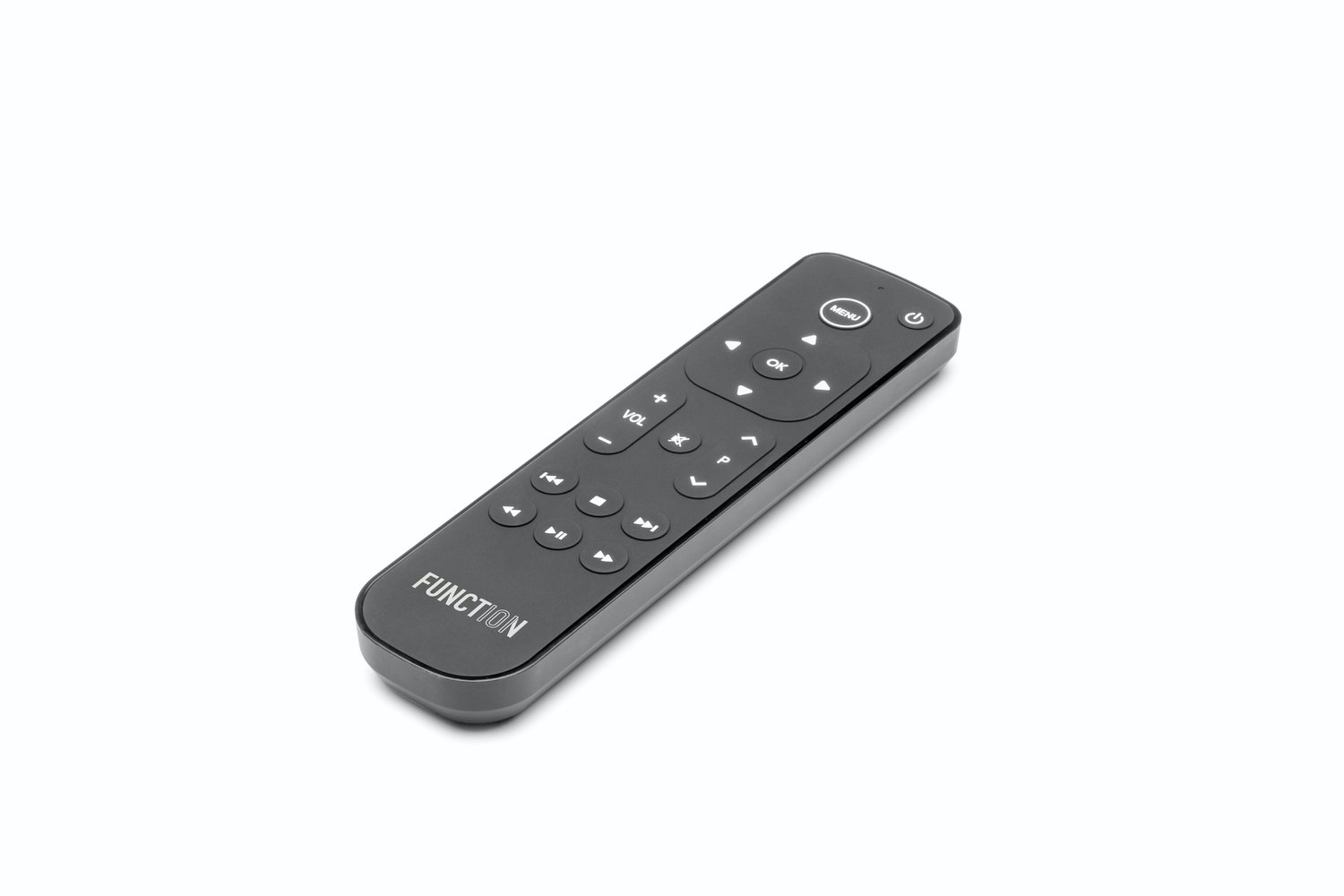
One can argue that the Apple TV remote has a derisive design12. In my opinion it has several major flaws:
If the room is dark it’s difficult to determine which side of the remote should point forward.
It’s difficult to pick up because of its thinness.
It’s easy to lose because of its small size.
If the room is dark it’s difficult to differentiate between buttons.
One way to mitigate some of these issues is to place the remote inside of a case. I did this and it made picking up the remote much easier. However, it made differentiating between a regular trackpad press and fast forward/rewind very difficult. I often pop the remote out of the case before attempting to fast forward or rewind.
I’m surprised the only change to the remote’s design since its initial release is a slight bump in the form of a white circle on one of the buttons. This did not fix any of the problems. I often wonder how Apple can continue to ignore this considering many of its own employees must own an Apple TV.
When Salt, a Swiss TV company, announced in 2019 a remote specifically designed to work with the Apple TV, I was intrigued and even considered purchasing one on eBay. Patience, David. Patience.
Lo, Function now sells the remote directly in the United States for $29.95.
Like a typical remote, the Function remote feels good in your hand. It’s large, bulky, and not too heavy. When you set the remote down it does not shake back and forth like TiVo’s more curvy remote.
The dedicated fast forward, rewind, and pause buttons are a dream. You will never accidentally fast forward or rewind when you are trying to pause. However, the up, down, left, and right buttons are definitely a step backward compared to the Apple TV remote. It takes more effort and time to navigate Apple TV’s interface. When you temporarily pick up the Apple TV remote you feel again how easy it is to quickly traverse the screen.
The more traditional layout provide enough space for the button positions to enter your muscle memory. You can easily slide your finger around to find volume up/down and be confident you are pressing what you intend to press. Oh, and a mute button lets you… mute.
One major drawback is the lack of a Siri button. Occasionally I know exactly what movie I want to rent so I speak its name into the Apple TV remote. That is no longer possible. Apple TV offers a screen that shows you what apps allow you to watch a movie for free. Without Siri I’m not sure how to get to that screen.
Another drawback is the lack of a home button. “Wait, David, the Apple TV remote has a home button?” Yes! The TV icon button in the upper right corner instantly jumps to the home screen with the grid of app icons. I have encountered multiple people who never tried pressing that button. They press the menu buttons repeatedly until arriving on the home screen. Can you imagine?! Those naive users will be comfortable with the Function remote. I, however, am instantly frustrated every time I want to return to the home screen.
The last drawback is visual: Function’s ugly logo is prominently displayed at the bottom of the remote. This is similar to LG placing their logo on the UltraFine 5K Display. I don’t need to be constantly reminded of who made your product.
If your household exclusively uses Apple TV for content (YouTube TV, Hulu, Netflix, HBO MAX, Peacock, Acorn, Disney+, Apple TV+, etc.), I recommend purchasing the Function remote. Interacting with your Apple TV should be simple and enjoyable, and that requires a better remote.
As an Apple fan since since 1990 with the arrival of the Macintosh LC in my home, this is an achievement of which I am particularly proud.
Transform how you get things done. The App Store has over 235,000 apps for people at work, and Apple devices are designed with powerful technology that brings out the best in every one. Discover apps for daily tasks, better customer experiences, and efficient operations. Or build custom apps across Apple platforms for infinite possibilities.
John Siracusa, of Hypercritical, Accidental Tech Podcast, Reconcilable Differences, and The Incomporable fame, is an underrated storyteller. Whether it’s cooking, researching cheese graters, reviewing toasters, moving refrigerators, or, as I discovered this week, troubleshooting his new Mac Pro, I’m somehow always enthralled. No detail is too small, and subtle hints live amongst the minutiae.
Casey: So right before we started recording, something appeared in the after show section of the show notes. And it says, “John’s Mac Pro woes.” Oh no. What’s going on…
Marco: “I saw this too and right at that moment I’m like “Oh no… This is not good. Oh John. What’s up?”
John: “Hmm… Well… This is one of those things where… it’s not a slow-moving disaster, but it’s kind of a gradual thing… I’m trying to pinpoint when did this all begin.
Who knew troubleshooting could be so entertaining.
An hour after presenting, Systrom was reminded of Facebook too. His iPhone flashed with his new boss’s name, and he went to a quiet spot to take the call. Good, he thought. Even if Cox and Zuckerberg weren’t attending the event, they were at least acknowledging the accomplishment. He swiped to answer.
“We have a problem,” Cox said. “Mark’s very angry about your icon.”
“Are you serious? What’s wrong?” Systrom asked.
“It looks too much like the icon for Facebook Messenger.” The IGTV logo had a sideways lightning bolt shape inside a TV-shaped box. The Messenger logo had a similar bolt, but inside a cartoon dialogue balloon.
After the drama of the day, there was no praise from on high—only Zuckerberg’s concern that Instagram would step on Facebook’s branding.
This similarity did not occur to me. Take a look for yourself.
Each icon includes a lightning bolt, but they are different enough to not be confusing. However, one wonders if the IGTV design team was winking, nodding, waving, or sneering at the Facebook Messenger team.
This reminds me of when Facebook Places launched in 2010. Facebook partnered with Foursquare and Gowalla on their new product for sharing your location. But, if you look closely at the Places icon, you’ll notice the Places icon includes a “4” inside of a square. Were the Places designers winking or sneering at Foursquare?
Marcin Wichary writes about an interview he conducted for his upcoming book about keyboards on his corresponding Shift Happens newsletter.
I have a feeling chasing people isn’t the right take, anyway. You have to chase stories. But stories don’t announce themselves as such. Many are hiding inside people’s heads, feeling like nothing very exciting. It haunts me that somewhere within the readership of this very newsletter, there are great stories that will never see the light of day; even if I had time to talk to everyone, and you had the willingness to engage me, well… I’m not a great interviewer.
I’ve had some luck with chasing stories on Twitter, and I’ll write about that some other day. And I was pretty lucky with finding some wonderful people who surrendered great stories too: fans of mechanical keyboards, people who typed on the oldest of computers, ergonomics specialists, inventors. To the extent I could determine it, I thought I was already done with interviews about a year ago.
And yet, despite that, the most unusual interview I‘ve done happened only last month.
Marcin is a master storyteller. If you have never seen him speak at a meetup or conference, I recommend watching his latest talk from Config 2020: I Pressed ⌘B. You Wouldn’t Believe What Happened Next. I absolutely cannot wait for his book.
The biggest was “community first,” meaning all their decisions should be centered around preserving a good feeling when using Instagram, not necessarily a more fast-growing business. Too many notifications would violate that principle. Then there was “simplicity matters,” meaning that before any new products could roll out, engineers had to think about whether they were solving a specific user problem, and whether making a change was even necessary, or might overcomplicate the app. It was the opposite of Facebook’s “move fast and break things,” where building for growth was valued over usefulness or trust. There was also “inspire creativity,” which meant Instagram was going to try to frame the app as an artistic outlet, training its own users and highlighting the best of them through an editorial strategy, focusing on content that was genuine and meaningful.
It’s clear today that these early values, especially “simplicity matters,” are lost. Instagram is a confusing mess. There are 3 camera flows each with their own interfaces, features, and content placement.
The book also includes several passages discussing Systrom’s refusal to build a “regram” button that would allow me to post others’ photos to my feed similar to a “retweet” button on Twitter and a “reblog” button on Tumblr. He believed Instagram should be a place for expression and creativity; not viral content. This button does not exist today, but sharing others’ photos and videos to Instagram Stories is possible. This functionality means my Stories are filled with impersonal nonsense.
I’d been thinking about how the inclusion of a road in a photograph affects the way I felt and what I thought about when I viewed the image. So, on a recent evening, I searched my catalog for photographs in which a road was a prominent feature of the composition. I found and created a new collection of a dozen examples. As I examined them more closely I discovered that they fell into two broad categories: one in which the road drew my eye into a clearly seen destination, the other where the road disappeared into parts unknown.
While making landscape photographs I look for a place to set my camera in order to represent an evocative view. I want my print to give the viewer a feeling that they are standing, virtually, where I had stood to make the photograph. I call this “giving the viewer a place to stand.” When a road is also included in the composition, the viewer is not only offered a place to stand, but he/she is invited to enter deeper into the image.
As I continued looking at my road photographs I began to explore what I was feeling when I made these two kinds of images. In the case of the road leading to a clearly seen destination, the feeling was obvious: the road had drawn me to a view that exuded a sense of heightened beauty or grandeur. It was as if I had arrived at a captivating place and could now stop and gaze at the view. I felt happy…my spirt soared. The second type, where the road disappeared around a bend or over a hill, made me wonder what was beyond, what awaited me. I felt a sense of curiosity, mystery or longing. In both cases the inclusion of a road in the image invited me in–stimulating new feelings and thoughts.
This is our 6th campaign and we’re more excited than ever to bring you our first line of bags for the NEW work - backpacks, totes, and organizers for working anywhere and traveling everywhere.
The Klein household currently uses a Filson tote (thank you for the wonderful gift, Jesse) when we travel to family members’ houses and wife-approved hotels. The Filson tote is pretty but its lack of pockets and zipper causes anxiety. Cables and chargers also end up tossed into a suitcase which results in cables getting tangled amongst my allbirds underwear and socks.
The river runs from Fujisawa to Enoshima and on the return trip, the Enoshima lighthouse acts appropriately as a beacon in the distance. The other night, the moon fought through hazy cloud cover, and the river water looked stage-lit. There’s a path along that river that runs for miles and miles. At 10 PM it’s empty. Just me, on my orange bike, total silence, floating through the soup that is the air of August in Japan, air that even at 10 PM is as soupy as you can imagine, more soupy than even in the afternoon since the humidity rises at night. My bike has a beautiful little German-engineered light and dynamo hub on the front wheel. Totally silent in operation. It lights the path (which is otherwise unlit). The river glints. My presence is nothing more than a gentle rubber-on-cement hum. Every now and then a fish flies up and out of the water, splashes back down with a thud. Bridges bisect the river at various intervals and one of them carries the Enoden, a small local train, and as
you hover alongside the river, the fishes flopping, the air like soup, the lighthouse marking the way in the distance, every now and then a train will trundle past downriver and you’ll catch a quick glimpse of a few heads, yellow-lit from within, and the rough reflection of the cars in the water.
Actually, become a Special Projects member and support his endeavors.